


The colours on this image are great and it has a very "instagram" feel to it and I think it would do very well on there.
Your treatment and retouch is good but just have a look at keeping everything straight and using lens correction to remove the pincushion effect you are getting around the edges of the image which spoil it ever so slightly for me.


I think this is one of the best images i have judged on this platform and it absolutely nails the brief, so well done.
Without reading your caption it makes the viewer question what is happening in the image and it almost looks like a lone building lost at see with a fantastic bit of motion blur around the edges.
The colours are great and you have handled the exposure really well, nothing on the light is blown out and all the detail is still there in the image.
I don't think I would change anything about it.
Well done!


This is a beautiful example of using a pop of colour to create a striking image.
I really like that it has an almost diptych quality to it with the patterns of the architecture on the right and the stark tree on the left.
The image is well weighted and roughly conforms to the rule of thirds which I think helps balance the difference in subject matter.


2,223 Photographers


4,845 Images entered

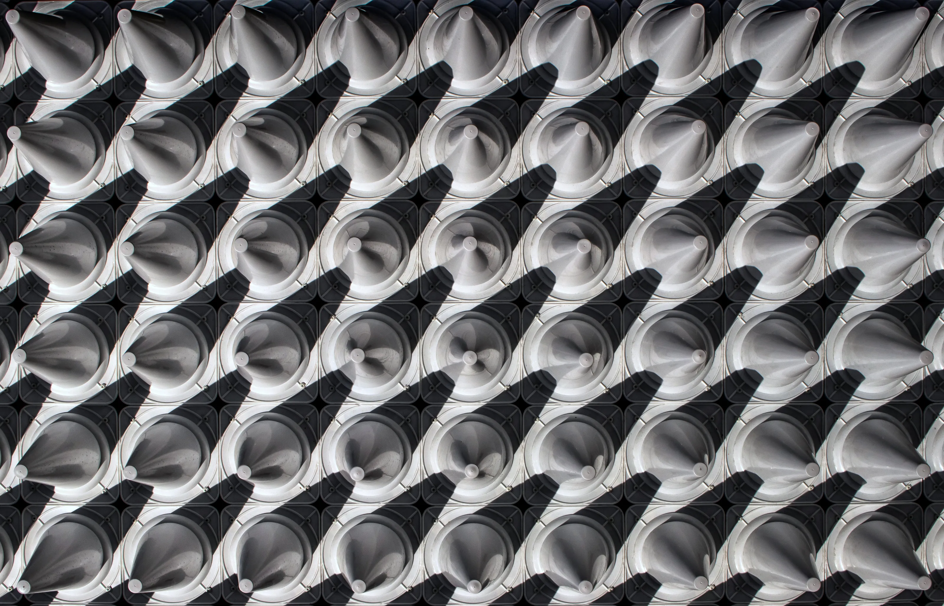
The colours and patterns throughout this image are great and I keep finding new bits to look at even as I'm writing this review.
You've chosen a really interesting subject and it definitely ticks all the boxes of the abstract brief.
I would have liked the shutter speed to be a little faster to get a bit more density in the light trails, they're just a bit too drawn out for me to add anything worthwhile but I think it's a great image.


I'm not usually a huge fan of black and white but this looks great.
There's a really good level of contrast throughout the image which made me initially look at this image a little further.
The detail of all the tiles comes out really well and the visitor walking through the image is what makes it for me.
I would have liked to have seen something more in the sky though, it looks great in black but it's just a little too much for me being such a solid black, slight clouds may have just lifted it a little.

This is the only drone shot in the top 10 so kudos on trying something different!
I'm an absolute sucker for a good top down shot and you have handled all the lines absolutely perfectly as everything is straight, as it should be.
The cropping is great but I would just like it to have a little more breathing room to get a little more space in the corners.


I am usually not a massive fan of really over processed images but the impact of this image is great and the amount of effort for you have put in to make a really graphic image is commendable.
I would look at feathering some of the edges just a little as a few of the edges stand out a little too much for me and make it a little too obvious what you have done to achieve the effect but it's a great image and love the impact.


A beautiful capture of light interacting with the built environment, a great take on the abstract brief!
I think your colour grading is really good, orange and blue is always a winner and it works fantastically here to create a wonderful warmth throughout the image.
The sky does stand out a little for me and a few bits make me question the retouch but the treatment of the front of the image does a good job of keeping the viewers eyes there.
Great image and congrats on your top 3.


Meet the expert judge


144,103 Ratings

The colours of this image are what drew me towards it.
The colour temperature of the facade and metal work contrasted against the warmth of the random colours in the living areas creates a really nice juxtaposition.
A small detail, but it it's weighted ever so slightly one side as the metal work on the right hand side comes into the image further and there is a little bit of pincushion distortion. Maybe worth changing the crop and lens correcting 1 or 2 degrees to make it all perfectly straight but I am really nitpicking there, it's a nice image!

Really nice image this and I like the effect which shooting from this location has given you of creating almost a photograph within another photograph.
The colour treatment is good and the subtle oranges throughout the image work well with the blue of the sky.
I would have liked to have seen a little more detail on the right side of the image but I guess you're kind of stuck with what was there and the concrete doesn't look too interesting.
Brief
See more contest details
Get close enough to pretty much anything and you can shoot an effective abstract. Buildings are a particularly good subject for abstract photography given their use of varied materials, shapes, textures and colours. And they don’t always require you to be right up close, given that they are often large, and somewhat abstract in their design to begin with.


This was so close to being in my top 10.
It's framed really well and the subject of the people in the middle draws the eye right through the image.
I would have liked a little more contrast just to make it a bit more graphic and differentiate between the tones of a grey a little bit more as it is all a very similar tone but I do think it's a really nice shot.


