

The lighting in this shot is fantastic, balancing the highlights from the light source with the contrast and depth of the shadows.
What really makes this shot for me though is the people, I love the fact those stood in the light pop while the lone figure in the shadows is steeped in darkness, that little bit of motion blur is just the icing on the cake too!

A bit of a wildcard pick for me this but I think it deserves its place and wouldn't look out of place on the walls of any art gallery.
I think the framing you have chosen is great, those bold colours really help the protagonist of the image stand out and the shadows give it an almost cubist feeling.

There's a very comic book feel to this image, that strong pop of red between the shadows really draws the viewers eye into the image and the subject is framed really well between against that graphic white background.
The sky looks a tiny bit odd and there appears to be a small bit of sensor dust up there too which draws my eye but overall a great image!

A great shot which has been treated really well, the pops of orange contrast really well with the slightly blue/green of the shadows surrounding the image.
The use of the person walking through the image is great and gives the viewer a defined point to look at and the elevated angle gives the viewer a bird eye view they wouldn't usually see.


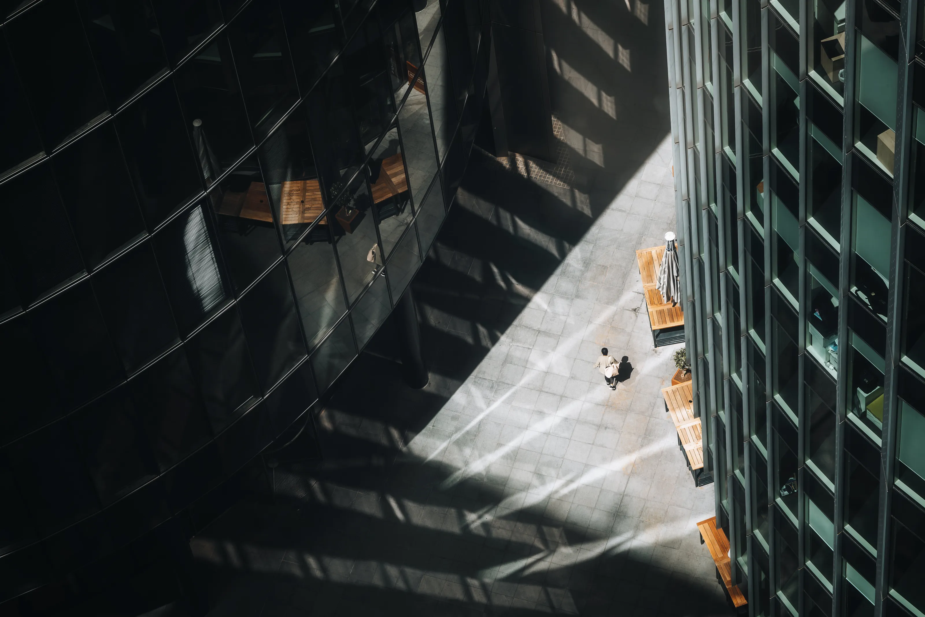
I chose this image as the really strong, contrasty use of black and white creates an image which not only ticks all the boxes of the assignment from a technical angle, but is also really pleasant to look at!
The strength of those blacks creates a really graphic image which is emphasised by the elevated viewpoint you have taken the image from and really serves to bring out the highlights further and draw the viewers eye to the gentleman walking through the image.


This is a great moment in time and a perfect example of the best camera you have is the on in your pocket as I'm guessing it was just an ad hoc moment?
The colours and treatment of the image to bring out that wonderful warmth throughout the photograph are fantastic and it definitely fits the brief with all the graphic shadows across the image.
It's really well composed, the two doors provide a good frame for the image and the subject sitting on one of those rule of thirds lines was a really good choice.


A lot of people are a sucker for a long exposure of the sea and I'm definitely one of them!
The colours on this are great and really fall into that "blue hour" period of the day with the sun just peaking through on the left hand side and providing enough illumination to pick of the details on the underside of the bridge but still keeping a great depth to the shadows on the water too.
I think the framing could be a little better to suit the brief, I feel putting the horizon line dead centre would create a stronger leading line and get you more shadows from the bridge above but apart from that it's a great image.


A stunning shot with so much going for it, well deserving of its top 3 finish!
You have handled the colours of the whites and blues across the whole image well and nothing is over exposed, which considering how bright the area is, should be congratulated.
The use of the water to create the reflection of the cyclist is fantastic, I would have loved to have seen it perfectly in the middle though to split the photograph exactly in two but it's just a small, personal thing.

Congratulations on your winning image!
I chose it as the winner because I think it ticks all the boxes of the assignment from a technical stand point but it's also got a very graphic element to it, coming from the elevated viewpoint you have chosen, creating those wonderful elongated shadows.
The way the shadows are a cold blue and the sunlight areas are a warm orange really drew my eye to the image and it's exposed beautifully across the whole photograph with enough detail in the different areas to keep me coming back for another look.
2,406 Images entered
823 Photographers
Meet the expert judge


Brief
See more contest details
The interplay of light and form is one of the many considerations in the mind of a good architect when they are designing. In this contest we’re less focussed on the architecture, and more on the shadows that it casts - shadows that might be falling on the building itself, or the area around it. When it’s possible to return to the same building at different times of day, and in different lighting conditions, one can explore the many ways in which that building’s shadows will interact with its surroundings.

I really like how simple this image is an how it so obviously ticks the brief.
It's a well exposed image and there is plenty of different bits to hold the viewers attention, from the vendor sat under the umbrella to the tour guide with a crows it keeps me coming back for more.
From an architectural stand point, I would have liked to have seen the Alexander column centred in the image to help frame the photograph better.


I had this shot in my top 10 for quite a while and do thinks it's brilliant!
It has an almost brutalist feeling to it which I think represents that area well.
I would have like to have seen a bit more contrast or maybe just a slight s curve to give it a bit more depth as it doesn't pop quote as much as other images but I do think it's a great shot!


I think this is a really well exposed image, you have kept all the details in the white of the handrail but there's still enough detail in the blacks to bring out all that texture in the back too.
I do like how you have framed it and that use of negative space works really well to further highlight the subject.


A beautiful image to look at which really captures the eye!
You've chosen a fantastic viewpoint to capture this building and the black and white really gives it a punch which brings out all the shadows.
I would have like to have seen some texture in the sky though, it seems almost too perfect just as a gradient.


