Get notified of their new contests


I find the high key brightness in this image attractive, and like the colour contrast between the orange crusts and purply/red dip. The depth of field is very shallow, but I think your choice of focus spot (the centre front bread slice), is perfect, as the rest of the scene fades gradually out of focus, but retains enough detail in the background without being distracting. Composition and framing is good too - with a scene such as this it can be difficult to know what to include and what to leave out. Great shot of a tasty-looking spread.

Another image which was close to my first place. I immediately liked the overall look of the image, which brings to mind a scene from an old master's oil painting. The set up for the shot has been very cleverly done to showcase the bread, alongside other related objects. The lighting and colouring is superb and the entire image well focused. The diffused softness across the picture split my decision each time I looked at it , one occasion I loved it, on another I felt it slightly let the image down, and it was this which eventually placed it 3rd. Still a fabulous image, well done.

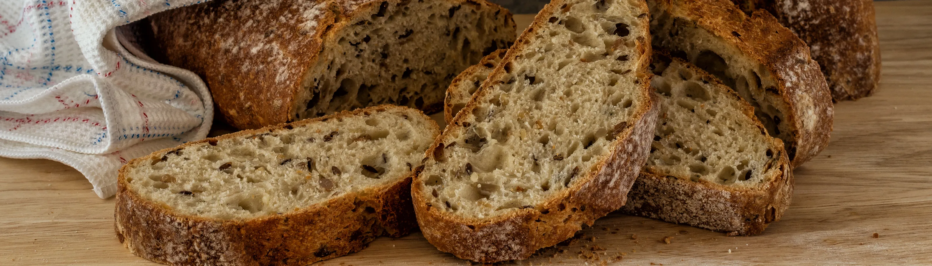
I was attracted to this image as soon as I saw it, but the more I looked at it during the judging process, the more I liked it - hence the first place. The set-up and composition work well for me - it is always difficult to know how much of an object to include in the frame for the best effect, without making something look accidentally chopped off - but I feel you have judged this perfectly. The small piece of hessian peeping into the top left corner is a small but essential element in the success of this image, and adds to the whole rustic feel of the wonderfully captured crusty loaves. The lighting and colouring you have used suit the subject completely, and it is an image I could see in a food magazine or on the wall of an aritsan bakery. Congratulations.

This image shows off the wonderful texture of the crusty loaf, and your control of the colouring and white balance have meant the bread looks appetising - one of the things I feel is vital when photographing food. A simple, uncluttered composition, but perfect for the theme of "bread". Well done on a top ten placing.
279 Images entered


This is one of only a few close-up shots of bread in this contest, and for me it was the best. Being critical, the focus is maybe a little too soft on the upper section ( a smaller aperture may have remedied this), but what I do like is the detail in the central section - even though the bread is baked, the strands of former dough are still clear, which give an excellent representation of the structure, texture and make-up of bread. Well done.
233 Photographers


Bread is what we have here, nothing more, nothing less - spot on brief! The lighting initially attracted me to this shot, as it is clean and bright and gives a very realistic colouring to the bread. The use of the black background makes the subject stand out further, enhanced in this case by the narrow white frame. I may have been tempted to move the aperture up to something like f/11 - f16, which ought to have allowed more of the loaf to be in sharp focus (assuming your camera was being held steady on a tripod), but the top section is still nice and sharp to bring out the lovely crusty texture. Well done.


There is a lot I like about this image, and it came very close to a top 10 placing. What just went against it though was the bluish tinge on the whiter areas of the image. What I thnk has happened is this: often, when photographing objects of predominantly one colour (yellowish in this case) the camera or post-processing can be fooled into trying to correct the white balance, and it does it incorrectly - it sees what it thinks is too much yellow, so adds too much blue to compensate for it. If you could remove the blue tones in some processing software and return them to their true white, I feel this well composed image would be even better. Still a very interesting "bread" shot.


I love the tones and soft, brown shades in this image. It is a great set-up , well composed and focusing is good too. Where it could be improved in my opinion, is by lightening the background on the left hand edge of the image, as I found the dark patch distracting and it drew my eye away from the main subject. Alternatively, the whole background could be darkened to match the darker patch, although that may result in the image being too dark. However, you obviously have a creative eye as this is still a beautiful composition.
Meet the judge

Coming in the top 10 in a "bread" contest with no bread in the photograph may seem a bit odd, but it is the suggestion and representation of bread which I really like here. The image is different, and I liked it as soon as I saw it. I don't know how it was produced, but that doesn't matter. You have captured the "essence" of a bread roll - the loose holey texture, the crumbs and the crispy outer surface. An excellent creative image, well done.
Brief
See more contest details
Bread is a popular staple food around the world and has been part of the human diet for thousands of years. It comes in a wide variety of types, shapes and sizes and is often made and eaten in accordance with centuries old traditions. In this contest I want to see your best images of any type of bread, from crusty baguettes, soft tortillas, large tandoori naans, small bagels, dark rye breads to the sliced white loaf. Photographs can show bread at any stage, from making and baking, through to selling and finally eating, but please make sure that bread is the main subject of your image. Whether the aroma of baking, or the taste and texture of eating, do your best to convey these in your image. Show bread at its delicious best.
28,265 Ratings


A brave decision to take a camera into the kitchen and start throwing flour around - recipe for a mess (but hopefully a lot of fun!). I commend you for capturing such crisp detail in the fingers and dough, which you have managed to catch well as they smash down onto the surface, despite a relatively slow shutter speed. Where I think the shot could be improved is in the b&w conversion, as to me it is a little bit grey & grey. I am not sure if you did a simple desaturation/remove colour, and if so, it may be worth converting to b&w by adjusting the tones of the different colours separately within the image, to get more contrast and a range of tones from pure white to pure black. I find my attention drawn to the dark kettle in the background and away from the subject. I am sure it would be worth further experimentation with the b&w conversion process. Hope you have been able to dust all the flour off your camera by now! Thanks for your entry.


There is a lot I like about this image. You have done well with the set-up and composition, and been able to keep the colours realisic to make sure the food looks appetising. If I could suggest one thing to improve, it would be with the focus point, as I find the blurry cheese piece in the foreground a little distracting. Ways to improve this could be by experimenting with i) increasing aperture from f/5 to something like f/8 - f/11 or ii) moving your focus point slightly further forwards, or iii) slightly repositioning the cheese so it is closer back towards the bread. Any of these ought to decrease the blurriness of the cheese, whilst retaining the lovely out-of-focus you have achieved on background. Thanks for your entry to this contest.


The concept, and the photographic skill and the creation of this image give it a well deserved top ten placing. All parts are well lit and well focused. The stitching together of the seven different images is seamless and you have done very well to keep the bagels in line and evenly spaced. Brilliantly creative, very well done.


