
This is a neat idea, representing the one second of the exposure very literally and choosing an attractive watch for the task. It has the potential to be a great shot, but is let down a little in the execution. The main issue is the sharpness of the shot, which is not good enough. The primary culprit here I think is the ISO, which was set to 1600. Whenever possible a much lower ISO should be used, as higher ISO values result in graininess, loss of sharpness and colour distortions. In this case it would have meant Richard shooting with a wider aperture, maybe f8 or f11, but this would still have given him sufficient depth of field as the subject is quite flat. It is also imperative when shooting this close-up to make sure the focus is pin-point accurate, and a remote shutter release and the mirror lock-up function are being used. Finally, I think that the crop is a little too tight. Some key elements of the subject are bumping up against the edges of the shot and need a little more room to breath.


I've been imagining that Van Gogh might have had a similar vision to this after a night hitting the absinthe too hard. This exciting shot grabbed me as soon as I saw it, with all its energy, invention and vibrance. Over-exposing subjects makes colours pop, and the results with this sunflower are, literally, brilliant. Retaining some detail and colour in the core of the sunflower, with its streaked seeds, gives an interesting central focal point to the image from where we're free to explore the chaos of the rest of the scene.

I've found this shot of Sue Gurney's, combining (I assume) a television image with a reflection in the television screen, to be evocative, enigmatic and captivating, and it grows on me the more I look at it. It is mysterious - who is the girl standing by the fireplace, what is she doing, is she calling to the man, and why the word 'GOAL' over the fireplace? The alignment of his glaring and urgent eyes with the top of the fireplace draws these two separate scenes together beautifully into one, aided by the pattern of the screen that covers the entire frame. The balance and interaction of the elements in the frame is perfect, but it is the image's ability to set the imagination racing that is what makes it so special for me.


I love what Ziggy has done here with a clever subject (the hourglass), a brave but well thought-out composition, and some bold contrast between the blacks and whites. The main thing I would change is the plane of focus. For me this should be on the trail of sand, falling and marking time, at the point where it lands rather than in front of it as it is. The subject is sufficiently abstracted to require a little more direction from the photographer as to where we should be looking, and so helping to inform us better what the subject is. I'd also like to have seen a little use of the healing brush and clone tool in the top right of the picture to remove the distracting details from the glass, and a darkening/removal of the highlight that draws your eye up to the very top right corner.

I love the use of the slow shutter speed here to emphasise the hard work being done at the computer. What makes this work well is the combination of a well-composed, clean arrangement of objects, and the sharpness of those objects contrasted with the blur of the hands. The mug provides some much-needed colour and a touch of humanity in an otherwise quite sterile shot. On the far side of the desk are some objects that could have been cleared away in order not to distract the viewer, which they do. I think that a slightly raised angle of shooting would reduce the amount of desk being shown, and bring the monitors more into play, which are of more interest. But generally a well thought-out and executed shot.

This is a straightforward shot, but is very pleasing to the eye. It shows nicely the way in which photography can give us totally new representations of the world that we inhabit. Long shutter speed is particularly adept at this. Here we have one second's worth of movement collated into one image, producing a swirling, smudged mass of movement that looks more like a charcoal drawing than a photograph.


Yes, this is a great example of an exciting experimental outcome - playing with fairy lights and long exposure. And yes, it is well executed in terms of composition, the arrangement of the lights, the shape of the light trails, and the interesting pattern. But what makes this one of my favourite shots from this assignment is simply the riot of colour, and the fun of it all. What an explosion of uplifting hues, and why wouldn't you want this brightening up one of the walls of your house?

This is a soothing and attractive shot that is a nice mix of blurred shapes and solid stars. It falls down in only one respect for me, and that is the crop. I'm not a fan of image ratios that are slightly off-square. I would prefer the crop to either be square, or clearly not square. Anything in-between feels like a weaker choice of image dimension, and smells of cropping purely for the sake of removing unwanted dead space or distractions. In this case I think that a square crop that removes only the right hand edge of the image would be much stronger. It would avoid the situation that exists currently where the eye is taken down to the bottom right of the image, when ideally it would stay with the star shapes on the left of the shot.

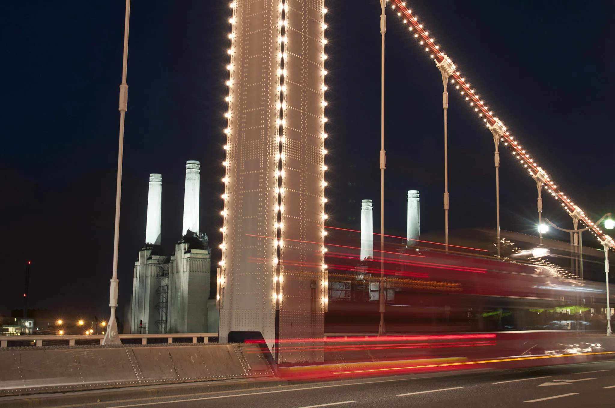
My favourite London building, favourite London bridge, both shown off at night when they are in their pomp, well exposed, and added to with a wonderful streak of red from vehicle lights to lift the whole even higher. This is a shot that has been well planned and almost perfectly executed. I say almost because despite Andreas clearly paying a lot of attention to where he was stood, I don't feel that the composition quite works. The chimneys of Battersea power station are cleverly positioned relative to the cables of Chelsea Bridge, and this works well. But there is a quite barren section of dark sky on the far left of the shot that creates an imbalance, and that is exacerbated by an awkward crop on the far right of the shot where the street light and one of the bridge's cables bump up against the edge of the shot. Another area for improvement is in the overall sharpness of the image, which is not quite there. Shooting on a bridge with a one second exposure and traffic on the bridge is tricky, as the bridge itself will likely be moving, so it may be that all the rules of using a slow shutter speed were actually observed.

I just love this shot, and it's my Expert-choice winner for this assignment. Aside from all its other qualities, it just seems so now. I've still got the footage fresh in my mind of the meteorite that burnt a trail through the Russian skies in February, and we don't seem able to go more than a month nowadays without a TV newsroom pumping out a story about the chances of humans being wiped out by a passing asteroid sometime soon. But it's the visual impact of this shot which wows me. The dark moodiness of the light and the featureless industrial landscape add to the doomsday feel, and the blurriness of the shot suggests the photographer hurriedly snatching this shot as the skies erupt. The main 'meteorite' is perfectly formed, and the small row of lights in the bottom right corner of the screen tie the quite distinct upper and lower halves of the shot together very neatly. To have created all this from a simple motorway sign may seem like a happy accident, which in itself is no reason to dismiss an image. But Cathy's accompanying notes confirm that this is something she has been trying for a while, so I applaud her efforts.
60 Images entered

This is a very classic long-exposure shot, and it is one that Dan has done well. The composition in particular is strong, with the buildings on either side used well to frame the scene, and the main lit building in the centre given just the right amount of sky above it to breath. I particularly like the slightly off-centre positioning that Dan has adopted on the bridge - I think this works well. The inclusion of the Japanese writing on the road helps us to navigate ourselves geographically, and the exposure of the shot balances the lights of the street and the dark night sky successfully. The sharpness of the shot is in question however. Dan has propped his camera on the bridge, and it seems that the combination of the movement of the bridge by the thundering traffic, and the instability of the camera, have resulted in an image that has some camera-shake.

What a wonderful use of slow shutter speed. The concentration, the pursed lips, and the furious blur of the knitting needles. The slow shutter speed exaggerates the speed of the needles to great effect, and is very amusing. Sure, the subject herself is not pin-sharp, but sometimes the effect or story that an image presents is more important than technical concerns. The close crop works well in focussing us in on the 'action', and the use of black and white similarly avoids us being distracted by colours.

Brief
See more contest details
Cameras perform a kind of magic, pausing the flow of time, and capturing and stretching moments for us to see, enjoy and return to. What is the camera’s eye able to record when set to exactly one second? What sense of comedy, oddness or beauty can this bring to a scene?
34 Photographers
Meet the expert judge
6,176 Ratings

In terms of technique and composition this is a very neat shot. By balancing his camera on his bicycle Damian has managed to keep the camera very still for the one second exposure, and all but the towpath walkers are perfectly sharp. The composition is formal and well balanced, with multiple layers of towpath, verge, water and trees all leading the eye in a comfortable sweep from left to right. Elements such as the boat and tall trees on the left, and the bush in the foreground on the right, add interest and frame the walkers well. It's interesting to see how little of the walkers is visible with a one second shutter speed, as what remains of them blends with the mist on the other side of the canal. Successfully blurring figures in an image is a balancing act between adding enough blur to create an interesting effect and reduce focus on the individual, but not so much blur that the figures all but disappear. Cameras record light, not dark, so figures in darker clothes are most likely to disappear in this way. Overall I think this shot lacked enough beauty or interest to warrant an award, but it is well executed.

This shot perfectly illustrates two essential facets of successful photographers - effort, and experimentation. There are no prizes for having a good idea, but Richard has seen it through, stringing fairy lights to a power drill and seeing what a one second exposure would give him. When you experiment like this you often have no idea what you'll end up with, or the result turns out to be wildly different than you imagined. But rarely does it fail to be thrilling, and it will always leave you a wiser photographer. From a technical point of view the shot is excellent, with beautiful sharp focus in the far reaches of the shot, and the loss of focus in the foreground giving an important sense of depth. Wonderful.

From the same shoot as Richard's other submission to this assignment, this shot again proves that from experimentation and effort can come wonderful surprises and beautiful imagery. Using a string of fairy lights and a power drill comes this fantastic light sculpture. Whereas the abstraction of it's sister shot grabbed me and pulled me into the image, I feel that the more literal nature of this shot assigns it less interest. The tea-lights on the floor are an unnecessary addition, and the visibility of bicycles and other garden paraphernalia remind us of the practicalities of the shot, rather than leaving our minds free to imagine as they might otherwise. A tighter crop, darkening of the shadows and cloning out the tea-lights would remedy all these things.

Another clever representation of one second, and the whirring of the digital numbers as they count a second make for a very cool effect. It's also interesting to be made to think for a moment about the machinations of the screens and computers that we spend so much of our time looking at each day. The composition of this shot is what lets it down for me. The circle around 'Lap' bumps against the edge, and there is an awkward crop at the top where a small remnant of a character is visible. The crop needs to be much tighter, and focus on the point of real interest - the whirring numbers. One thing that is done very well with this shot is the sharpness - you can see every pixel of the screen.

Alas I wasn't able to give this image an award as it falls outside some of the requirements of the assignment - most notably being only 1/4 of a second, but an interesting one to think about. For me this is a great reminder of the need for having fun with photography. The photographer has ditched any concern for technical formalities and the result is scene comprised of surreal characters reminiscent of Dali, and with a stunning blue of the swimming pool which grabs the eye. The lack of any sharpness or detail in the shot allows the viewer to fill in the blanks themselves, imagining their own interpretation of the scene, the location, the characters. It leaves us free to revel in the joy of the swimmers, and tap into memories that it might stir.

More experimentation and rule-breaking with this shot, and I love it. I'll be hard pushed to see a shot of a kid's playground anytime soon that is as fun and interesting. "Rules are made to be broken" goes the saying, and doing so can lead us to a better understanding of why the rules exist in the first place, and down new creative avenues.


I like that William has chosen an autobiographical subject - the sculptor in his workshop, surrounded by the stone he works with. The choice of lighting emphasises the seriousness and intent of our subject, and it feels like a personal glimpse into the world and mind of the artist. Photographically however there are aspects of the shot that leave me dissatisfied. I want to see more of this interesting workshop that William works in. The few things we see are not sufficient to define the context. The balance of the shot is weighted too heavily to the right, which contains almost all of the eye-grabbing light and objects. The idea of the stone swinging is an interesting one, but I wouldn't have had it interacting so heavily with the subject's body and face, and a little less blur in the stone would have made it clearer exactly what we are looking at. The shot is also not quite sharp, and I think in this case it is important that there is sharpness in the subject to contrast the blur of the swinging stone. Tripod, remote/timer release, and mirror lock-up are all essential. Finally, some Photoshop work to darken the area around the legs, darken the right hand side of the shot to draw more attention to the face, and remove the object directly above the head would all have helped to strengthen the shot.

