


Thank you for participating to this competition, and congratulations for a very nicely seen image!
Reflections are a tricky thing. They are extremely pleasant for the human eye and brain, and as such they can open the road to success for a photograph. However, they present challenges, and I found your image a very good example of this. In my opinion, what stopped your image from earning a commendation here is the way you organised the reflection of the center pole. Unfortunately, you cut off the reflection halfway in the middle of the top structure. My suggestion here would have been to either include the whole roundish top, or to cut into the reflection much more. One of my pet suggestions, when working on composition during my Workshop is "either in or out", and I am afraid in this case you are neither here nor there.
Other than that, I'd like to commend you for the control of the light and the colour palette you choose to use here, and for the very good eye you showed in this submission. Thank you!


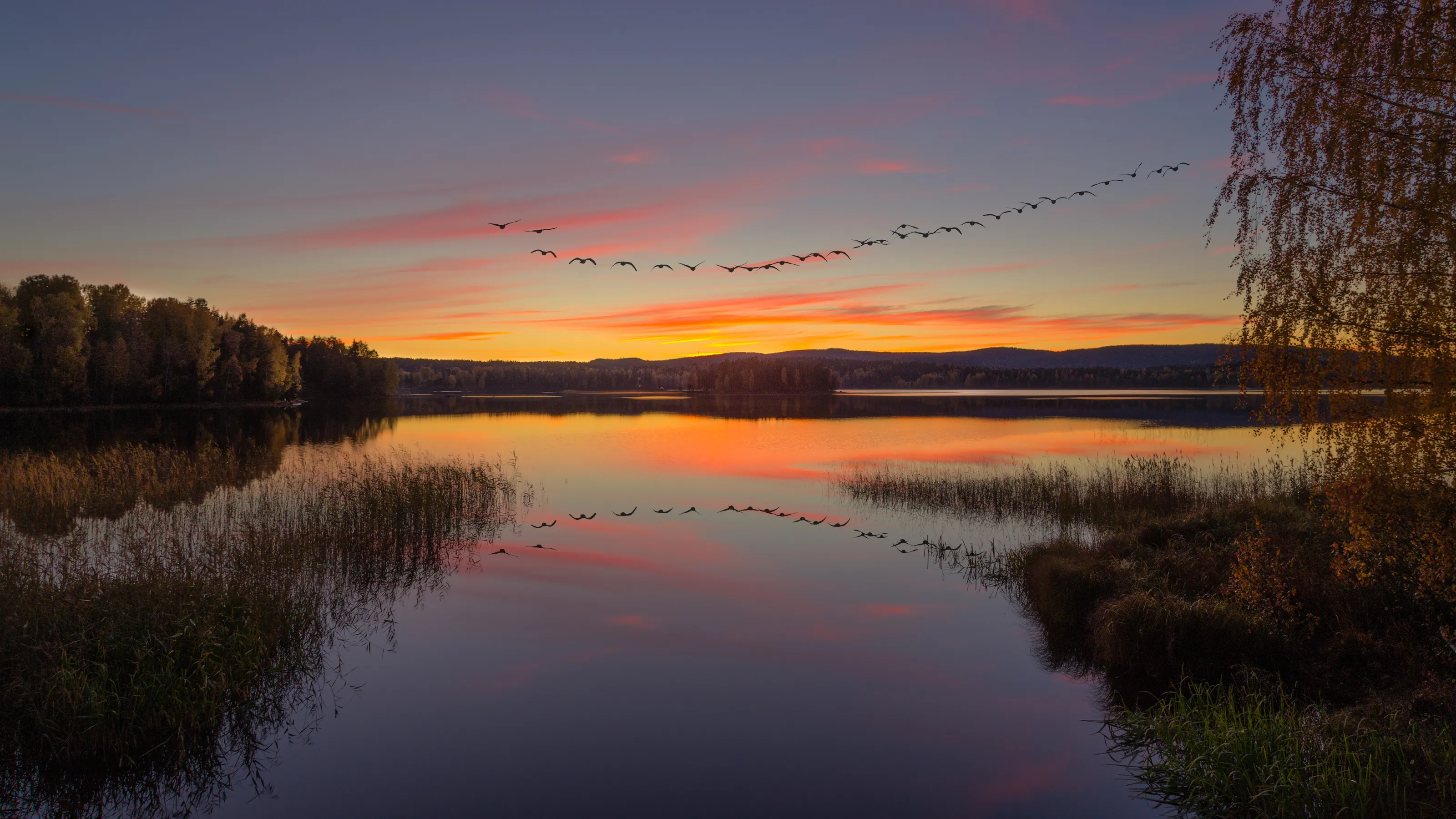
As landscape photographers, one of the crux we often face, in these days and age, is that of having to photograph locations that have been already done to death. I consider myself an interpreter, nature is the score and my photographs are the performance: as such, I am not much bothered by how many people went somewhere before me. However, there definitely is a challenge in tackling such location as the one you submitted here, and I'd like to commend you for a job well done here!
Your choice of time of the year was definitely a great one, and what made your image a winner: the colours in the leaves, and the light you got, are what made the image for me. While I understand your idea of having a point of attraction for the viewer's eye to go to, I found the bring area at the end of the road slightly too "hot", and would have loved to see it toned down a notch, I think that it would have made the image even more balanced without loosing much attraction.
I enjoyed your choice of processing very much, even though I think that slightly less saturation would have worked as well.
Compositionally, I liked your choice of focal length and of going vertical, which is something I think works very well in landscape photography despite many thinking otherwise. What I found slightly distracting in your composition, however, is the bright area on your image's left side / just below mid height: I find my eye is going there a little more than it should, and I might suggest you to either tone it down, or clone some of the redder leaves under it to make it less visually evident.
Hope this helps, and again congratulations for a job well done!


3,740 Images entered

Congratulations for your submission and for the result! I truly enjoyed your submission's idea and the unique sky you got here - the lightening bolt of course truly helps making the image.
When reviewing images, I am always looking for composition first. Composition, in my opinion, is the most important thing we need to look for, and look after, when we create our images. My suggestion for the image you submitted here would be to ask you if you considered cropping this in 16:9, keeping the whole of the sky and getting rid of some of the foreground. This, in my opinion, would make the image stronger, more balanced and more "focused" on what I find it's what makes the image a stand-out one, which is the relationship between the sky and the tree.
Other than that, I really enjoyed the tonal range you got in the sky and the powerful simplicity of the scene. One final minor thing I would do, if this was my image, is to clone out the little dots along the horizon on the left side of the three: I know, these are extremely minor things, but as small as they are I find them distracting from the power of the scene.
Hope this helps, and congratulations again for a great job!


First of all, congratulations for your victory in this competition! To tell you the truth, I wasn't expecting to end up rewarding a cityscape, when I started judging the competition. However, the elegance of your image won me over and, in the end, made me prefer it over the other 3700+ images I examined during the voting process.
I particularly appreciated how you positioned yourself to organise the skyline in your frame, leaving enough room on both sides not to feel cramped, but managing to get the central skyscraper just off-center. The long exposure definitely helped here to achieve the result you were after in terms of mood. I enjoyed your use of light, both at the time of shooting and during your post-processing of this image: if I might offer a suggestion, it would be to slightly tone down the light on the central skyscrapers, while adding a tiny bit of light to the clouds just behind them: I think that this would help balancing the image even better.
Other than that, I must once more commend you for your work: congratulations, and enjoy your well-deserved prize!


I love black & white landscapes, and Iceland's dramatic landscapes, especially the island's waterfalls, really lend themselves perfectly to this treatment - even more so when the weather is bleak. Your submission proves my point perfectly, congratulations!
I particularly enjoyed your "dark" processing here, which I found to go very well with the scene. I also loved how you used the light, and my suggestion to make this image even more powerful would be to work on getting even more depth out of your black & whites. Not just going for dark and contrasty, but work to extract more micro-contrast and tonal contrast, particularly in the mid-tones.
Other than that, I really enjoyed your composition and the way you used the waterfall's spray & water flow to direct the eye into the frame. The human figure, which I found much overdone these days, works very well here to give a sense of scale and loneliness, which compliments the scene very well. Congratulations!
Meet the expert judge


Brief
See more contest details
This competition is about your very best images that capture the landscape, be it natural or urban from around the world. We want to see unique views that show the world through your eyes. The competition is open to everyone either professional or amateur. The use of digital enhancement is allowed but not essential, it’s all about the quality of the picture. You don’t need to use filters, it is all about the composition and artistic quality of the image.
2,596 Photographers
161,913 Ratings


