Get notified of their new contests

This image stood out for me as soon as I saw it, and it was never out of my top ten. A stack of newspapers as a subject could be rather mundane, but here they have been creatively captured and processed to produce a great image. Lighting and a shallow depth of field have been used to good effect, so focus falls on the near corner of the stack, where there is most interest in the shapes and folds of the papers. Conversion to black and white works well, as to retain colour in a subject such as this would be unnecessary. Great work, well done on your top ten placing.

There were a number of images entered into this contest that were variations on this theme, but for me this was clearly the stand-out shot. The soft side-lighting picks out and highlights the gentle curve of the glass and the bottle. I especially like that the lighting has been appropriately positioned to allow the top of the bottle to be captured too, which somehow "grounds" the image and prevents the highlights becoming floating meaningless lines. The colour of the liquid has been subtly represented, a rich deep red, but not over saturated. A beautifully captured and well processed image, with the matte effect working well. Congratulations on your second place finish.


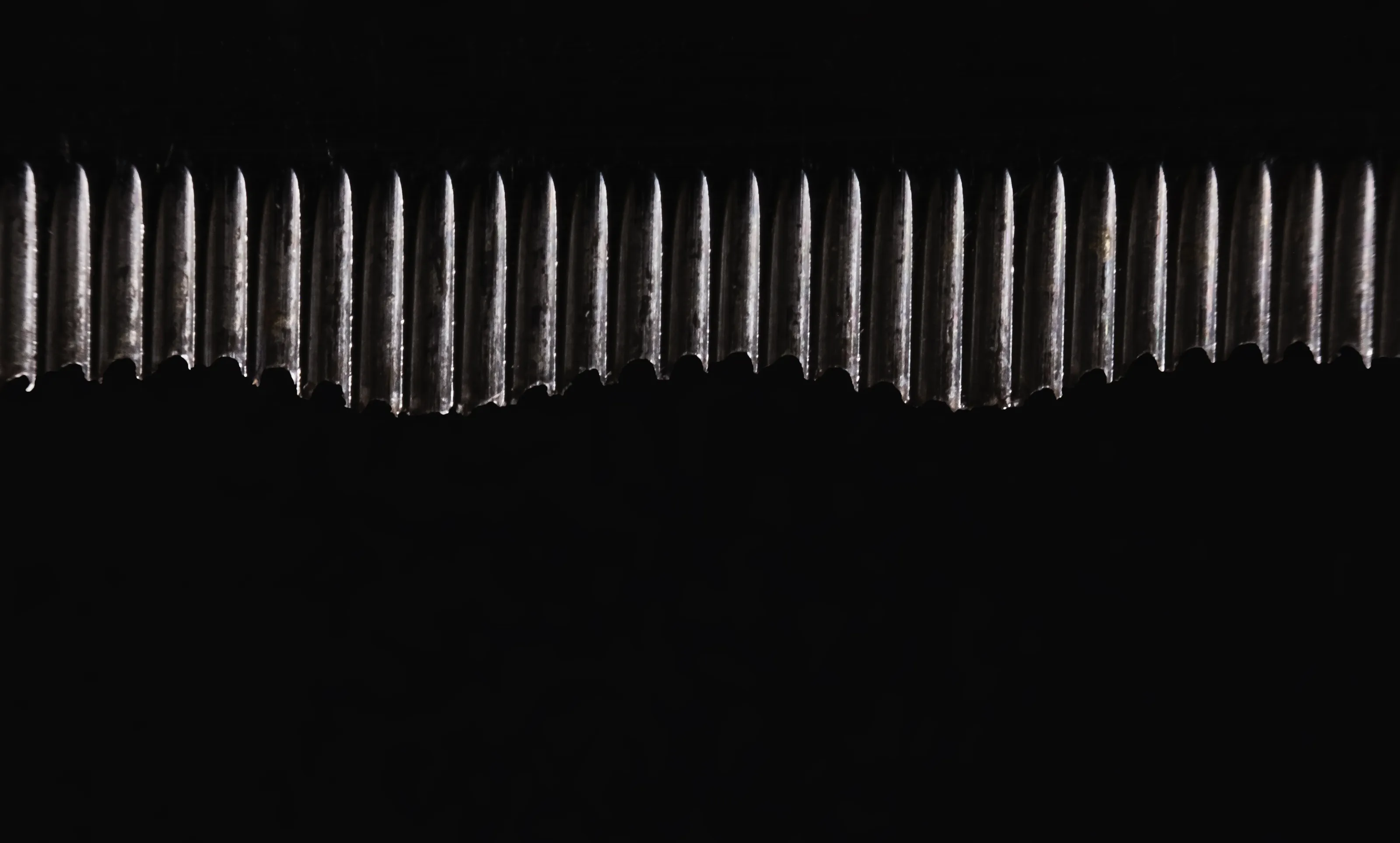
This was a late entry to my top ten, but one I kept coming back to. With a subject such as this, and the lighting conditions at the time, it can sometimes be very difficult to pre-visualise the effect of the highlights and deep shadows, but here you have done well to realise the potential for the subject, and capture the tyres in an interesting and creative way. The light nicely reveals the cog-like shape of the tyres, and the eye is drawn into the frame as it hops from one tyre to another, drawn by the illuminated upper edge of the subjects. Being picky, I may have been tempted to crop off the nearest tyre, so the immediate foreground is totally dark, and clone out the two little specks of bright light above it. Great image though, well done on your top ten placing.


There is such a great sense of movement captured in this image, abstract but still recognisable for what it is. There is no shooting data attached to indicate the shutter speed used, but hopefully it is a result of a slow shutter speed, capturing the swirls and gentle tumble of the breaking wave, rather than an effect totally created in image editing. Just the right amount of highlights and lighter tones to create interest throughout the frame, despite the black and dark tones, a gentle and calming shot. Congratulations on your third place finish.

This image drew my attention as soon as I saw it, and was one I kept coming back to when finalizing my placings in this contest. A subject many of us would ignore, but you have realised the potential of the train speeding through the night. I love the abstract look added by the lines, mainly running horizontally across the frame, but also the shorter angled lines created by the track sleepers. I love the contrast in colour between the upper and lower parts of the image too. Great work, well done on your top ten placing.

An interesting low key still-life image, bang on brief for this contest with black and dark tones dominating. Lighting on the keys is subtle and is just enough to highlight the shape and form of the bunch of keys, and other metalwork in the composition. Composition and focusing are both great. The colour palette is muted but helps create a lovely feel to the shot. So many images in my view are ruined by adding a massive white border around a photo, which tends to dominate and can become a subject in its own right. Here however, the image has cleverly been presented with a fine white key-line, just a few pixels wide, which serves to contain the subject, especially important as the judging/rating screen colour is black, so the key-line avoids the subject being lost on the screen. Great image, well done on your top ten placing.


A superb study of shape and texture in this simple but elegant still-life image. Composition and framing are great, with just the right amount of the vase in the shot to prevent it looking chopped off. The diffused side-lighting picks out the curves of the body, neck and rim of the vessel, and emphasises its gently curving form. There is just enought light to reveal the patterned texture on the surface of the vase. Simple but beautiful image, well done on your top ten placing.


A stunning and captivating portrait photo. Whilst the image is dominated by black and dark tones, from the low level of lighting, the black backdrop and draped clothing and the model's dark skin tones, the image somehow seems to be flooded with light. For me, where this image stands out from many of the other portrait photos in this contest, is that the model has been so beautifully lit, and all parts of the body in the frame are obvious and connected, unlike some others which had rather distracting elements looming out of the darkness, which somehow disconnected to the subject. Beautiful multi-directional lighting creating lovely highlights to capture the shape and form of the model, revealing just enough detail in the face, and the important catchlight in the eye to ensure the shot is full of life, and a gorgeous soft delicacy overall. It is incredible how much is revealed from such a dark image. Congratulations on your winning image.
Meet the judge
Brief
See more contest details
In this contest I would like to see your photos where most of the frame is filled with black or very dark tones. The subject can be anything from a dark moody landscape, to a low key portrait, a still-life image, or a subject which is predominantly black in colour. Please avoid using image editing software to simply cut out an object and paste it onto a black background, instead try to use appropriate lighting and control of exposure to achieve the dark tones and mostly black images. Photos can be in colour or black and white. I look forward to seeing your entries.
1,360 Photographers

What I love about this image is the sense of peace and that it conveys. Aided by the frame-filling calming gredn tones, there is a lovely balance between detail and shady dark tones. Spotting an individual tree that stands out against its neighbours is always a beauty to find, but photographing the subject in a way that looks natural, but still captures the contrast, is not easy. I think you have been very successful here, with the bold green tree highlighted wonderfully against the grey-greens of the surround. A beautifully atmospheric woodland image, well done on your top ten placing.
2,465 Images entered
87,152 Ratings


Something about this portrait photo of a child drew my attention, and once I studied it for a while I was captivated. The image looks to have captured a candit moment of quiet contemplation, possibly tinged with a little sadness, wrapped up in the mood and thoughts of the moment. The lighting reveals just enough to give a sense of the mood and character of the child. The overall softness of the image suits the subject and the darker tones, ensuring the shadows and areas of lightness are not harsh. Super image, well done on your top ten placing.


