


I enjoy images like this, compositions that deliberately exclude the majority of the subject, but leave you in no doubt as to what animal you are looking at. The bold white vertical line of the facial stripe creates a strong anchor for the right of the frame and contrasts well with the dark background to the left. The position of the eye in the frame is critical here and is just right, on the intersection of thirds. I also rather enjoy the slight under-exposure which has created a moody feel. The negative space to the left has been well judged and is an essential element to pull this off.


From a technical perspective, this image stands out above all others in the selection and for this reason takes top spot. The lighting, colours, composition, depth of field, and post processing all show a skilled hand. The vertical orientation works really well here, and the direct eye contact creates that connection with the viewer. I'm not too keen on the stump clipping the left of the frame, and the rear legs of the badger are uncomfortably close to the bottom edge, but these are minor points. However, my guess is that some form of enticement was used to get the badger to pose in this way. I would have liked to have seen this disclosed in the photographer's notes.


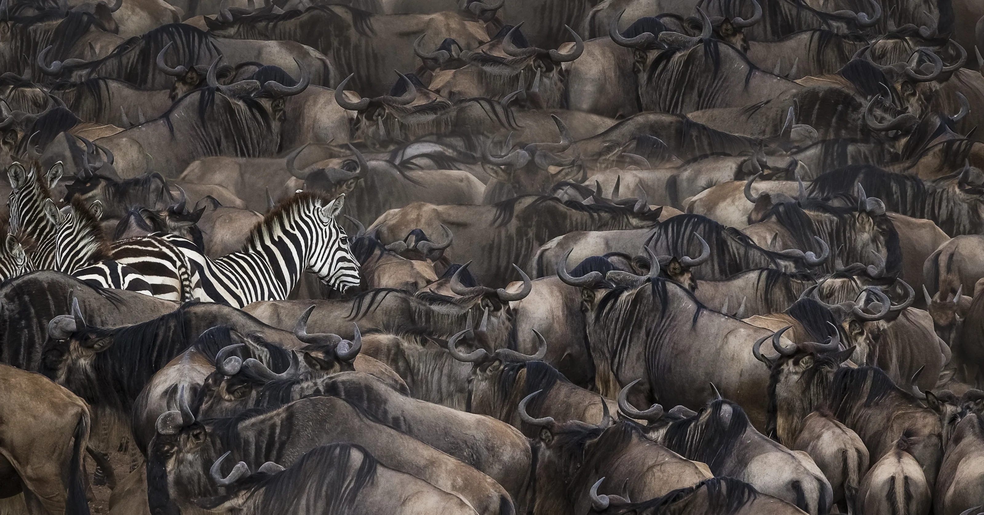
I like the idea of this image, the tight crop creates a very strong composition. I also like the placement of the head to the left of centre in the frame. The depth of field focuses attention of the main features, the out of focus body and skin texture creating a complimentary background which critically lacks distraction. The black and white conversion works well, but the post-processing lacks a bit of punch to really bring out those textures and tones. The focus has grabbed the animal's snout and I would have liked to have seen it on the eyes.

Elephant images are great for black and white conversions as this image shows. I love the way the side lighting is producing plenty of light and shade to sculpt this animal and produce a truly three dimensional feel to this image. Getting the exposure right can be tricky in these situations, but I think the balance is spot on here. That slight under-exposure has given this real mood. The image would benefit from a crop to lose some of the dark space on the left which dominates and unbalances things.

Shooting subjects from an elevated position often does not produce the best results, however, I think this image is one of the exceptions. I rather like the overhead view here, that line of rock sweeping out of the top left of the frame is nicely contrasted by the out of focus snow to the right, dividing the frame into two distinct sections. The fox is placed perfectly on the intersection of thirds and dominates the scene. That direct eye contact holds the viewer's gaze and creates an instant connection. A very successful image.


The thing that stands out to me here is the amazing detail captured in the textures and tones of this lizard's skin. The dark background offers a complimentary tone, yet focuses all the viewer's attention where it needs to go. The lighting is sublime, and photographer has chosen a plane of view which is square to the lizard, ensuring that as much of the body as possible remains in focus. There is so much for the viewer to enjoy here, detail which has been emphasised with the post-production techniques used which has produced a very polished looking image. The composition has too much dead space at the top for me, and I would have liked to have seen more of the animal as it sits uncomfortable close to the bottom of the frame.


When shooting with a macro lens, unless you employ focus stacking, the depth of field is going to be much shallower than with a standard lens. It is therefore very important to get the right part of your subject in sharp focus and, more often than not, this will be the eye of the animal you are photographing. This image is a perfect example of the photographer getting that just right - this shot is all about that eye. I also really like the composition, the eye being placed on the intersection of thirds and with plenty of space on the right for it to look into. The background is beautifully smooth without distracting elements and the lighting is also really accomplished. The twig curving up behind the head is a bit of a shame, but it's difficult to control these things in the field sometimes.


The shallow depth of field is the thing I enjoy most about this photograph. I love the way the focus is on the subject's eyes, the focus melting away deliciously to leave these as the central anchor of the image. I also like the complimentary tones of the background, into which the fox's fur almost disappears - even the dark tips of the ears line up with the darker background strip at the top of the frame. The composition is nicely balanced and the exposure is good - all these elements make this a very comfortable photograph to look at.

There is a very strong diagonal with this photograph, the grass ear placed in the top right of the frame, with the damselfly following its line across the picture into the bottom left. The lighting is good, exposure well balanced, and the focus and plane of view has ensured the whole of the insect's body is sharp and detailed. The background is nicely out of focus which helps to isolate the subject and hold the viewer's attention. The little dew drops on the grass and the eye add a little sparkle.

The composition of this photograph has a really nice balance to it. The placement of the face and eyes to the right of centre creates a nice space, filled by the lines of the leg and paw. The main draw is that direct eye contact, and it's good to see the focus has locked onto the eyes. The lighting is soft and even, and the exposure good. I would have been tempted to crop into the face even tighter to eliminate the mesh fencing creeping into the top right corner. A pity too about the out of focus plant stem which cuts across the face.


The technical quality of this image isn't perhaps as good as some of the other images in the selection, but what I like about it is the composition which is very strong. The direct eye contact from the monkey is key as this creates an immediate connection with the viewer and grabs the attention. Placing the subject in the middle of the upper third is clever, balance being provided by the tringular shape of the statue's head. The bright, warm tones of the monkey's fur and the material around the statue's neck, are in perfect contrast to the cooler tones of the stone wall behind. A slight shame the nose of the statue is clipping the right edge of the frame.


I like the idea of this image, the photographer trying something different from the norm. The chosen crop has created a strong composition, anchored by the position of the eye. This angle really shows off the eyelashes well. The focus appears to have grabbed the front of the head rather than the eye, but there is enough depth of field to still render the eye sharp. The conversion to black and white for the giraffe was a good choice, but retaining colour in the background doesn't work for me.

Technically, this is an accomplished image. The balance of the exposure is correct, the focal point is bang on, the depth of field perfect for isolating the animals from the background, and the composition is nicely balanced. What makes it stand out is that comical element; the symmetrical posture of these two groundhogs makes them endearing subjects for the viewer. These animals are so cheeky and charismatic, and this comes across in the photograph.


What makes this image work so well is the feeling of symmetry that the positions of these impala give to the composition. They are almost lined up like the front row of a seated theatre audience. Also, the direct eye contact from all of the animals is key, making the viewer seem as if they are the subject of the animals' attention. The light strip of grass at the bottom of the frame and the darker area of canopy above help to frame the shot. The out of focus animal on the left stands out a little, and the point of focus seems to be on the animals at the rear of the group instead of those at the front, but a great image nonetheless.
100 Images entered

I love the rather muted pastel tones of the background in this image. So many would be tempted to go to town with the saturation slider and try and make the colours really pop, but I think less is more in this case. The pose of the rabbit with that slight head turn and direct eye contact feels very comfortable. The use of out of focus foreground elements and that lovely smooth background frame the subject well. I would have cropped a little off the right of the image so the subject is offset to the right rather than being placed centrally. I would also have cloned out the distracting out of focus stick(?) to the right which draws my eye a little.
97 Photographers
Meet the expert judge
9,536 Ratings
Brief
See more contest details
Welcome to Photocrowd’s ‘Animals’ contest for New Joiners! These contests are a chance for new members to introduce their photography to the community, and get a taste of how Photocrowd contests work. They can be entered by anyone within their first 28 days of joining Photocrowd. After 100 images have been submitted the contest closes and the Crowd will start rating the images. The Expert Judge will also be judging the images and writing reviews at the same time. All the winners, both Crowd and Expert, will be announced after 3 days of judging. Make sure you also check out our two other New Joiners contests - ‘People’ and ‘Landscapes’.
