
This is rather delightful in terms of framing: it's simple but, with the addition of the rice dust, the image records a wonderful (if I imagine, choking) atmosphere. There's a strong echo here of Jean-François Millet's painting, 'The Gleaners', and I was immediately struck by the similarity.
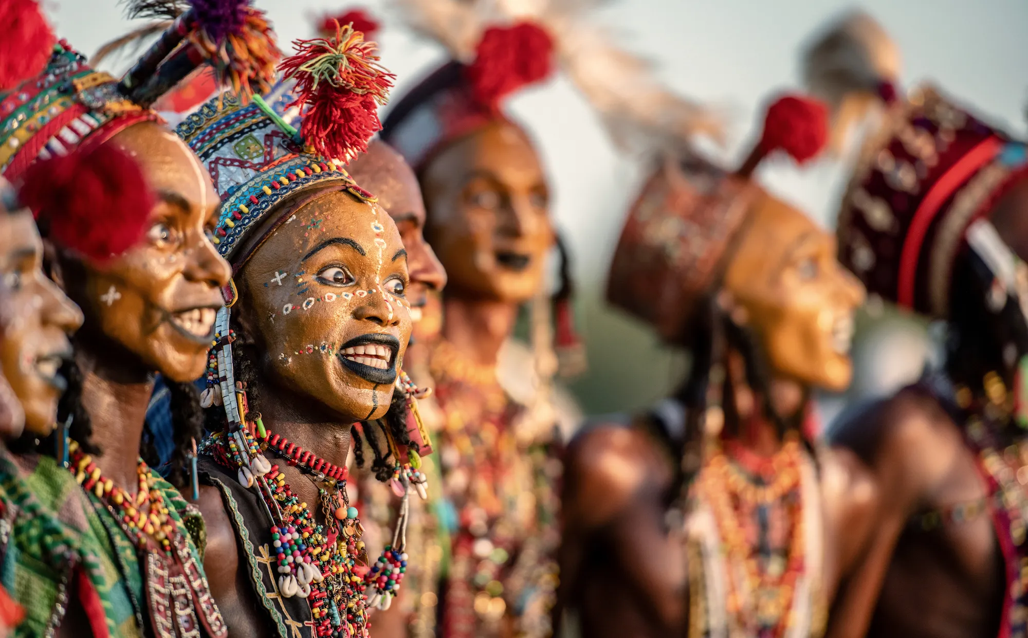
The use of a longer lens has compressed the figures with the front man anchoring the action via the shape of his legs and rake.
There's a good delineation of figures and a solid exposure. I additionally like the way that the eye is directed by the forward movement of the figures that are moving into empty space, frame right. I also like the relatively monotone feel of the picture, punctuated by moments of colour in the red and green turbans.
Well seen and well done.

100 Images entered

Whilst I really like the idea behind this - the photographer composing through some really interesting lights as both shape and form - the final image is rather disappointing. That's because the spotlights have rendered the highlights as very over-exposed, fooling the camera's meter. In this case, it would have been useful to obtain a manual exposure off the face (taking into account the harsh tones) and then adjusting the viewpoint slightly to compensate for the 'heat' of the lamps. Still, a good effort and well seen.


87 Photographers


Whilst this image undoubtedly is an aide-memoire to a particular moment that was significant for you, as a photograph that seeks to relate that memory to others, it falls down. I can see that the vibrant colour was visually appealing but the unordered mass of people in front of it means that this is just an example of 'point and shoot'. In making images that we want to be seen by others, it's the photographer's role to help the viewer 'through' the image by making visual sense. Perhaps if you'd have just photographed the sign/wall without the people that might have been more engaging? Anyway, have a think about what you want to say before you press the shutter and your images will improve.

There is a pretty well composed image with the figure and his jaunty hat looking directly at us - but it's rather let down by focus and exposure. I can see that the lens is wide open so as to detract from the background, and that works pretty well but the exposure is such that the entire right of the frame is bleached out. That means that we look at that segment first and inevitably that detracts from the subject. A good effort but be careful that lack of basic technique doesn't spoil what you 'see' before you press the shutter.


The Delhi Gate is a wonderful piece of architecture but here I get little sense of it, nor of the people that are passing by. Images like this work best if we work out what we are trying to say - it takes a lot of skill to make a balanced frame of such visual clutter although it's the photographer's job to do just that. Perhaps a detail of just the Gate or some of the people in relation to it might have worked better - but that necessitates the photographer moving him/her self around the scene.

Although tilting the frame can sometimes give the viewer an alternative position in engaging with the subject and/or the meaning of the image, here I'm unsure just why it's been used. There was a vogue in the 1990s, especially in Danish photojournalism schools to work this way and it mirrors the notion of The Dutch Angle in cinematography - but here, I don't think that compositionally it adds much. In fact I think it detracts from a really well exposed frame with what I think is balanced additional lighting, frame left. The message here is simplify and only use these additional compositional tools when really needed.


In line with what Cartier-Bresson was supposed to have said about sharpness being a bourgeois concept, this image is strong without being in focus. I really like the pose and the way that the attitude of the photographer's grandmother has been captured,. It's nicely composed but I suspect that shooting wide open to concentrate the gaze on the subject and not the background has made the autofocus hunt and hit upon the hand with the cigarette. It's a shame, but something to think about when you're composing next time.

This is a nice frame of someone very small - and as a record of a memory, it really works. That said, as a photograph - a statement of something that you want to explain visually, it falls down a little in a couple of places. Firstly, focus. Anything hand-held at 1/15 of a second is going to be 'soft'. If you're using a camera without a tripod, and work n the range of 1/60th or 1/125 to freeze even the slightest movement. Secondly, what happened to the baby's other hand? Hands and eyes are now we communicate and a frame where all are visible (or not for a good reason) would have, in this case, brought a better compositional balance. Keep pushing.

Nicely done. I like how the pose of the girl echoes in the reflection and I especially like how the locks fall in a cascade downwards. This is a cracking and simple frame (that's good) but watch your exposure - the shadows are very clogged and that's a shame because there are no (or very few) subtleties in the skin tones - and that means the legs are difficult to delineate. Still, a very nice effort,
5,111 Ratings

Flash and blur - the idea that a slow shutter speed can record movement - was a very popular technique before the advent of digital which meant sensors could capture images way beyond the possibilities of film. It can still be an interesting visual device however to record movement but does take a bit of practice. Here the issue is not so much with capturing the kick but the crowded background (especially the ceiling) that distracts from the action. Additionally, a more accurate exposure that better records the ambient light would help. This is one to keep practicing.


This is very nicely done and, although I see this kind of frame all the time, this is a good example of it. A little like Cartier-Bresson's early game hunting in Africa in the 1930s, you've lain in wait and pressed the shutter (analogous to Cartier-Bresson's trigger) at just the right/decisive moment. Nicely balanced with the man's food just poised to hit the floor and decently exposed. My thoughts are however, now you can do this, push on with something more intimate and closer: push yourself. Still, well done.


I think that there is an interesting frame in here - both in terms of the inherent colour of the musician and the shape that his costume makes... but this isn't the frame that achieves that. Well done for isolating him - but that's just the start. A successful image is one where the subject and the background are in relative harmony (I can see lots of interesting shapes behind him too...) so the point is to move yourself and your frame around him so as to make a harmonious image. Keep pushing.


Sometimes, simple really works and here as if by excellent explication, the plain background means that we're forced to look at what's in front of us. The yellow and the red work in the same way and the bubbles and the pose/expression are excellent. A really engaging and 'easy' image that is straightforward in intent and reception. Well done.


Although I'm generally not a fan of images that in some sense compromise the dignity of others (although I'm not suggesting that this image is necessarily doing that), this frame is engaging because of the mirroring of the monk's shape and that of his bowl and belongings. That said, I'd have preferred the image to be taken not 'peering' down but rather on the same level - that way, a little more intimacy and no odd vertical perspective as evidenced by the metal pillar. Anyway, well done.


This is rather an intriguing image, not least because although it's in a category about people, it's actually about shape. I think that there's a lot to like here but a lot that's a little infuriating because with a couple of simple alterations it could be excellent. The central visual conceit is of the sharp wood in the pan that points upwards to the chef's face - via the 'block' of his arm and the log. Lovely - decently exposed and the smoke is a dramatic extra. But the frame should be about Bellini and we just get a hint of him with extraneous sky behind. I'd be entirely delighted if the frame encompassed his single eye as the image almost does and if this was from a slightly higher angle, we wouldn't have to be distracted by the sky (the lightest part of the frame) behind him. Frustratingly nearly there: think about what you want to show when you're framing up and the possibilities. Keep pushing.


Meet the expert judge


Brief
See more contest details
Welcome to Photocrowd’s ‘People’ contest for New Joiners! These contests are a chance for new members to introduce their photography to the community, and get a taste of how Photocrowd contests work. They can be entered by anyone within their first 28 days of joining Photocrowd. After 100 images have been submitted the contest closes and the Crowd will start rating the images. The Expert Judge will also be judging the images and writing reviews at the same time. All the winners, both Crowd and Expert, will be announced after 3 days of judging. Make sure you also check out our two other New Joiners contests - ‘Animals’ and ‘Landscapes’.