
This is a lovely restful image that is I think equally about colour and spacing.
What really caught my eye, apart from the rainbow, was how well delineated each element - the hut, the bins, the flying bird, the man on the bench and the sign were. My only thought twas that actually, coming in closer (or cropping) might have made a tighter frame with less extraneous information. That said, I think that this is a cracker. Well done.

As an idea, this certainly works. The devices of mirrors, reflection and land are strong themes.
My thoughts are however, more prosaic and they concern firstly framing (why are the model's hands cut off?); the colour balance (it's very cyan) and finally (although I understand that hair is a crucial part of especially female black identity), why is there a piece of hair floating free as if it's growing from her face?
When we're making symbolic and very simple compositions, it's the small details that really do matter because they distract from the message. Keep pushing.

Drones, from which I'm presuming that this image was produced, give us a rather unique perspective in life and here, it has made a bold and entirely graphic image. I love the bisection of the frame by the boat but additionally the shapes that our eyes gazes over - the circular bucket (?) on board and the net(?) at an oblique angle to the boat itself. I like the ripplesl and texture of the waves and the patterns of the sand beneath. Lovely.


Identifying people, especially in conservative cultures / countries can be tricky (as well as politically problematic) and here the device of the placard is well used. However, visually it completely clashes with the iconography of the bus behind and overall the strength of the message is lost because the foreground and background are in conflict. As a photographer we have to move ourselves around the world so as to make a harmonious composition - however difficult that may be. Keep pushing.

Sometimes, an image can be used to evoke a memory: a simple aide-memoire but a photograph is usually taken with intent to communicate a wider message about what a photographer has decided to include in the frame.
Here, I don't really get what I'm looking at. Is it the scene? Is it the graphic composition of the lines of the awnings or is it the people in the picture - or is it all of the above.? This seems to be the result of letting the camera make a decision about what's recorded. A successful photograph is usually about making decisions and the next time you raise a camera to your eye, ask yourself 'what is it that I want to record and how best can I do that?' This will immeasurably improve your photography. Good luck!

I really do like this. The use of a slow shutter speed 'blurs' the action and gives an ethereal and rather impressionistic final image.
That said, the image could have been more carefully conceived and executed: the figure seems to 'blend' into the right hand door and what I presume is a sign to keep people out of the building bisects the frame horizontally.
This is a good effort and an interesting attempt - but technique needs to be grounded in solid composition. Keep pushing and experimenting.


Sometimes an image simply 'shows' and sometimes it can make one 'feel'. This is an example of both.
Its structure and palette are very simple; stark almost - but the impressionistic take - helped no doubt by the mist on the water makes this an intriguing and impactful image.
Well done. A very calming winner.


Sometimes the light is there and sometimes the picture is there. When both come together, you have something special. Here, I can see the photographer was attracted by the late afternoon sun but the image tells us very little about what's happening. The sociological premise of the image - the station as 'non-place' is interesting - but photography, especially reportage as is attempted here, is not at all subtle and it needs to 'show AND tell.' I think that you might think more about transport hubs as places of visual investigation (and if that is just collecting evidence, that's fine) but perhaps looks at Bruce Davidson's work on the New York subway as inspiration. Visual Sociology has a rich history and if this is a direction you'd like to pursue, think how you might visually 'explain' more clearly to audience as opposed to just imaging what you see as evidence.
'Visual Sociology' by Douglas Harper is a good place to start if you're interested in imaging/academic practice.


I think as a concept, this image is interesting but I also think its execution could be technically improved.
Clearly, the photographer has identified lighting as being problematic and I think in this circumstance, introducing external lighting might have reduced the harsh reflection in several surfaces and made the figure clearer whilst diminishing the importance of the window/exterior. The work of Anna Fox and her 'Work Stations' (1987-1998) remains I think the best example of visual critique of contemporary office life and its stylised conception might give you further inspiration. Have a look.


I think that this has all the elements of an interesting image but it's marred by technique.
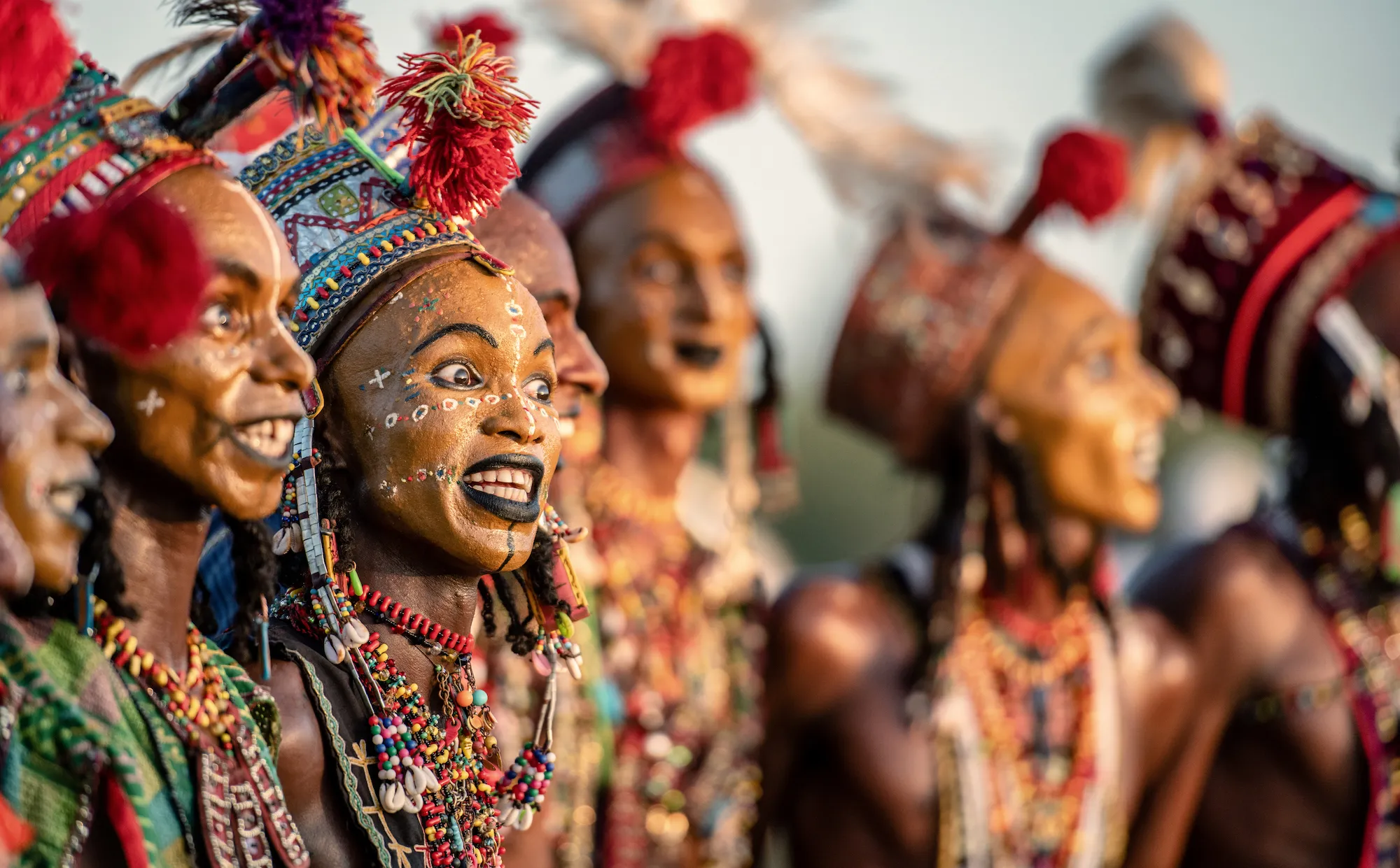
This looks like a portrait made in Kumortuli in Kolkata and the fundamental issue with it is that the highlights on both the woman and the clay statue behind her have been lost. A more accurate exposure would have meant that rather than looking directly at the brightest part of the image, we might have been able to make out the shadow details too. This is a simple technical fix that is easily learnt. Especially by not letting the camera choose an average exposure. Have a try and meter manually!


I think that this is a cracking image. The child's face is nicely framed by the circularity of the hat and the collar. The direct stare is delightful. I think that the minor distractions of the glaring white collar and the hands (bottom left) are a shame but overall, the portrait captures well a moment and crucially, a character. Well done.


Despite the presumed triviality of the premise of this image, it does in fact represent an interesting and historical notion: that of perspective. This principle of course was a fundamental rediscovery during the Renaissance and for photographers who guide the viewer through their vision, it remains crucial. I like the way the photographer has subverted the usual gaze and it reminds me a great deal of the photography of the Russian Constructivist, Alexander Rodchenko whose purpose was to interrupt bourgeois art for revolutionary purposes. His image, 'Pioneer with Trumpet' (1930) - shot from underneath - is a good example of this. Nicely done.


95 Photographers
100 Images entered
Meet the expert judge
Brief
See more contest details
Welcome to Photocrowd’s ‘People’ contest for New Joiners! These contests are a chance for new members to introduce their photography to the community, and get a taste of how Photocrowd contests work. They can be entered by anyone within their first 28 days of joining Photocrowd. After 100 images have been submitted the contest closes and the Crowd will start rating the images. The Expert Judge will also be judging the images and writing reviews at the same time. All the winners, both Crowd and Expert, will be announced after 3 days of judging. Make sure you also check out our two other New Joiners contests - ‘Animals’ and ‘Landscapes’.


5,398 Ratings


