
Simple and very effective. The strength of this image lies not with its focus (it seems quite soft) nor with its exposure (it seems quite warm) but with its composition. It's a very straightforward moment - throwing a piece of wood onto the fire - but it's well captured and the 'action' is balanced nicely with a background that is a sunken sun. I like the shape of the circular brazier contrasted to the other straight(ish) lines of the figure and the horizon and overall, it feels easy on the eye. Well done.


This is a potentially interesting image but its execution might have been improved. Firstly, it's a strong moment: a central character with a dramatic face and pose. However, the exposure on him is such that the highlights are far too shallow, the shadows, far too deep. Secondly, whatever is going on in the background means that our eyes are distracted from presumably what the photographer wanted us to see. It's a well-seen frame but a successful image is about both getting the basics of aperture and shutter speed right and balancing the frame. Keep pushing.

This was a good idea: the contrast of the speed of the walkers to the stationary figures sitting. I think in terms of technique you've illustrated that by slowing the shutter exposure, however what you might call the 'base' exposure is off. The camera's been fooled by the very bright background and over-compensated by blocking the shadows. Either a much more accurate exposure or inevitably the introduction of an external light source to 'balance' the different zones of exposure would have improved the image. Still, a good effort.

This is really well done in terms of composing and showing what you wanted to show. I think the figures are 'caught' at interesting and crucial moments of their action and the frame is nicely set at an angle to give an impression of the ground and the flats. Two things however. Firstly the image is rather contrasty and although I can see it's a grey day, it's a little too much. Ditto the 'pulling-out' of the colour. Mixing (just a little) flash and daylight here would have helped - as might shooting this on less of a wide angle to avoid the converging verticals of the buildings. That said, this is still a cracking documentary image. Nicely done.

Although this is a lovely moment, I can't help feeling that it would have been enhanced by paying attention to the background. The pretty well-exposed figures and their gestures are somewhat overshadowed by the window frame right, and this is an enormous shame. A little move to the right might have excluded this as might a tighter framing - but this is still a good effort.


I like the idea of difference here: the brutal symmetries of the building contrasted to the child. However, both exposure and composition have conspired to make this a muddy (literally) and opaque frame. Firstly, I think that the figure is too small for the visual contrast - and that could only be resolved by being closer or using a longer lens to compress the elements together. That would have meant excluding much of the under-exposed sky which I think has fooled your camera into compensating too much for its brightness. It is a good visual idea however and just needs a little forethought to make it work. Well done.


I really like this - a rather fun and well-thought out image that is in essence a visual trick. The exposure is, for a cameraphone, pretty good (if a little warm because of the sensor's reading of the leaves I presume). However - and here's the debatable point - for some readings, it's off-kilter and the model appears to be rolling to one side. I like it because it's not symmetrical but our eyes often crave symmetry to 'read' unorthodox framings. A more challenging frame might just have had the model's head amongst the leaves - but this is still an intriguing effort. Well done.


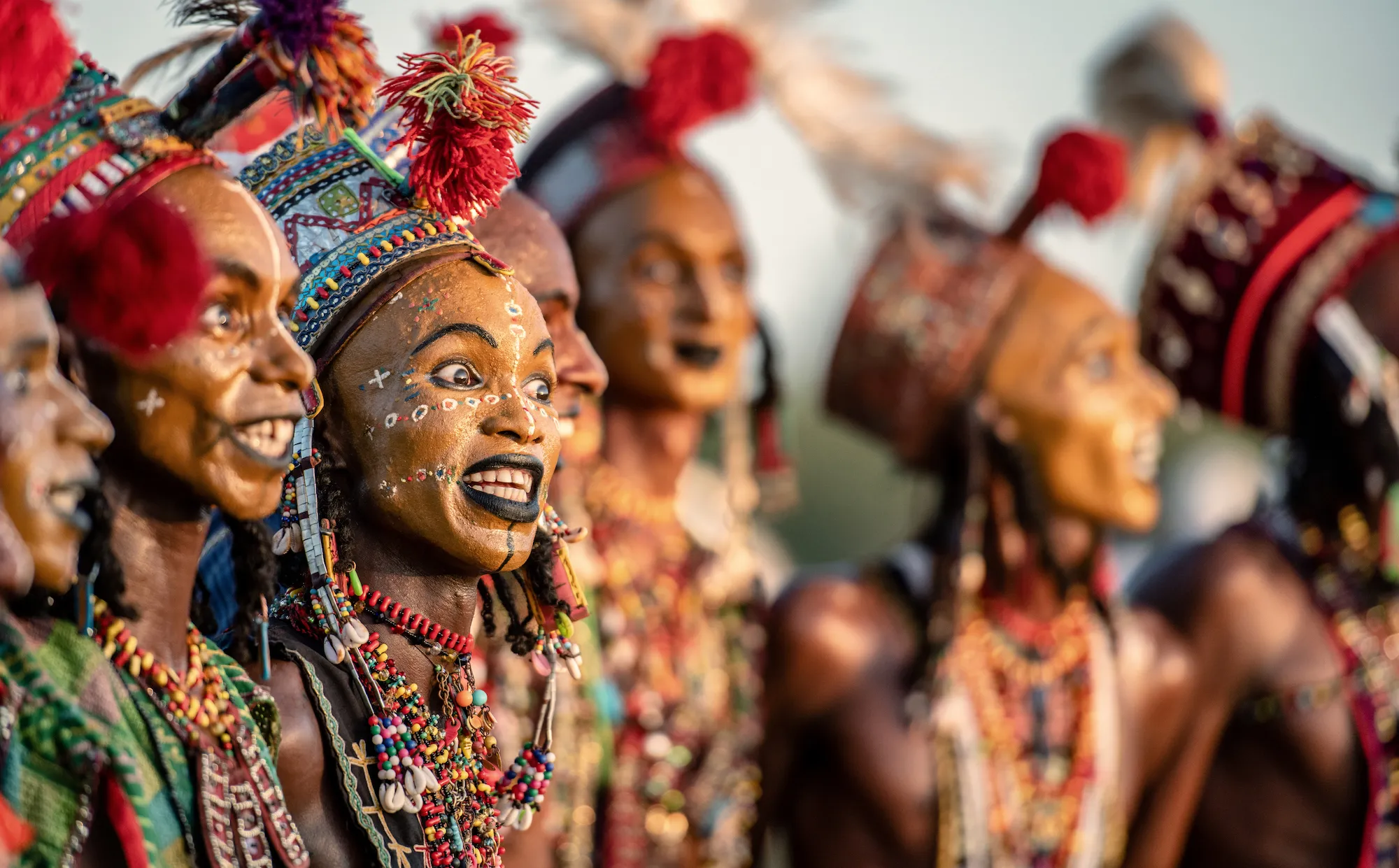
Some pictures tell-and-show and some suggest. I think that was the intention here but it doesn't quite come off. I get the silhouette idea but the issue is that it doesn't show enough. If one is photographing from the back in a situation with limited visual signals, it's a good idea to give as much information as possible. The cropping of the top of the adult figures is confusing. The viewer might 'know' what they're looking at but can't 'see' it. All faces - apart from a distracting portion of the figure on the right are hidden and some greater contextual information might have been a better idea. Well seen but a bit more thought about what the viewer might look at would have been useful.

As much as I do really like this, I'm curious why you cut off the bottom of this woman's hair... The composition itself is rather gorgeous. Good exposure on what might be a tricky white shirt, balances with the red hair. What makes this a cracker however is the singular nature of the colours and also the nod to texture - all capped off by the delightful and subtle pattern of the shirt's collar. But how much better would the point of the hair have been to complete it? Never mind, this is still an excellent, graphic - almost abstract - frame. Well done.


A potentially interesting image that falls because of poor exposure. I have no contextual information here but the highlights are very under-exposed and that leads to an entirely unnatural look to the image. In parallel, the shadows are too deep and we almost lose detail in them. Sometimes making images where the sun is so strong can be tricky but a more accurate rendering of aperture and shutter speeds and trying to frame within more diffused light might have helped.


Lovely. A simple, well composed frame that shows us exactly what's going on within it. I like the woman's gaze - unthreatened and perhaps curious - but mostly because it shows some intimacy between her and the photographer: the physical closeness mirroring the emotional one. The gesture with the bottle is well-captured and I like the lines of the sink that draw us into her. Mind your exposure - the sky is ever-so-slightly under exposed and the shadows are a little thick but this is a great effort. well done.


This reminds me quite a bit of Martin Parr's 'Le Louvre, 2012', part of a series that examined contemporary mass tourism. Like Parr's image, this frames tourism as a mass event largely viewed through recording devices but unlike Parr's, this photograph feels 'grabbed' - although it does indeed have some strong elements. I like that the focus is indeed on the viewers of the statue and it catches some of the 'feeding frenzy' of an audience more interested in a social media curated experience than culture itself. It is however confusing in its composition and would have benefitted from being focussed perhaps just on the three people gazing at the front of the glass cabinet. All that said, it does ask questions and does show what it set out to do and so in those terms, it's a good effort.


Meet the expert judge


I like this a lot: certainly not for the 'auto-only portrait mode' nor for the 'colour preset' but for the framing. Although the central characters are right in the middle of the frame (nothing wrong with simplicity) the device of shooting through the leaves makes us firstly work a little harder to recognise what's happening but secondly, act as a visual path for us. Simple but effective.


I absolutely love the shape of this frame, its structure and its viewpoint... but what happened to the exposure of the hat? This is such a shame because it's way under-exposed (ditto the hands and the oar) - which is odd because the darker tones seem to be intact. If this is the result of post-production then I'd reconsider your approach. If it isn't, then a more careful metering would have solved this - but well done in composing.


This is an intriguing image as much for what it says as what it doesn't. I like that it hints at a dreamscape and I think that there's a rather Brothers Grimm/fairytale quality to it. However, in more basic aspects, it fails to match its ambition. Compositionally, the movement of the dress is interesting but I think the viewer would like to see the model's hand and generally the image feels cramped and constrained. Technically the work is lacking too. I can live with the light being direct and harsh (and maybe that's the point) but the underexposure in the highlights and the deep shadows mean that more attention has to be paid to this. The main take is that this is a good conceptual idea and technicalities can be learned - so push on.


100 Images entered
92 Photographers

5,844 Ratings
Brief
See more contest details
Welcome to Photocrowd’s ‘People’ contest for New Joiners! These contests are a chance for new members to introduce their photography to the community, and get a taste of how Photocrowd contests work. They can be entered by anyone within their first 28 days of joining Photocrowd. After 100 images have been submitted the contest closes and the Crowd will start rating the images. The Expert Judge will also be judging the images and writing reviews at the same time. All the winners, both Crowd and Expert, will be announced after 3 days of judging. Make sure you also check out our two other New Joiners contests - ‘Animals’ and ‘Landscapes’.

