


Timing. The secret apparently of great comedy and... photography. Here, it's almost worked very well but sometimes fractions of seconds can make all the difference. I like the blur on the man going down the stairs but the figure to the left of the frame is distracting. It's a shame because it's a well conceived image that pretty much does what it sets out to do - and sometimes with situations like this, there's an element of luck. Don't be discouraged - keep pushing on here - when photographing, keep scanning the entire frame for extraneous elements and breathe deeply. Images will come with time and patience.

Whilst this is a potentially nice moment, both exposure and composition mar this frame. Primarily the exposure is very flat, dominated by mid-tones. A more accurate rendering would have made this much more dynamic. Additionally it has all the hallmarks of being a bit rushed. Why are the kids' feet cut off at the bottom? That said, I like how the composition seems to ascend toward the top corner - but as a photographer you're responsible for effectively framing every single inch of the image. Breathe deeply and compose - you'll find the final product is usually better and looks less snatched.


Whereas this has the potential of an excellent image, it has all the hallmarks of being rushed. Although the Kumbh is an enormous and chaotic event it does provide a rich canvas on which to concentrate - if you're judicious and clear about what you want. Here the pilgrims are between the pontoon and permanent bridge - the horizon nicely disappearing into mist. Yet there are distracting figures behind that mar the composition. A lower angle might have eliminated their distraction from the overall scene whilst retaining the perspective of the background. Well seen but keep pushing.

Although this is an engaging and interesting frame I wonder whether several more graphic images might have been more impactful? I think that the way the photographer has cropped into the resting students might have been more deliberate - focussing on the difference between the steps of the ghat and the heads for example of just one line of bodies. There are endless possibilities here of course, but well done for 'seeing' the scene.


There's clearly an interesting image to be made here that speaks both to colour and custom but the issue is that the viewer can't see it for all the visual noise. The job of the photographer is to explain in simple terms what they are trying to say and here, the woman - presumably the centre of interest - is lost in the confusion between background and foreground. This is as much about planning and identifying an image as it is about getting a correct exposure. Nicely seen but push on and think about what you sent to say - and how best to do that - before you press the shutter.

The isn't a bad effort and I like the captured moment and the exposure, but the frame could have been be better constructed and I think that is dependant on two things. Firstly, what the photographer wants to show and secondly where he/she stands to realise it. The doorway and the group of tourists are the key drivers here but not only are there a second group to the left but also a distracting couple identified by a splash of yellow. Moving in front of the main group might have excluded both of those distractions. Still, this is well seen but concentrate on making simple and clearer constructions - think about what you're after and layering of the frame before you press the shutter. That said, this is a very good start.


Really rather beautifully (if one ignores the subject matter) observed. Sometimes a different vantage point allows us to examine the most mundane of objects and situations. Here, shooting downwards on to a butcher (?) and his produce has revealed a rather graphic yet compelling image. I like the quadrants of the image that seem to arrange themselves and I especially like the green and yellow of the trolley handles. Shape and colour and a well thought out framing make this a cracker. Well done.

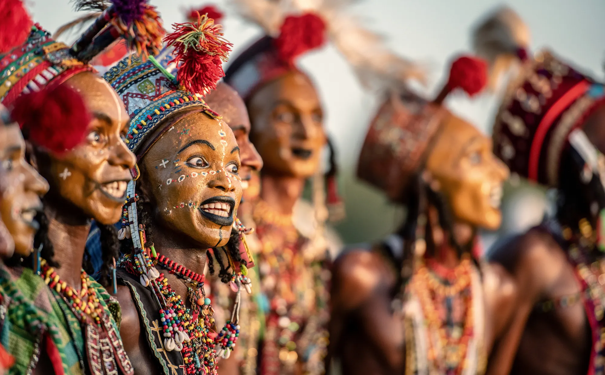
This is an excellent and eye-catching example of how to achieve a black background (I presume) without a backdrop using flash. Here I suspect (again) a narrow aperture and a 2-4 stop underexposure has resulted in a completely darkened background whilst a carefully built up exposure on the subject has resulted in a well exposed, sharp and vibrant figure. Excellent contrast of colour. Very well done.


I really do quite like this - a nice simple portrait with a touch of humour - but how to improve? I think that although this is all very well exposed (a great dynamic range) and nicely composed, the open space of light in the background eventually becomes a distraction. A tighter composition that excludes the alleyway which gives little to the message of the frame might have been a good idea. Still, a very good effort.


Lovely - but with such a striking face and tattoos, I wonder whether a tighter framing might have made this even more impartial. I'm presuming that this is a crop and not a natural medium format portrait, which if is the case then I think a portrait orientation that excludes the distracting background (white) might have been a better first thought. Still, this is a very good effort. Nicely exposed as high-contrast befitting of the subject. Well done.

Sometime we just have to wait. Or move. Sometimes both. Here, a really nice frame is compromised by the figure in the background who annoyingly has a light coloured shirt that distracts. Good exposure on the trumpeter and I can see that the aperture is wide open so as to throw the background out as much as possible - but there really is no substitute for either waiting for a clear (or entirely) harmonious background or moving so that you can situate the frame better. Keep pushing on.


This is, by luck or judgement, a really nice image. Its strength is its directness and leaves the viewer in no doubt that the subject is the child's face. Despite its "off-centredness", the left side is actually balanced by the stray hair on the left and again, although the exposure is a little on the contrasty side, this is an image full of feeling. Well done.


It's always very tricky to have an image like this with lots of people seemingly engaged with what they're doing - and not looking at you. I think that this frame, shot on a longer lens than one might normally choose to get in closer, does that very well. A solid exposure and the lens and aperture choice has meant not only a slight flattening of perspective with a fall-off in sharpness of the background but a relatively unobtrusiveness that has worked in your favour. A nice graphic splash of colour too. Well done.

100 Images entered
96 Photographers

Brief
See more contest details
Welcome to Photocrowd’s ‘People’ contest for New Joiners! These contests are a chance for new members to introduce their photography to the community, and get a taste of how Photocrowd contests work. They can be entered by anyone within their first 28 days of joining Photocrowd. After 100 images have been submitted the contest closes and the Crowd will start rating the images. The Expert Judge will also be judging the images and writing reviews at the same time. All the winners, both Crowd and Expert, will be announced after 3 days of judging. Make sure you also check out our two other New Joiners contests - ‘Animals’ and ‘Landscapes’.
5,673 Ratings
Meet the expert judge


Sometimes a 'snap' is just a 'snap' - the recording of a nice memory but sometimes - whether by luck or judgement in terms of framing, a 'snap' can become a little more. Here, the boy off-centre, and the diagonal path in the sand makes a strong, almost graphic image. Added to that the obvious joy that the beach has produced, and you have a lovely frame. Well done.

Sometimes, simple is best. Here a three quarters portrait where the background doesn't intrude into the foreground works well. Nicely exposed, the wide aperture separates the boy and focuses our attention. I think that the colour balance is a little too green - likely the result of an auto setting within the processing software - but this is a solid frame. Well done.


