
There's a reasonable balance to this composition but the exposure is probably a stop or more off, resulting in the highlights blowing. I like the shape of the bending man but I like less the figure on the left peeking at the camera. I think that away around that might have been to get a little lower so that you're not looking down onto the frame. Still, it's close and it's a decent effort. Work on your exposure and try not to rely on the camera's meter which is what I suspect has happened here.

Sometimes the light is there and sometimes the picture is there. When they're both present, you'll get a great image. The warm, late afternoon light is here and the capture of the gesture is decent, but overall this image suffers from framing: the figure behind the standing man is distracting and although the baskets(?) are interesting, you're not close enough to show the viewer what this frame tries to be about - the conversation. It's a good effort but move in closer and be brave. You'll be glad that you did.

I think that this is a strong image in terms of exposure and overall framing. I like the 'flatness' of the composition and the textures of the wall that has been captured, but the decision to make an image when the barber's throwing something across the customer's face is very distracting. An almost 'indecisive moment' if you like... I think that patience is your best friend here and waiting and anticipating is key to this kind of work. Nearly a very good image - keep pushing.


The idea here is sound: a composition through a bold shape that makes the viewer examine what the photographer wants them to. I think that this works pretty well although the central figure isn't perfectly sharp and I like the contrast between the darker figure and the lighter surround. Pretty well exposed but keep an eye on that sharpness. When there are fewer elements, focus becomes more important.


I had to look up what a recipe for post-production was, but to quote Cartier Bresson, “It very rarely happens that a photograph that was feebly composed can be saved by reconstruction of its composition under the enlarger; the integrity of vision is no longer there.” I DON'T think that this is feebly composed but it IS rather compromised from the start by a difficult exposure largely due from shooting from shade to harsh sun.
I like the image in that it clearly captures a memory - and in itself is a nice idea with a portrait of a woman turning - but making a frame into the light like this, even with a properly calculated exposure, was always going to be tricky. I like the framing through the trees - but simplify. There's a much stronger image that is perhaps of a single figure here. Not a bad effort but keep pushing.


This is completely intriguing and perhaps with an unintentional nod to Surrealism. It reminds me rather of the seaside cut-out boards where people would pose for a photograph with someone else's body. I do rather like it however: decently exposed it really does concentrate the gaze on the face. There is a great deal to peruse from layers of colour to shapes - and what looks like flowers. Intriguing and a nice change from the run-of-the-mill portraits.


What usually separates a photograph from a 'snapshot' is often about how the final image will look and what the photographer wants to say. Here, a rather nice glance at the camera - with a relatively neutral background - is spoiled by a pole coming directly out of the subject's head... Although we always compose with the subject,, it's always a good idea to think about the relationship between the foreground and the background. There is certainly a nice image in here and the important thing is that you saw it - combine that with a little forethought and you'll be making excellent images.


This is an image that rather oddly reminds me of the work of Stephen Shore photographing the exciting mundanity of Americana. However, even though this image contains semiotic messaging about the urban landscape, I think that its overall effect is confused, and that has much to do with composition. Oddly, I like the way that the traffic lights seem to frame the whole image, but the placement of the figure (with the other traffic lights growing out of his head) and the overall rather heavy exposure spoils the frame. Still, it's well seen.


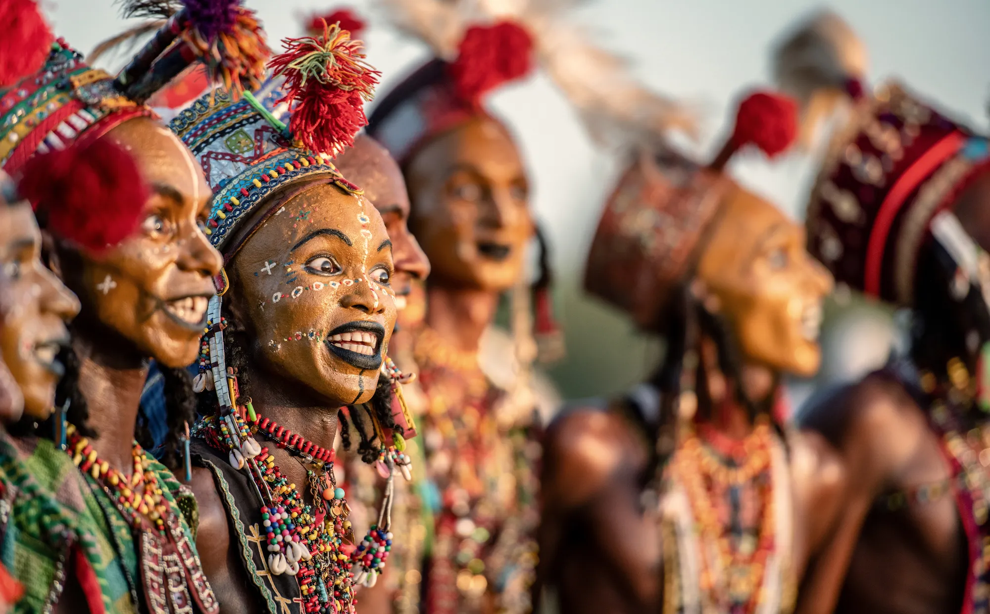
This is rather eerie and disturbing image and is reminiscent of the poster for the film, The Silence of the Lambs - which itself echoed René Magritte's painting - The Son of Man. I think that the addition of extraneous colour in the shadow and the overall green tone is a little too much but as a concept, this frame is a very effective idea and portrait. Well done.


A real graphic sense here that mirrors the formalism of both the figure's pose and his attire. I like very much how each segment of the image has its own life - from the shadows on the steps to the designs in the window to the neat bags on the pavement. A strong mid-frame bisection is an obvious anchor but this image has depth and an intriguing nature that makes you rediscover its elements again and again. Well done.


100 Images entered
96 Photographers
6,917 Ratings

Brief
See more contest details
Welcome to Photocrowd’s ‘People’ contest for New Joiners! These contests are a chance for new members to introduce their photography to the community, and get a taste of how Photocrowd contests work. They can be entered by anyone within their first 28 days of joining Photocrowd. After 100 images have been submitted the contest closes and the Crowd will start rating the images. The Expert Judge will also be judging the images and writing reviews at the same time. All the winners, both Crowd and Expert, will be announced after 3 days of judging. Make sure you also check out our two other New Joiners contests - ‘Animals’ and ‘Landscapes’.


Sharpness is not always the be-all and end-all - it was according to Cartier-Bresson (apparently) a bourgeois concept... Here, movement has created a rather ethereal atmosphere and the background reflection of the trees have created a sort of darker backdrop for the rather eerie face to emerge.. It reminds me somewhat of (the obviously staged) Victorian seance pictures and I wonder if the small part of the preceding window had been excluded whether it might have been stronger - but this is a good effort.

Although this is a very simple portrait, I think it's whether by luck or judgement it's quite sophisticated in what it tries to do. A decent overall exposure and although the right hand is not clearly delineated, I really like the way that the child's eye is obscured. This gives a completely different feel to what could be a regular and straightforward child portrait. Well done.
Meet the expert judge


This is a dynamic and well captured frame. It also evidences the rare occasion that fisheye lenses might be useful and the shape of the frame mirrors the shape of the dancer. The exposure is however quite harsh with direct flat and I wonder whether a greater diffusion - a large bounce card for example - might have helped. You could have slowed the shutter a bit more to suck in some ambient light, but the resulting flash-blur might not have been the effect you were after. Overall, a really engaging image.


