Get notified of their new contests

Although not true origami, I do like the story this tells, and I think that, as it is a scene created from paper, it fits the brief well enough. The plain browns create quite a dull colour scheme, and yet there are so many shapes that I think the addition of colour would detract from that. It also matches the mood of the image, the woman's plain, almost bored expression, the television screen telling us what to think, it is almost distopian.


The angles at which the sheets of plastic are at and the shadows cast by the lighting really do create the effect of an abstract whirlpool - particularly with the central abyss where you can imagine being sucked into - and the way the boat leans adds to that even further.
The orange of the boat creates contrast, as does the lighting on the crisp white plastic, all to create a striking image.


There is a peaceful simplicity about this image with the two boats on the water. The green gives the image a pop of colour and the reflections of the boats really work. If it were me I would possibly have tried to find somewhere without the reflections of the trees because I think it maybe detracts from the focus of the boats slightly, and maybe I would have tried to photograph it on a day when the water was still and flat to convey the tranquility more, but I do understand that these things are not always possible, and I do not think that it is a major issue.


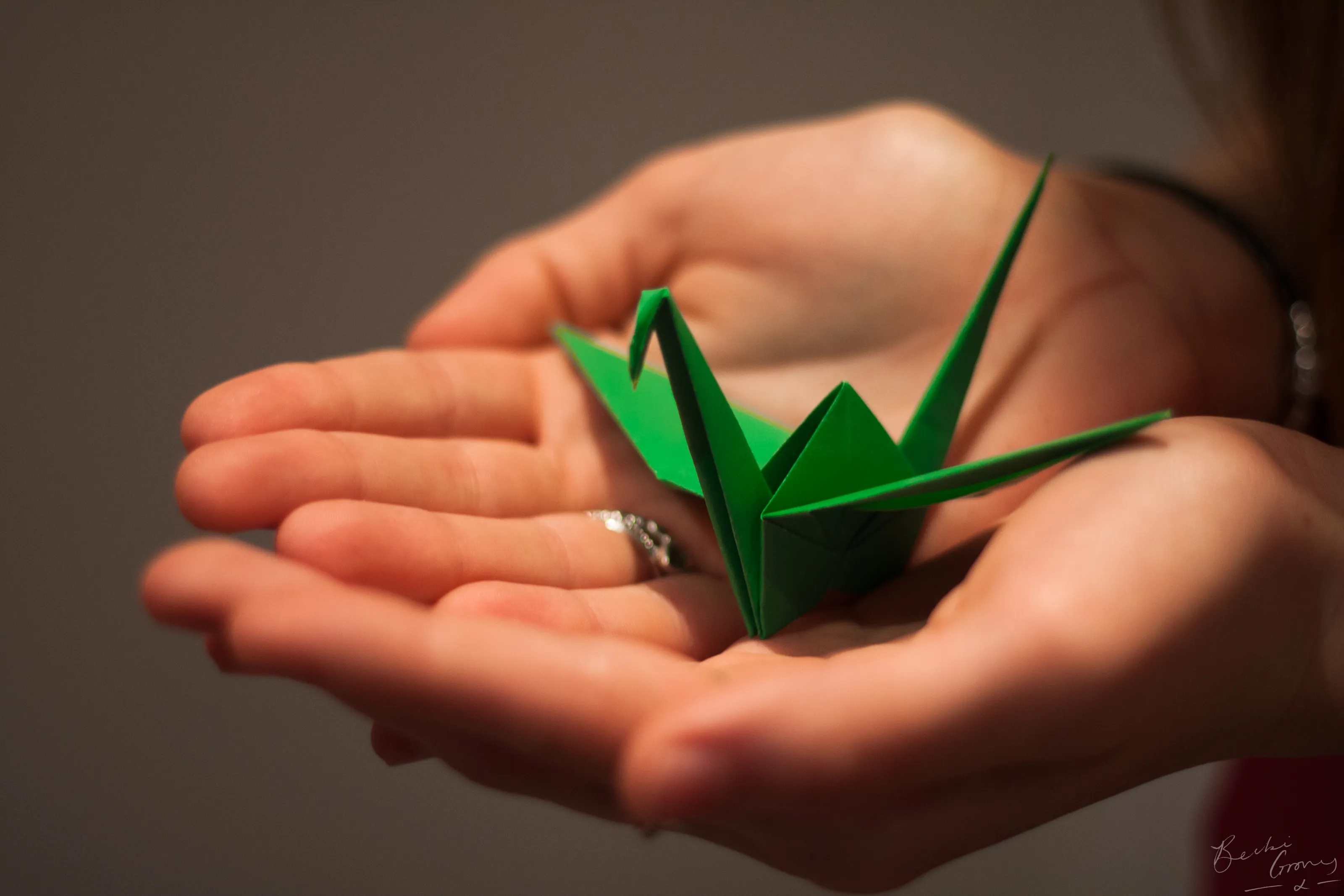
I cannot imagine this photo would have worked any time other than winter. The white of the cranes works with the white of the snow, whilst the trees provide contrast. You can clearly see the cranes, and yet they work so well with the image that, although they stand out from the background, they work with it to fade in. I expect people would walk past them and not notice that they are there. They do not feel out of place.
I think it would be interesting to see them slightly closer, to have fewer branches framing the image so that the cranes took up more space, but then maybe it would take away from the fact that they do blend in and do look like they belong there.


I do not know why I like this one, but I do. Maybe it is the colour scheme. Maybe it is that, whilst it looks chaotic there does almost seem to be some order somewhere, although I cannot identify where. Maybe that it tells a story. I do not know, but whatever it is, it works. The colours work well together, the composition works well together, and the white writing on black paper works well together.
Meet the judge
119 Images entered


Brief
See more contest details
Origami - the Japanese art of paper folding. With so many different shapes and colours, it makes an interesting subject to photograph. There are endless possibilities for creativity when photographing origami.
101 Photographers
10,704 Ratings


