
This is a good idea that hasn't quite come off. I like the idea of shooting through things that established a frame within a frame and forces the viewer to almost peer. However, what we can see is rather confused. The figures are not clearly delineated and the red sign - as red tends to do - distracts. Keep pushing because although this hasn't worked, the idea is solid.


Nearly. Architectural work s always about inclusion and exclusion: what we want to put in the frame. and what we don't. Here, an excellent shape and font are the main interest, well exposed and well framed. However, the brown shop next door really rather distracts. We can't change the architecture but we can make a decision about closeness and framing and, although I can see you're tight to the window on the right, there might have been just enough space to crop the foreground and the top of the frame to shift to the right a bit. Excellent effort however.


804 Images entered
Brief
See more contest details
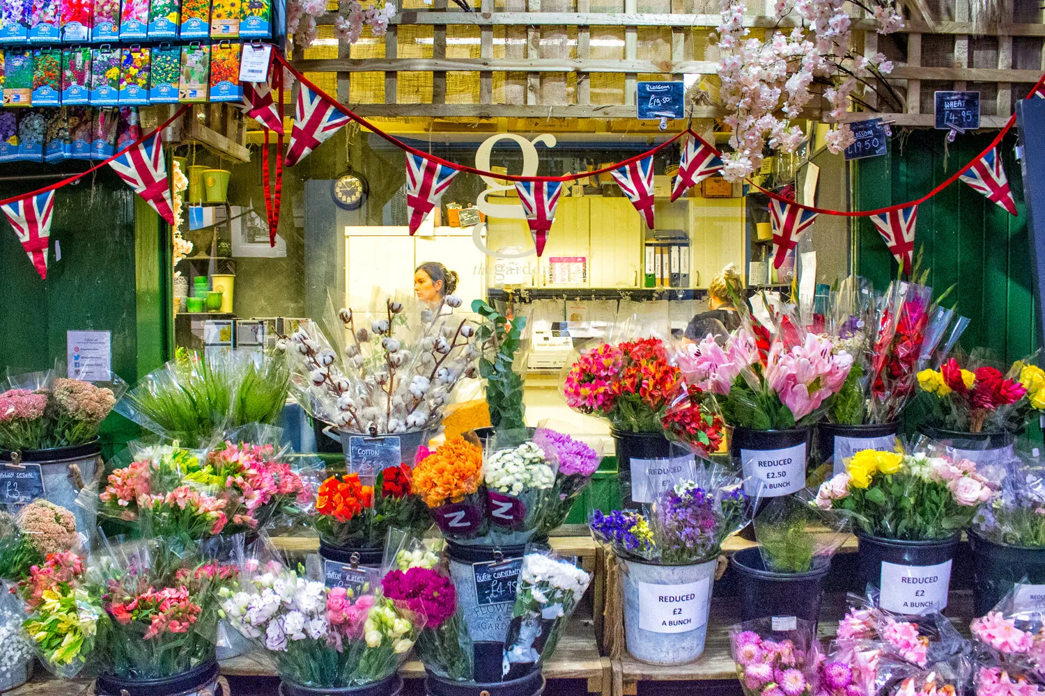
**This contest is open to photographers ranked 1001+ in this week’s <a href="https://www.photocrowd.com/photographer-community/">Leaderboard</a>.** There are myriad ways in which shop owners craft their storefronts, and display their wares. From the functional and uninspired, to elaborate and artistic creations that can draw crowds to signature stores, and put Turkish bazaars on the tourist trail. There are national and regional variations that give a distinct look to high streets, but at the increasingly popular out of town shopping centres there is a sameness to the shopfront designs that does away with much of that local and historical character.
421 Photographers
Meet the expert judge


