

Sarah’s image of demolition reminds us that architectural photography doesn’t just encompass shiny, finished modern buildings. Here we have a shot that is part architectural, part documentary, and the tone and graininess of the image takes us back to the days of film and darkrooms. The image has a strong visual impact. The crane rises from the gash it has torn in the building, and the newer tower block rises out of the ruins – presumably seen not long before as the future of architecture, but soon itself quite likely to share the same fate. My reticence in awarding the image sprang primarily from the distracting intersection between sky and building, where a darkening of the sky has left a light halo around the buildings, and above the crane. If what we’re looking at is a scanned darkroom print, then it may well be worth remedying this with Photoshop and some careful layer mask work.


This shot of Queen’s College (Oxford or Cambridge?)only narrowly missed my Top 10, and building silhouettes don’t get much better. Finding such a well-balanced arrangement of rooftops and statues I suspect is not as easy as we might think, but then Stephen has gone a step further and set the scene off against a fabulous multi-layered sunset. I would have been tempted to crop a section off the bottom so that the far left-hand building edge isn’t allowed to come back in on itself, and would also have cloned out the distracting aerial that resides on top of the cupola just to the left of centre. But it’s a great shot, and the sunset seems believable, which is often not the case nowadays.

The Olympic velodrome in London is a beautiful piece of architecture, and Pei-Chi Wong has done it justice with this serene image. This is building as sculpture. The range of tone from left to right, the intricate patterns of the wooden slats, and the black night sky all combine brilliantly together.


Alison Ruane’s study of intersecting lines and reflections is well observed and framed, and the contrast is high, which suits the subject well. The sky is very bright and blown-out, as can often happen when shooting on overcast days if you’re not careful. But a great solution to this problem, as demonstrated here, is to turn the image to black and white, which is much more forgiving of blown-out highlights. And the fact that this is essentially an abstract image makes the bright sky even less of a problem. I’d make two changes to this image. I think that a square crop has more strength than an almost-square one such as this. And it is very important to scan the edges and corners of your shot before signing it off. In this case the bottom corners both have distracting details that could easily be Photoshopped. Otherwise a strong and pleasing composition.

The Millennium Bridge in London is much photographed. From the Tate Modern side, like this shot, the obvious composition is from above the bridge with St Paul’s Cathedral in the distance. Not only does Brian Roberts go for the less obvious view from under the bridge, it does it with technical brilliance. The 106 second exposure seems to be absolutely spot on for the scene, and despite the potential this offers for movement of the camera, the shot is pin-sharp throughout. Finally, the balance between the brightness of the sky, and the artificial lights of the bridge and the city, has been achieved, which is no mean feat when playing with such long exposures.


Michael Holey has used a 5 second exposure to create this interesting effect of the running water next to the Hepworth Art Gallery in Wakefield. The placing of the building high in the image, with a vast expanse of the river in front of it, gives prominence to the water and to the effect that he’s achieved. This is a more daring composition than one in which the building would have been lower, but is compromised a little by the cropping on the left and right of the image. The left-hand edge of the building is shown, and the busy-ness here draws the eye away from the centre of the image. And to a lesser extent the right hand side of the tree, with a bright highlight next to the right-most orange boom, also draws the eye away from the subtle effect on the water. With images that contrast a moving element (the water) with a fixed one (the building) it is essential that the fixed element is pin-sharp, and in this case the long exposure seems to have resulted in a slight loss of sharpness in the building.


This shot of a German tube station by Jacob Almagro is fabulously observed. The symmetry of the scene is essential and gives it a strength of composition. To ensure this Jacob has made sure to place himself centrally when taking the shot. The reflective ceiling combined with the interesting light lifts the shot immensely, and the placement of the travellers and their darkness against the white floor is great. It's a shame that a distracting white remnant of some Photoshop work remains on the bottom edge of the picture, and a highlight on the top edge of the shot, towards the left, also needs to be cloned out. This shot though is another great example of how far phone photography has come.

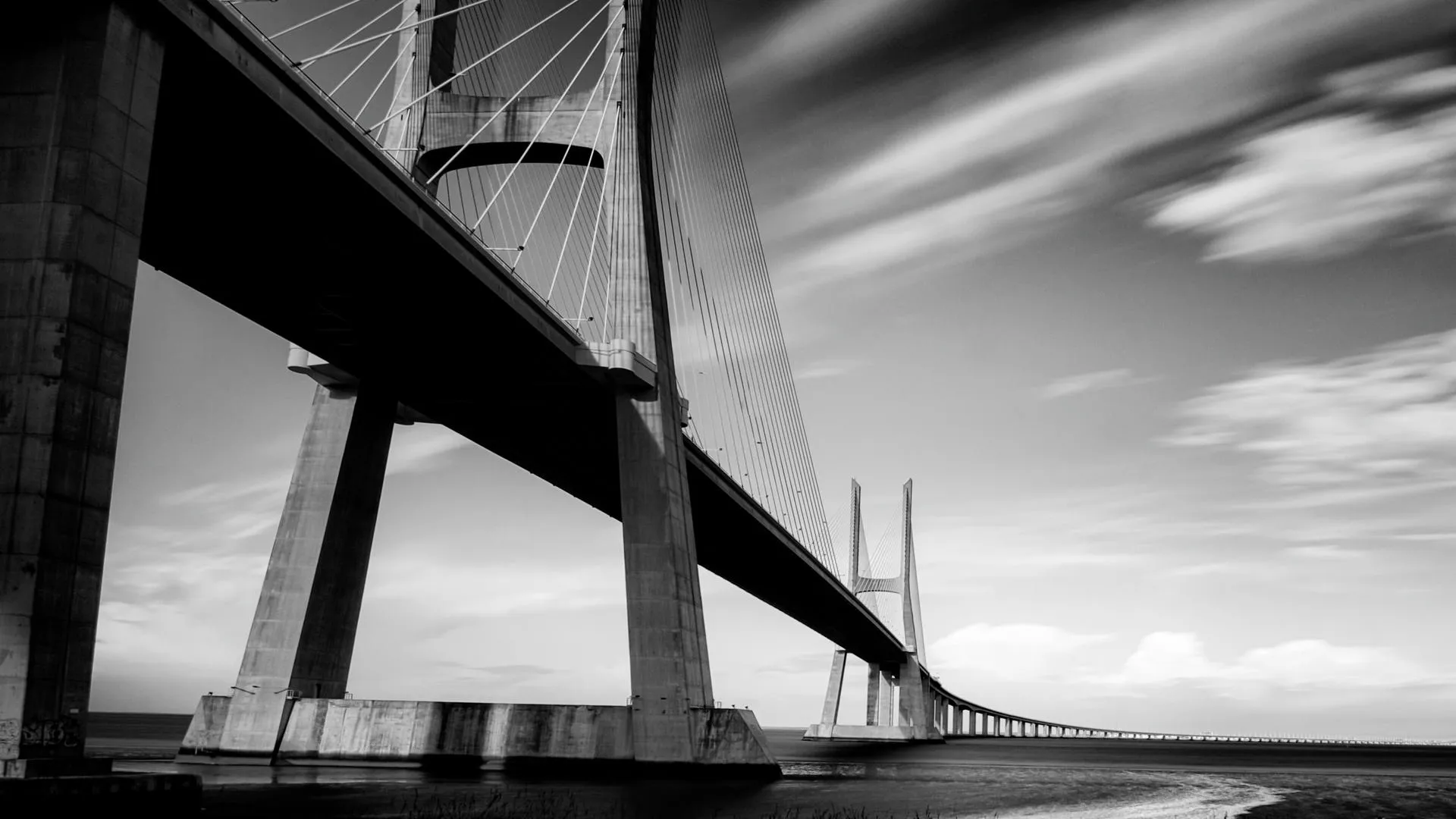
This is a classic wide-angle view of a bridge, tall in the foreground, and rapidly shrinking into the distance. The long exposure has given a wonderful effect with the clouds, and the high-contrast treatment emphasizes both this, and the dark underside of the bridge against the lighter sky. The only thing that stopped this being a Top-10 image for me was the distracting bottom-left corner of the image, where the brightness of the column draws the eye away from the centre of the shot. This would be easily remedied in Photoshop, and I would also try a gentle, graduated darkening across the whole of the bottom of the image, to focus the eye more on the bridge and the sky.


I absolutely love this shot, and I’m comfortable that it falls within the realm of architectural photography, albeit architecture from a distant time. Experimenting with torches, flash and other artificial light sources at night can generate all sorts of wonderful effects, some planned, others not. But it usually pays off in some way, and Roger Blandford’s efforts here have brought an air of mystery and other-worldliness to this ancient monument that seems to suit it perfectly. The focus on the near-most rock, with a slight drop-off in sharpness on the rocks behind it serve to draw the eye neatly to the centre of the image, from where the beams of light are best appreciated.

This is a brilliantly observed interplay of walls, doors and the burning light that is pouring through, well, through what? Some sort of slatted wall, or roof? As well as being a well composed image that has been impeccably framed/cropped, it also prompts lots of questions. Where is it? Why is there dirt on the floor? Does anybody live there? Answers that are provided by Suzanne’s accompanying text, but which make the image intriguing on first view. The exposure is perfect, and the half-open door in the background provides an interesting journey from light to dark to light again as your eye travels through the scene.

This is a brilliantly composed shot and what a fascinating building to shoot in! The two converging lines in the image – up the stairs to the left, and down the corridor to the right – work very well, and the light streaming in through the boarded-up windows provides real atmosphere and depth to the scene. The shot has a quite unreal, almost computer-generated feel that may be down to the use of HDR software, and which I think is to the detriment of it, although many will feel otherwise. I would have preferred the shadowed areas of the scene to retain more of their darkness. This would perhaps have given a stronger feeling of dereliction and lurking danger, contrasted with the light straining to get in from outside. But that isn’t to take away from what is a very well observed image.

What’s not to love about this wide-angle shot of the Museum of Modern Arts in Frankfurt? Beautiful symmetry and balance in the composition, fabulous attention to detail in the framing and cropping of the scene, and explosions of colour to either side. The exposure is good, only allowing the highlights to blow out in the window spaces, and retaining just enough detail in the white walls. I think this is such a fun shot, but also one that has been so well executed, and it’s my winning shot for this very competitive architecture contest.
69 Photographers
125 Images entered


Terry Stoten’s image of an amphitheatre in Arlington uses a well-chosen vantage point to create an interesting arrangement of curves and columns that draws the eye in nicely. What the shot is lacking is direct sunlight and blue skies, which are such handy allies to have on your side when shooting architecture. The building here is left feeling very flat, with little contrast, and a moody, almost depressed feel. This could have been allayed a little with some added brightness to the image, but ultimately what was needed was better weather.

11,749 Ratings


Brief
See more contest details
Upload your best architecture shots, whether taken last year, or last week. Live Crowd voting, Expert judging by Mike Betts, and great architecture photobook prizes for the winners.
Meet the expert judge