


Overall, while judging this contest, I was really drawn to the black and white images. Black and white really simplifies an image, as there are no distractions of color and you can really focus on the lights and darks. This image is a perfect example of this. The contrast of highlights within the shadows creates beautiful shapes all over the image. This is such a perfect, simple moment captured as the smoke leaves the lips of the subject and leads the viewer out into the shadows of the image.


All photographs exist with one common element: light. To simplify a photograph to its bare minimum, you would have to begin with light on a reflective surface. This image successfully defines the very essence of simplicity. It did not go any further than the necessary elements of a photograph and it stopped there. There is such beauty in the unknown in this photo, as we want to reach around this wall and enter into the other side. This is a very impressive solution to the brief.

This image has such a painterly feel to it, and normally I might skip past an image that may have too much post work, but I couldn't get away from the haunting beauty of this photograph. The decision to let the small hill fade out on both sides into the white mist, while still in frame, is a perfect solution to allow the composition to draw the viewer in. The reduction of contrast works very well to make it softer, without allowing rich shadows to overtake the emotion of the image.


The cool monotone colours of this image immediately drew me to it. The simplicity of the contrast between the darks of the image and the mid-tones is perfectly achieved. The small details across the horizon lead wonderfully into the centre column and then back into the right-hand side of the horizon to the distant mountains. Your eye is allowed to move freely throughout the image while never leaving it. This is a very well executed photograph all around. Well done.


The contrast of colour from warm to cool in this photograph is extremely inviting. The simplicity of the lines from left to right carry your eye through the image horizontally, as the warm and cool colours carry your eye from top to bottom. The small details left within the mountains are a wonderful second read. The format chosen for the image suits it well and complements the strong lines that give the photograph its essence. This is a great sample of simplicity.


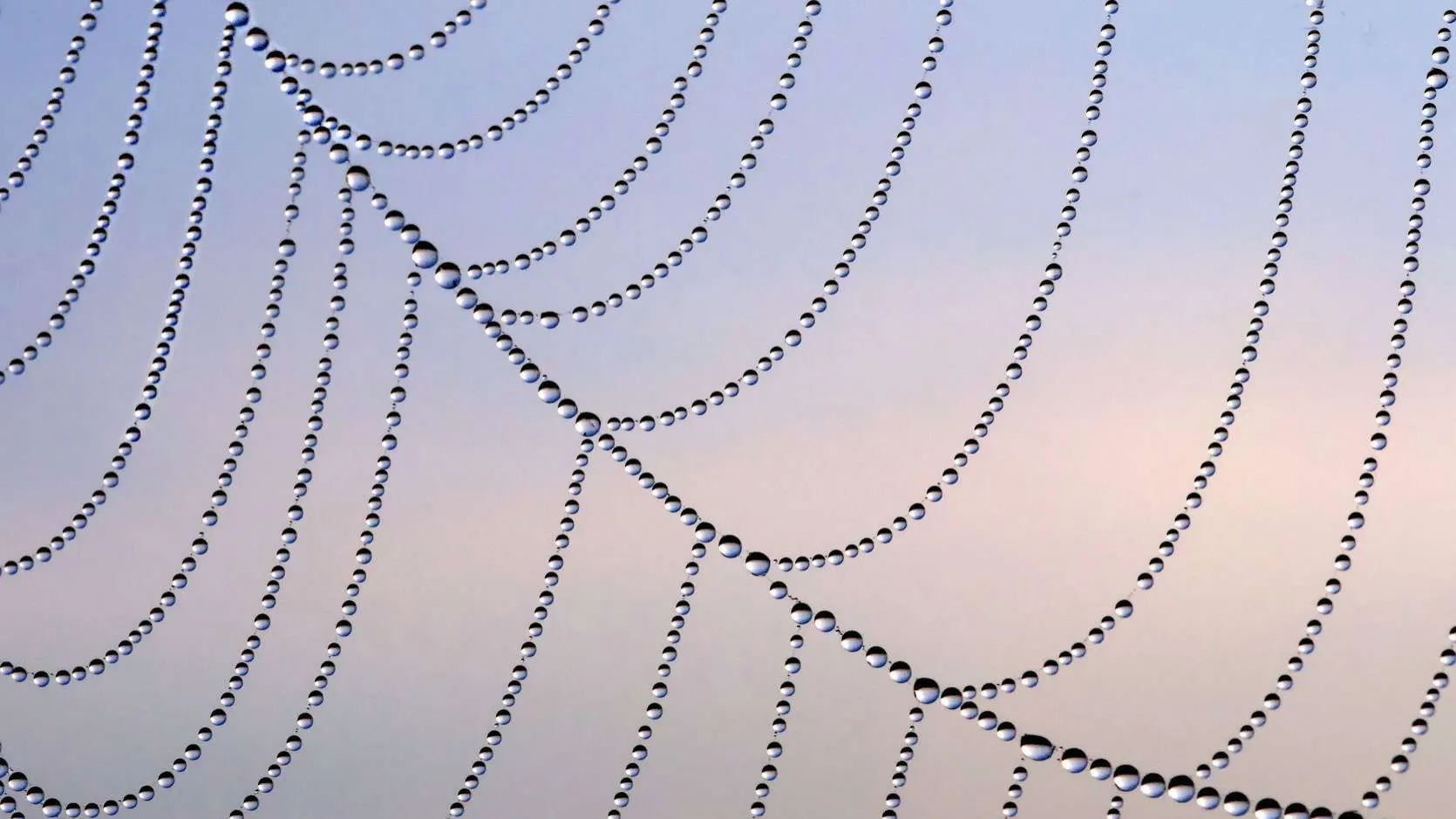
This is a great example of an image that looks simple, but is much more complex. To balance the shadows with the highlights and retain information in both areas is a very difficult feat. Technically, this image is astounding. I'm also drawn to the bleakness and coldness of the image. It is perfectly balanced compositionally, which makes it extremely easy on the eye and allows the viewer to move on from that and analyze other aspects of the image. This is truly a simple image, executed perfectly.


This is a perfectly executed image for the contest at hand. The photographer managed to successfully turn a mundane and simple scenario into a beautiful photograph. The composition is perfect: the shape comes down the image from the top and turns into the bottom leading the eye into the corner, but not allowing the eye to leave the image. We then follow it back up and break off into the third line which leads us into the center of the right hand side. Very well done. In addition, the contrast of the three colours is beautifully integrated into the photograph. This is a very beautiful photograph.
800 Images entered


Simplicity can be found not only in the technical aspects of a photograph, but also in the emotion of a photograph. There is such beautiful simplicity to the calmness of the subject and the connection he has with the light. This image is about a simple moment in time that was recorded with a compassion for the the light and subject and it really comes through as that. The gradation of light from right to left is wonderful, as is the subtle gradation from top to bottom. Just a beautiful photograph.

From the shadows on the wall, to the pattern of the dress, to the cropping of the subject, to the movement so beautifully captured - this image stopped me immediately and I wanted to know more. I believe it works for the contest as it is a very simple moment, but captured so gracefully. The cropping is done so well and the decision to leave in the wall leading away on the left-hand side both play wonderfully within the composition. This image is very successful in capturing the simplicity of an act while also retaining a beautiful composition.


442 Photographers
Brief
See more contest details
Upload your photos exploring simplicity, whether taken last year or last week. Live crowd voting, expert judging by Alan Gastelum, and great photobook prizes for the winners.
117,435 Ratings
Meet the expert judge


This is a stunning image. The play with lights and darks is very captivating. It is well printed and the attention to detail in the greys is really done well. With regards to the composition, especially as the image is titled "Circles", I am a bit concerned that we don't see a full circle. I would love to have the image pulled back just slightly to complete the circle since this would allow the viewer's eye to stay within the frame and not wander off. When you follow the line of the circle up or down, you are forced to leave the image frame instead of seeing the end of the circle and following it back up.


Such a wonderful moment is captured here. The composition of the stark building juxtaposed against the strong diagonal of the the jet-stream is wonderful. For such a simple image that relies so heavily on the composition, every little detail in regards to that needs to be perfect. The fact that the building is not perfectly centered on the bottom of the frame disrupts the perfection of the composition. With a little cropping, this could have been a nearly perfect image.


This image had me from the beginning and was amongst the final ten for a long time. I love the point of view and the way all the lines lead us away into the depths of the photo straight into the subject. The light on the ceiling of the hallway is just perfect. I love the shapes the highlights are creating on the wall. My only concern is the lack of information within the highlights. I would have loved to see just a bit more and not have it blown out all the way. If not for that, this image would have been in the Top 5.


This is just a beautiful image. The contrast of the lights and the darks is done so well and it immediately draws the viewer in. The subtle shapes of the plants on the left-hand side are at a perfect exposure to contrast against the dim sky. My only concern was the rendering of the image. I noticed that a lot of images do not seem to be processed at a high enough resolution and the image becomes pixelated and starts to diminish in quality. Other than that, this is a really wonderful photo.

I was really drawn to this image as the tones of the ocean and the waves within it are beautiful. I loved the strong ambiguous figure in the foreground, but this is also the reason this image was not included in the Top 10. I almost wanted to see a bit more information in the figure. Maybe just a hint of what it was to draw the viewer in to investigate more. Right now, it is just a shape and I think giving a little bit of information turns it from just a shape into an idea.


