

Very wide landscapes need very wide lenses, but you can trust Wales to deliver the goods. You can't trust it to supply the weather, so it's possible our heroic photographer was left exasperated by the clouds drifting across the top of the scene here. Still, there are a few stars peeking through and I like their stillness in contrast to the rather busy clouds. In fact if anything, I think the clouds might be a bit too "rushy", and I see that the picture was taken at f/7.1, so the photographer could have opened the aperture a bit and sped up the shutter speed to get a more peaceful looking shot.
Still, I love the tones, and this looks as sharp as anything to me. A lovely treatment of a smashing place.
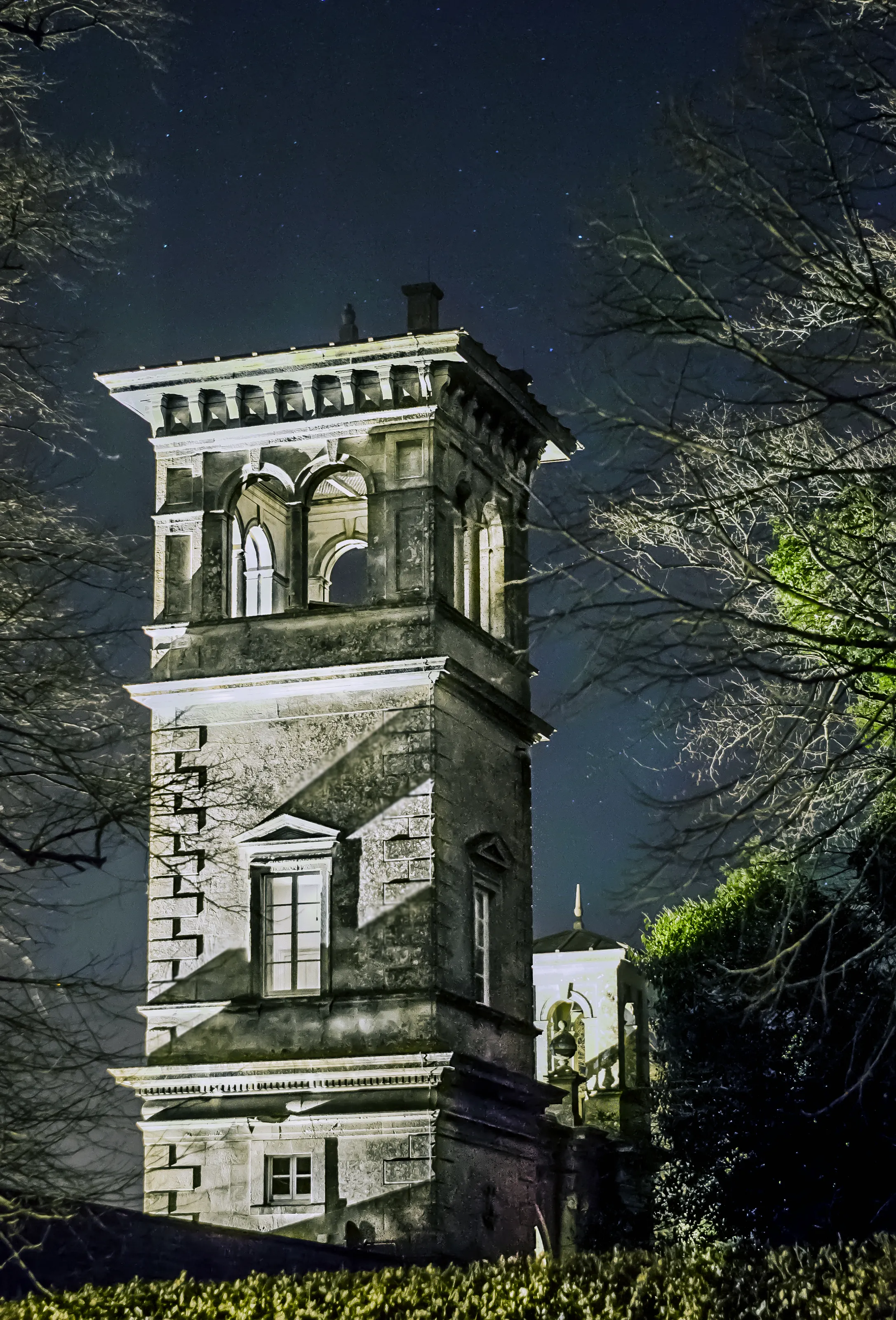
58 Images entered

Entering a night skies assignment when you live under the northern lights is of course cheating, but nonetheless this is a smashing effort of what looks to be a properly spectacular display. The northern lights are ranked on a scale from 0 to 9 on the Kp index: I've photographed them a few times and sky-fillers like this are very few and far between.
I particularly like how the snapper's packed quite a bit of foreground into the scene. The hut with the light on gives the scene context, and I love the bare trees as well: good northern lights photos are never just about the skies.


Another good composition that's a strong answer to the assignment in hand. The dead-centre moon doesn't totally tickle my composition taste-buds, and I might be tempted to get shot of the trees in the top right centre. More than anything, those dust spots all over the place need killing off: shooting at f/14 is going to make the most of any crap on a camera's sensor. A bottlerocket blower will make short work of them! Even if it weren't for the dust spots, opening the aperture up would make for a brighter image, and a slightly boosted exposure might make this a more impactful shot.

A lovely, peaceful concept, made at dusk, which is traditionally not an amazing time for lunar photography. Still, I really like the deep blue of the sky here, and it's kept life a shade easier for the photographer, who's stood a better chance of getting the foreground focussed properly.
The moon's a tad obscured, so it might have been worth waiting till it arrived at a place where it could be photographed in its entirety, and I'd be interested to see what this might look like with a touch of positive exposure compensation and possibly a bit more saturation, but this is a really nicely conceived and executed shot.

I love a good moonshoot, and this telephoto image is very impressive for handheld - lovely and sharp and I love the fade to black. If I were being hypercritical I might experiment with lots of different compositions (although maybe the photographer did!).
The only other issue for me is noise: there's been a crop here, which is fine, but the lens the photographer has used has a very effective image stabilisation system, so they could quite possibly have dropped the shutter speed to around a quarter of what they ended up using, quartering their ISO in the process, and possibly ending up with a less noisy image.

This is a real smasher. The processing here is really understated, which has resulted in a very tranquil-looking scene, pin-sharp skies, and I love the rocks in the foreground. This is a composite of 15 different frames according to the caption, which makes this not only a well-executed image but a well-conceived one as well. It's normally the case that the longer an image spends in Photoshop the worse the result, but that's absolutely not the case here.
The only thing I'm confused about is the little lightsource in the middle of the frame, halfway up the hill. Answers on a postcard as to what - or who - that might be.

I see from the photographer's info that this was shot in Utah - an amazing place to be outdoors, and the result is this pic which so nearly comes off.
Sure, lit-up tents are a bit of a photography cliché, but they're evocative and I like them. If I were the snapper I might opt for a slightly different composition, though - the tent's a bit obscured by the tree, and the different coloured lighting looks a bit awkward. The framing also cuts off the bottom of the tent. Finally, the shutter speed's on the long side at 30 seconds: with a focal length of 27mm that means the stars have come out a little blurred.
A great rule of thumb here is the "600 rule": divide 600 by your chosen focal length to find the longest shutter speed you can use and still get non-blurred stars.

Another ace star trails shot, and again one which seems to understand the importance of a bit of foreground to add scale and context. Norfolk's windmills make great subjects any time of day and this is technically very accomplished. Still, although I'm not a slave to the rule of thirds it might be nice to see a slightly more lopsided composition, and again this is a frame where the light from whatever's illuminating the building has added a distinct colour caste to the shot: a touch of white balance correction might get things a shade less purple, particularly at the top of the building.

I really like this image as a concept. Light trails are always spectacular, and shooting a well-lit building at night can make for cosy-feeling images, even if this one doesn't adhere all that strictly to the astronomical part of the brief.
The thing with light trails is that you need to bag quite a few different options to get the "right" look. Here, the way the car appears to have started its journey inside the pub (?) is a little awkward, and it's possible that the exposure might be reduced a tad to stop the front of the building looking a tad over-exposed.

I really rather like this. The composition, framed by the trees, is a smasher, and the photographer's either gone to great lengths to light the building and surrounding trees, or has struck it lucky and found a pre-lit scene just asking to be snapped. The only problem is that there's a big difference in dynamic range between the brightly-lit building and the stars above, so the astronomical aspect of the frame is rather lost.
I can also see that this frame was shot at ISO 3200, which suggests the frame might have been handheld. Convenient, sure, but a tripod would allow a waaaaaaay longer exposure and a much lower ISO, which would produce a sharper image.

Phwoar! What a colour. Assuming this is what things actually looked like (the photographer says "colour adjustments done in Lightroom" but doesn't specify what), this is an amazing sight.
It nearly comes off, too. The idea of leaving a sliver of horizon across the bottom of the frame anchors things nicely and gives the moon a bit of context. I'm less keen on the telecoms tower: a bit of movement on the part of the photographer would have neatly gotten rid of this, and it's difficult to overlook that the moon itself could be quite a bit sharper. Part of this is the challenge of shooting at night: the photographer's shot 1/20th of a second at 250mm, which is a stern test for any image stabilisation system, but at ISO 100 there's quite a bit of latitude for shooting a more sensitive frame at a faster shutter.

This image must have been such a pain in the bum to shoot. I've been to Malaysia, and while it's roasting during the day at sea-level, get above the clouds at night and you're in for a chilly time. The view above the clouds, as nabbed by the photographer here, looks properly spectacular, with only the slightest hint of light pollution from below. If we were dishing out awards based on effort this would bag a big one. One of a handful of shots in this competition I'd have loved to have been around for.

This is another image whose conception I really like: the earth framing the heavens is a really poetic idea and this could be a spectacular image.
The photographer's not helped by the light pollution just over the horizon – taken apparently in the middle of Bracknell it's actually impressive the picture looks like it does – but there are other technical areas to work on. For me, the trees at the front of the shot need to be sharp: focussing in the dark is a challenge but if push comes to shove you can always bracket a few shots and inspect them at 100% on the camera screen to make sure you've nailed it. The stars could also be a bit steadier - at ISO 400 there's a bit of room for manoeuvre, so sticking more closely to the 600 Rule (Google it!) might have produced a steadier looking shot.

This composite image is such a great idea: star trails with human elements (the photographer's house, I'm guessing) give an amazing sense of context to an image. If you've ever wanted to feel tiny, astro-photography is a great way of expressing it.
This frame nearly comes off, for me. The house is a great inclusion but the light shining on it is a bit "suburban" for my liking; a more neutral light might make things look a bit more natural. The tree in the foreground also looks a tad soft: if you're going to composite an image it makes sense to light the foreground and get it sharp-sharp but still, this has the makings of a smashing image.

This stacked image is a technical triumph: the tree in the foreground is lovely and sharp, and the trailing stars look great. The foreground looks like it was lit by a torch, which is fine, but a touch of white balance correction might get it looking a bit less blue. I'd also be interested to see a shot with a longer exposure: let's get those stars really wheeling across the sky. Still, a smashing shot done on assignment I think.
38 Photographers