
We wanted straight lines for this month's photo competition, and we got them in this picture. Shot from one corner, and with all distracting traces of colour removed, this modern building becomes nothing but abstract lines. Only the crisply-captured detail of the pointed stone and the soft shadows on the lower surfaces give the viewers a clue that they're actually looking at a real, three-dimensional structure. This shot is technically excellent, and fits the theme of the competition exactly. Well done!


Views of buildings from extreme angles was another popular subject in this competition. What made this one stand out was the photographer's choice to shoot a building with a pedestrian mirror opposite, giving you two very straight buildings, strong lines thrusting upwards, and then a definite circle shape, which helps to emphasise the fact that virtually every other line in the photo is straight. The overall impression from this photo is one of shapes, of strong straight lines and a single circle.
486 Images entered
281 Photographers

63,029 Ratings


Brief
See more contest details
N-Photo magazine is exclusively for Nikon DSLR users. This month they are asking for your photos with interesting use of straight lines. But… all images MUST have been shot on a Nikon DSLR.


Living beings don't tend to have many straight lines, and most of the successful photos in the competition – ones that were both technically good and really yelled 'STRAIGHT LINES!' – were of man-made things such as buildings and railway lines. This photograph bucked the trend. The graphic stripes of the zebra crossing are repeated in the man's shirt and meet the theme of the competition. The colour is brilliant: the playing cards and feet of other pedestrians make you feel the shot wasn't staged, yet the bright yellow of the shirt and bags really make the man pop out from his surroundings and add to the graphic quality.


Two shots of piers taken from below made our Top 10. For this one a long exposure has made the sea look fairly misty, and combined with a soft sky it makes the textures in the barnacles clinging to the base of the pier look all the rougher. The light coming strongly in from the right shows the photographer has waited for it to be at precisely the right angle, so it helps highlight the shapes of the struts and the rough surfaces in the shot.


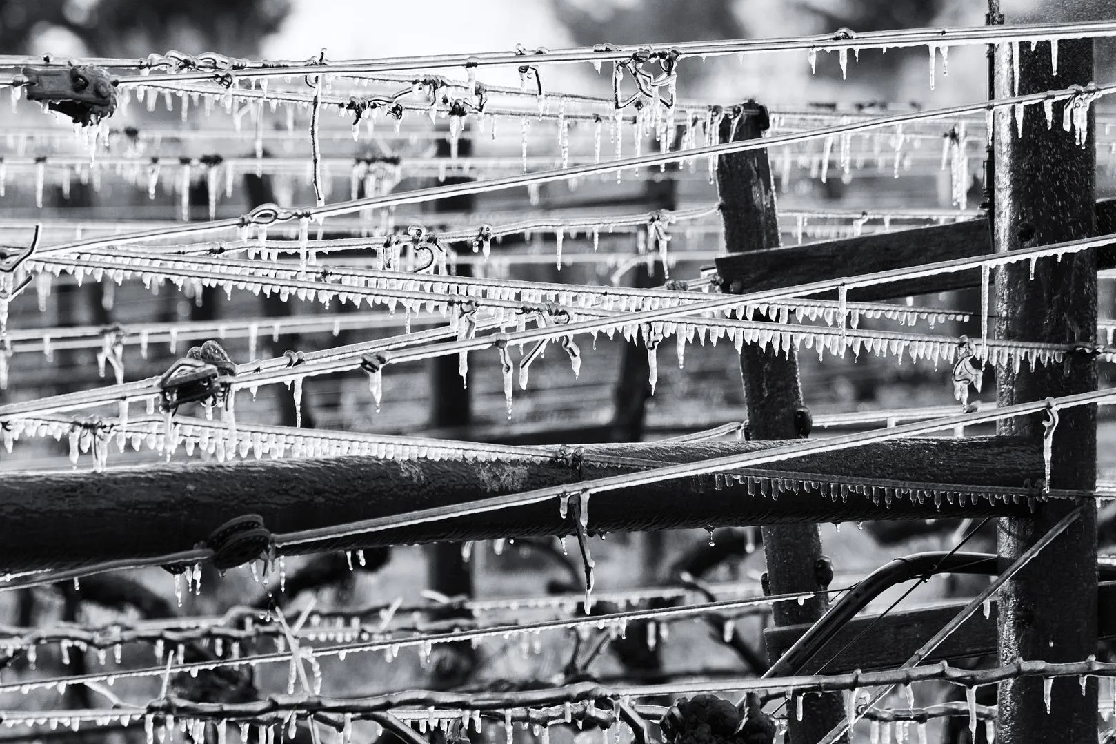
Simple and sharp. What we really liked about this image was its clean lines and strong contrast, especially where the straight lines of black wire are coated with bright white ice. The reasonably shallow depth of field is what makes the photo work: enough of the front strands of wire are sharp enough to give you a sense of the crisp, cold weather, but the detail drops off so there's nothing in the background to distract you from the subject.

What we appreciated about this photo was the technical difficulty involved in simply taking it. Getting the shutter speed exactly the right length to capture the motion of the pool balls as straight lines without overexposing everything would have taken careful planning. And the photographer still had to press the shutter button at the precise point in time when they would all be in motion but still close together. This is a simple-looking shot that would have taken a lot of work to perfect.


Many of the entries to the competition had a strong graphic quality, and this strong monochrome shot of staircases was one of the very best. The level of detail captured is fantastic, and the photographer clearly waited for the light to be exactly in the right place to bring it all out. The way the stairs repeat, with no top or bottom in sight in the shot, makes this photograph feel reminiscent of both Escher's prints and Bauhaus fabric designs.

London has a lot of iconic buildings, old and new, and the number of tower blocks there is constantly increasing. This image shows one of them, 30 St Mary Axe, but the photographer has resisted the urge to show its full 'gherkin' shape, sandwiching it instead between the Willis Building and the Lloyds Building. As well as being unusual, this removes the curved lines from the picture. It would have taken careful positioning to get all three structures in shot, and the right lens used in order to get 'The Gherkin' to appear at a reasonable size. The use of a sepia tone warms all the structures up, giving the whole image a warmer feel than you'd expect in a shot of the City.

Piers were a popular subject in the competition, shot from both above and below. This was one was our favourite. There's a touch of 'HDR halo' in places, but overall the use of monochrome and HDR has helped bring out all the textures in the wood of the pier, the clouds above, and even in the sand. The movement of the sea adds to the drama. This picture is chock-full of the straight lines we were looking for without being smoothed into blandness.


Meet the expert judge


