Urban vistas
Otto Berkeley

Urban vistas

February 2018

Crowd
winner
Entry 1612015
1st
255

2,787 Images entered

2,087 Photographers

119,216 Ratings

Entry 1472672
6th
194
Expert
winner
Entry 1472827
18th
161

Love the composition and the light – it's just a great photo. To be picky I would have lower ed the contrast in the middle section of the photo so that you play with the contrast of the contrast! Also, maybe I would just diffuse a little bit more of the sky – but not sure.

Entry 1472964
172nd
18

The view from the Acadamia bridge in Venice. Love it. Great composition and drama. I think it is a tad too dark and I would have boosted the white a little more, but that's just me. In any case very well done!

Entry 1477849
4th
384
Entry 1498865
1398th
1
Entry 1511390
394th
311
Entry 1514460
1292nd
30
Entry 1514535
1636th
4
Entry 1528474
133rd
39
Entry 1529545
34th
29
Entry 1535031
576th
27
Entry 1535356
1336th
34
Entry 1612014
8th
228

Brief

See more contest details

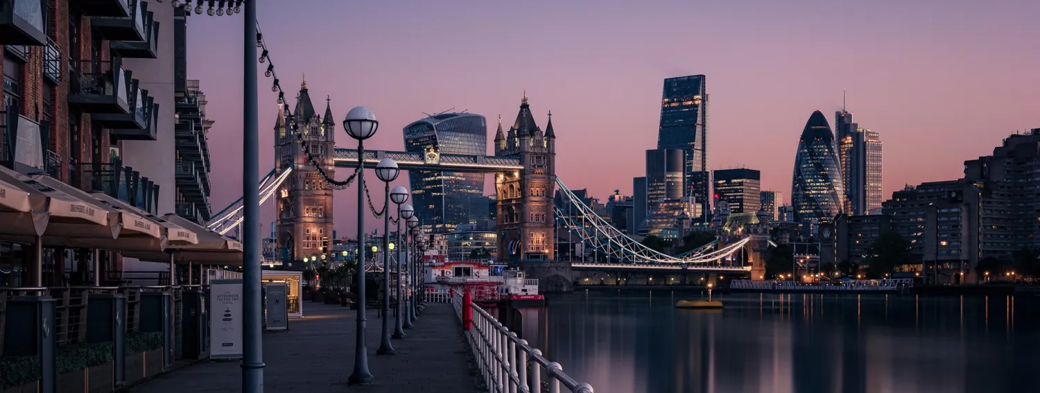
Cityscapes and urban vistas can be every bit as dramatic as natural landscapes. In fact, the dynamism and light play within them often presents buzzing photo opportunities that you just wouldn't get in a field or on a lake. Whether you go for a street level shot or higher, you can bring life to your urban shot by discovering your own unique perspective. ***Judge Serge Ramelli is currently running a number of excellent discounts on his industry-renowned PhotoSerge products! <a href="http://www.idevaffiliate.com/32293/idevaffiliate.php?id=400">Click here</a> to take advantage of these great offers while they last.***

Meet the expert judge

Entry 1472225
27th
1
356

I love the composition and the light. There is just one thing I don't like about it is the texture of the water, on this one I would have added an ND filter to have a more flat and less high frequency texture water.

Entry 1472831
60th
62
Entry 1472884
1155th
39

I like the composition but the sky is too saturated. I know very well this spot – you would have gotten a much better image at the blue hour when all the lights are turned on!

But good eye, I like this view. Las Vegas is a great subject

Entry 1473270
58th
77

Wow – I wonder how you did this, it's amazing how it becomes more interesting. I wonder which filter you used and if you did this in camera by moving it and layer back in the sharp one. However, good job! Creative.

What a great shot. It has definitely a strong foreground and great light. 2 ideas to make it maybe a little better"

  1. Diffuse the sky to make it contrast against the sharpness of the city.
  2. I think the foreground element is a little too big.

But hey, very well done... just ideas to make it better.

Entry 1474499
24th
246
Entry 1476531
42nd
35
Entry 1496894
64th
347
Entry 1498332
257th
110
Entry 1503730
138th
88
Entry 1506553
2213th
28
Entry 1510648
287th
9

I loved this photo so much and honestly, I would have put it in the top 10 if there wasn't a kid on the right of photo that is half in and half out. It is very important that you look at the border of the photo and make sure no major item feels half in or out.

Entry 1513749
44th
66
Entry 1557395
580th
101

I like the composition, the buildings are straight and the message of this photo is simple. The main issue that I have is the light is normal, photography is writing with the light and I feel it is missing. Also a foreground element would give a stronger story like a bench, a rock or a tree. It gives an anchor point from where to see the photo.

I love the composition with the leading lines and the foreground, middle ground and background. To be picky I think the foreground is a little too big and less interesting then the middle ground. BUT the big missing point is the quality of the light. I never shoot when the light is not beautiful – mostly sunset, sunrise, golden hour or night.

Entry 1584603
31st
40
Entry 1627342
61st
4
Entry 1628115
41st
304