


The photographer is going down a well worn path here. A super-long exposure of pilings in the ocean or a lake has been done many many times - it is as much of a photographic cliché as a sunset or a macro shot of a flower. In order for a photograph like this to be worthy of notice it would have to be extraordinary in some way. At the very least, the level of technical execution would have to be very high and there would need to be something noteworthy about the composition.


I admire the photographer's inspired idea to shoot a calculator screen through a crystal ball from a chandelier. But of course, what matters most with a photograph is the final product - not how you got there, and in this case the result of the photographer's creative impulse is a striking image. I love the riot of colours and numbers. I love the tension between the apparent disorder in the image and the idea of orderliness and regularity implied by numbers and calculation. And I appreciate the incorporation of two layers of abstraction - this is after all an abstract image, the subject of which is numbers, which are themselves an abstraction! Nice touch.

I understand why the photographer was attracted to the idea of having a gap at the top of the image where you see the man in the blue shirt. You have the stillness and verticality of the man and his fixed gaze contrasted with the horizontal motion of the cyclists. But the photographer might perhaps have thought more carefully about what he was trying to do here. What is this photograph about? If it's about the bicycle race, and the ideas of speed and motion, then the man at the top is a distraction. Imagine what this photograph would have looked like if it had been cropped from the top to remove the man, and produced in black and white!


This image is full of energy and motion, and I love the colours. One of the critical factors, I think, for an image like this one is composition. The image needs to be "built" in a way that gives the viewer's eye something to latch onto, a visual anchor in the midst of the chaos of shapes and colors. The photographer has accomplished that here: the eye is drawn to the vertical line between the two screws. A couple of weaknesses: i) I wish the image had been sharper; and ii) I wish the photographer had composed the shot without the "hole" at the bottom left-center, which I think detracts from the fished product.


This is a wonderfully moody and evocative image - it conjures up thoughts not only about dance, but also partnership, love, and romance. But even with all these associations with pleasurable things, the photograph also has an air of eeriness, suspense and menace, as if something bad might be about to happen in the moments after the photo was taken. The motion blur, the decision to produce the image in black and white, and the chiaroscuro effect are all beautifully done. Congratulations!


I surprised myself when I selected this photo for my Top 10. Normally I'm not a fan of macro shots of flowers or other plant parts (a question of personal taste of course). To my eye, at least, such images are rarely of interest as they appear to be mainly about the photographer's obsession with bokeh and /or the resolving power of his macro lens and camera sensor. But this photographer won me over with this image which avoids all the usual macro photography clichés and instead provides a wonderfully appealing abstract rendition of the idea of delicacy that is embodied by flowers everywhere. The only reservation I have concerns the square crop. I think it leaves too much white space in the wrong places. I wonder if the photo might have been even better in landscape format (perhaps 3 : 2) with less white space at the top. In any case, thank you for showing us this!


I love the energy in this photograph and the obvious degree of thought that went into the production of the final image. Even while conveying very effectively the abstract idea of speed, the photograph also has an aura of stillness and contemplation. The composition couldn't be better: the horizontal bands of green and yellow are a perfect background for the white and black blur of the motorcycle and rider. This belongs in a frame occupying a large piece of someone's wall! One small suggestion: I think the image would benefit from a slight curves adjustment to brighten it up.

It doesn't get much more "abstract" than this: two sets of three parallel lines and three S-curves against a gradient of light from a sunrise or sunset. And yet, for all the intense abstraction, we also immediately recognise this for what it is: a photograph of power lines against a cloudless sky. There's a sense of serenity here that is very pleasing, as well as being oddly disturbing because the subject is an emblem of our industrial world. Well done! A couple of weaknesses: i) there's a lot of noise in the image (surprising given the relatively low ISO), which could have been corrected in post-processing; ii) there are some fairly obvious sharpening artifacts at the edges of the power lines, which also could have been corrected with some (admittedly painstaking) cloning work.

515 Images entered

This photograph won me over despite some important flaws. There's sensor dust in the upper right-hand quadrant (something that no photographer who cares about his work should let slip through). The image is overly noisy and the green color is unnaturally garish. But for all that, I love the overall effect. The photo pulls you in: you can feel the tug of its energy. It's perfectly composed, with the slashing strip of white sky separating the greenery on either side of the railway tracks.
Meet the expert judge

294 Photographers
Brief
See more contest details
Upload your experiments with abstraction. Live crowd voting, expert judging by Mark Schacter, and great photobook prizes for the winners.
68,861 Ratings


The photographer had a good idea here. I too am drawn to sand fences as a photographic subject. But I think there are some important ways in which the photographer could have done a better job. More thought could have been given to the composition. As it is, there is nothing for the eye to settle on - the viewer is confronted with a jumble of lines. And although I appreciate what the photographer was trying to do with the narrow depth of field, I think that too much of the image is out of focus; and the part that is in focus is the least interesting part. I might have considered focusing on the roughly horizontal line of posts at the centre of the image, or the X-shaped crossing of lines at the top. I might have cropped out most of the blank space at the top and opted for a more landscape aspect ratio (3 : 1.75 or 3 : 1.5 instead of 3 : 2). Also the image is under-exposed and probably would have benefited from more contrast.

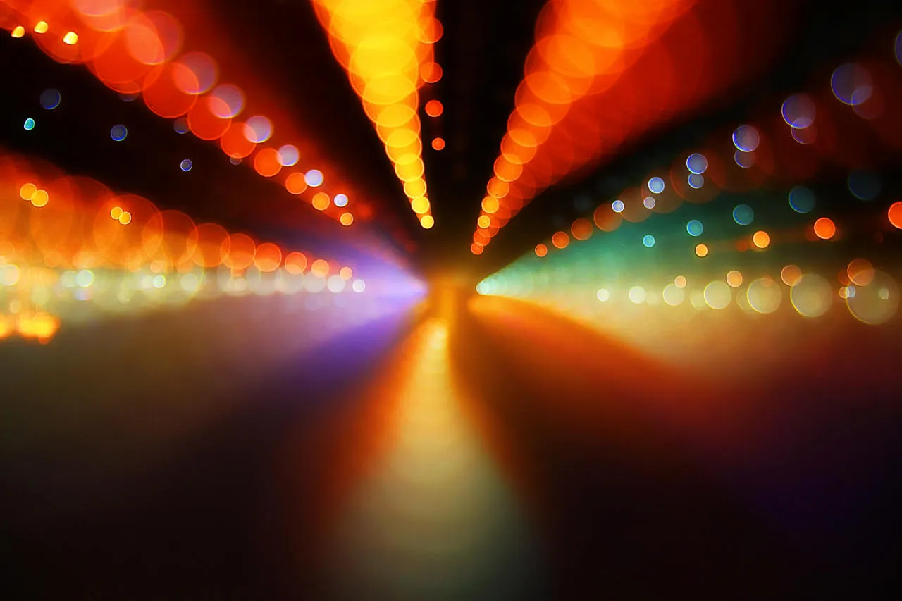
This "abstraction' competition has brought out a lot of often-seen subjects: raindrops on windows, oil drops in water, macro shots of plants, blurred photographs of landscapes, long exposures of colored lights, and that hardy perennial, reflections on water, of which this photograph is of course an example. I have said this in other reviews, but it is worth repeating: if you want to do well in a photography contest avoid picking a subject (or an approach to the subject) that has been "done" hundreds of times before by hundreds of other photographers. But if you choose to ignore this advice, then be certain that your photograph has something that makes it stand out from the thousands of others similar to it. Make sure that your level of technical execution is off the charts, and/or that your composition is especially interesting, and/or that you approach the image in a way that suggests you recognise that you are dealing with a photographic cliché.


I would have made this photograph one of the Top 10 if I could have figured out why it fits in the category "abstraction". Granted, the category allows for a lot of room for discretion, and everyone will have their opinion on what constitutes "abstraction", but still, a man standing in a tunnel making himself look like a Christmas tree doesn't fit my own view of abstraction. On the other hand, I admire the creativity, imagination, skill (and fearlessness!) that went into the production of this image. I'm guessing that it took more than a few "takes" to pull this off. But the result was worth the effort. The photographer's sense of humor and adventure come through strongly and the level of technical execution is high. Just for his own interest, the photographer might like to re-work the colour balance toward the cooler end of the spectrum to see if he likes that better. The reddish colour cast is a little too pronounced for my taste.


The photographer's idea here was very good. This has the potential to be an interesting image with its combination of light, shadow, angles, and textures. But the photographer needed to think more carefully about what he was trying to accomplish and pay more attention to detail. Some suggestions: i) crop out all of the blank space on the right-hand side of the photograph, it adds nothing to the image; ii) crop out the glass on the left-hand side; the glass itself adds nothing; the viewer, on seeing the shadow pattern on the window-well, will know that there is a window to the left without actually seeing the window; iii) produce the image in black and white.


I'm usually not a great fan of heavy post-processing, but I make an exception here. The way the photographer has worked this image fits well with the idea of "abstraction". He's taken a corner of a building and reduced it to a collage of lines and rectangles. But given that this image is all about lines and angles, the one important thing that doesn't work for me is the neglect of perspective correction. I would have straightened out the building to make the long vertical lines parallel, straight up and down.


