


I'm a real sucker for a single point image and circles always attract the eye so this ticks all the boxes.
This is some great design on behalf of the architect and your image has me asking questions on the use of the the circles and wanting to know more about the building which is exactly what good architecture photography should do.

The juxtaposition of hard grey building and lush greenery is fantastic in this shot and really shows off the organics design of the area.
The drift of light from top to bottom draw the viewers eye down, personally I would have lifted the bottom a little as it gets a little dark but it's a minor thing on a really good image.

A really nice one point perspective of a great subject, car parks are a favourite of mine because architects often use these amazing patterns on the facade, which are great for us photographers!
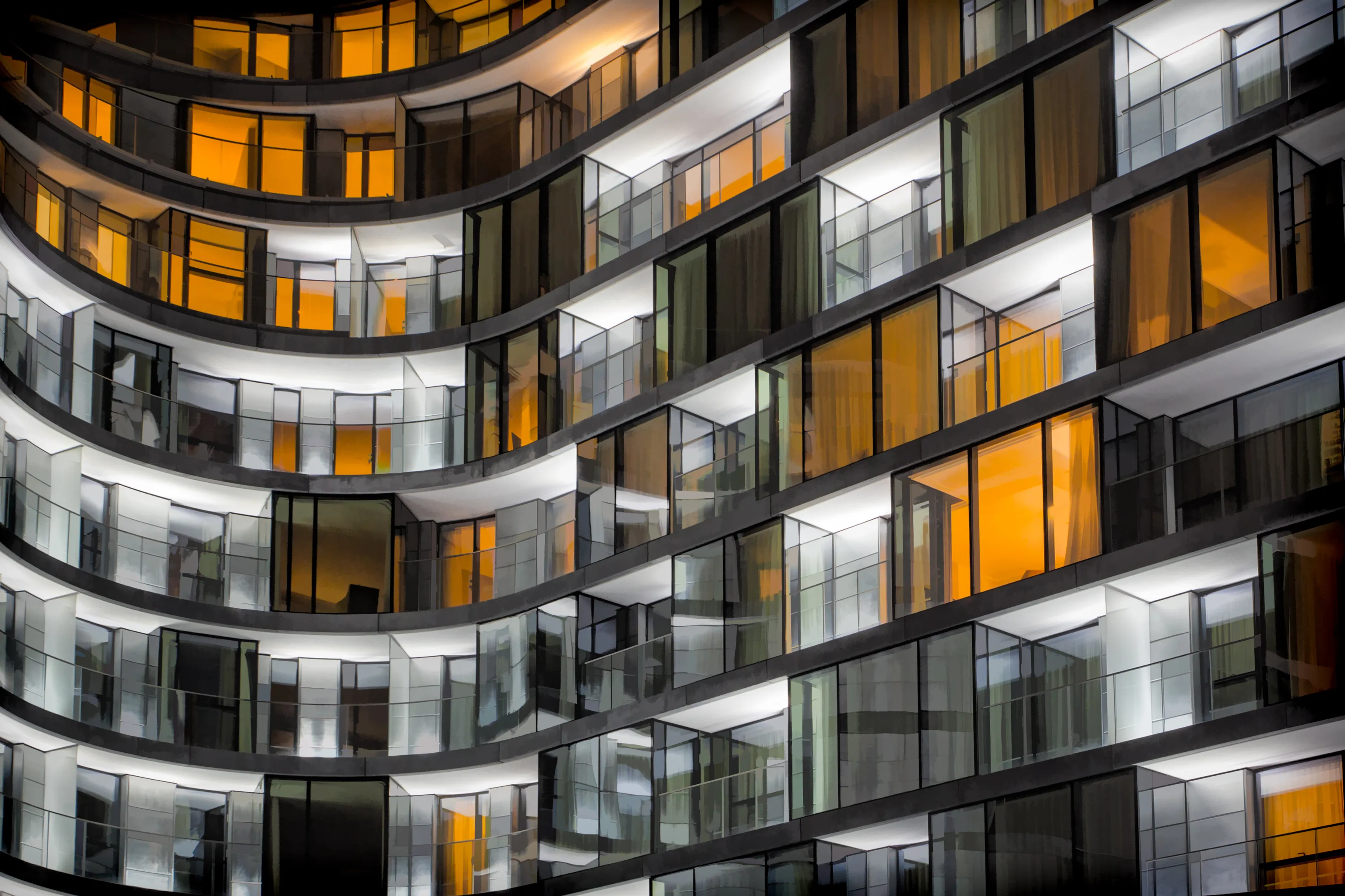
You've chosen a great angle, handled all the uprights really well and the tones are perfect so well done.

I was a bit torn on this image once I read your description as i'm a bit traditional but it's had the greatest impact on me when viewing any image in this competition so I believe it deserves the top spot.
It is instantly recognsable yet alien at the same time and you have done really well to make it not instantly obvious what has changed which has an almost optical illusion quality to it.
Well done on the winning image.
4,276 Images entered


Meet the expert judge

Very sci-fi feel to this one, the different hues of red are fantastic and reminds me very much of a Pantone book.
The gradient of light across the image is nice and I think you have done really well choosing this angle to shoot from. Has me asking questions on if it's an upright building or set of steps or piece of artwork which is good.
1,421 Photographers


I really like this shot, perfect example of rule of thirds and putting something on those grid lines really points the viewer where to luck.
I would have liked to have seen more consistency in the colour to place this higher, the whites drift to a dirty grey and we lose that really punchy red towards the right of the image.


I've seen this building photographed hundreds of times but this stands out among the rest.
Beautiful treatment and the photoshop work really works to add a sense of drama to the scene which keeps the viewer looking.
Black and white is the perfect treatment for this and really works with the tonality and contrast you have gone for.


Brief
See more contest details
Get closer to that building, look for detail, pattern, shapes, ignoring the wider context and setting and instead focussing on those things that the architect and builders would (hopefully) have obsessed about. Images can be interior or exterior shots of any kind of building.


A really nice shot which could easily be on a poster or cover for a movie.
The colours in it are great and the treatment you have given it to bring out the warmth really works.
Personal preference but I would remove the watermark (guessing it is a signature?), at first I thought it was an error in the image.


