


Unsurprisingly, there were lots of entries featuring Tower Bridge in London. This entry from Lee Acaster stood out for me because it was just so different in its approach. A very dark and brooding sky gives the image so much atmosphere with Tower Bridge just lifted out of the gloom against the contrasting lightness of the River Thames. I like the way your eye is led along the river from the right of the image accentuated by the dark section on the bottom left.


Phil's decision to process this image as black and white was definitely the right choice. The contrast of the white structure against the darker background gives it an almost three dimensional feel. I love the fact that no matter where you look, the careful composition always leads you to the same focal point right in the centre of the image. Phil mentioned in the notes that it needed early morning light for the best result, and the lighting is definitely what also makes this image. It comes in low from the left to illuminate the white structure and cast those beautiful shadows on the walkway to give something else for the eye to explore! Lovely image, nicely composed and very well executed - a very worthy second place.

The Infinity Bridge in Stockton-on-Tees is a beautiful bridge to look at, and Clive has captured it very nicely here with his shot of a section of it. He has exposed it just right not allowing the white section of the bridge to blow out yet keeping some detail in the darker areas such as the sky. An extremely long exposure time of almost four minutes has smoothed out the surface of the water, acting like a mirror and nicely reflecting the support legs. I like the way the composition makes the top structure of the bridge look almost like a roller coaster, leading your eye to the left, then swooping down and back up again. A nicely shot image with lovely colours - a definite Top 10.


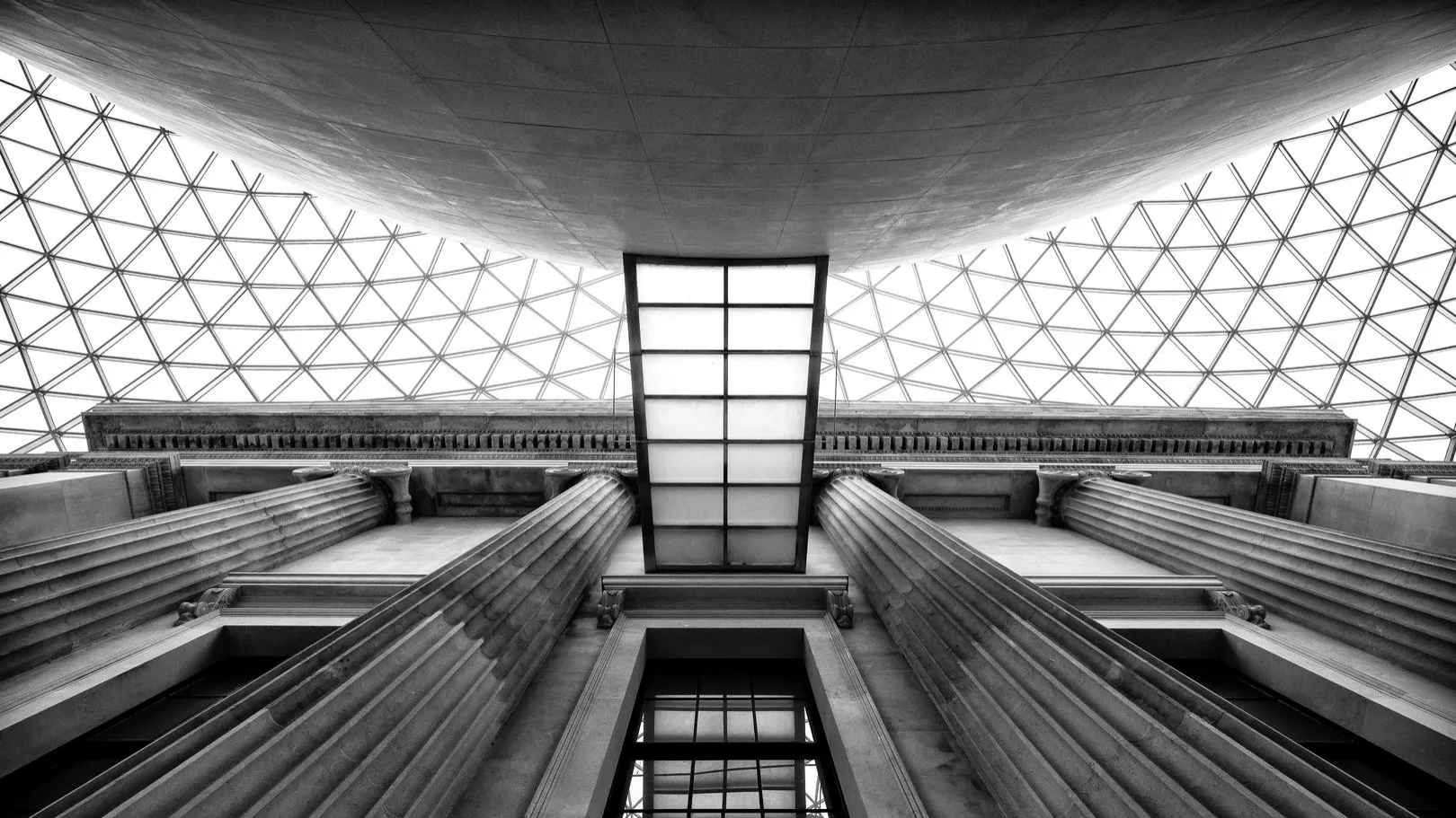
This image of an aerial walkway in the British Museum in London wouldn't be most people's first interpretation of this competition's theme, but I love Aaron's way of thinking! It works superbly in black and white and the composition is fantastic. I love so many things about this image: the way the two central pillars lead you up and into the centre to the focal point of this picture, the careful positioning when taking the picture to get the reflection of the walkway in the window below, the huge curved wall at the top acting as a frame, the geometry of the roof, and the exact symmetry of the shot. Very careful attention has clearly been taken here with regards to the camera position and it really shows. A fantastic shot. The superb composition, great execution and a brilliant interpretation of the theme make this my winning shot for this competition.

Of the many entries featuring The Forth Bridge this one stood out for me, and it shows both the Forth Bridge and the Forth Road Bridge. The composition of the shot is its biggest strength with both bridges leading your eye in from the edges of the frame with the foreground detail also leading the eye into the picture. Aaron has used a 6 stop ND filter along with a small aperture to achieve an incredibly long exposure time of four minutes. That resulted in the surface of the bridge being completely smoothed out into a glass-like finish. The long exposure time has also resulted in a slightly ethereal effect on the slowly moving clouds, which is helped by the even effect of the dusk lighting.

Myanmar (Burma) is a popular destination for photographers and this was one of many images of this same bridge, the 1200 metre long U Bein Bridge that spans Taungthaman Lake. This shot from Andy Ferrington stood out from the rest due to it's simplicity and yet fantastic visual impact. I can't quite tell if the contrast of almost pure black against a white background is down to just careful camera exposure and the bright even sky, or whether it was helped by some additional Photoshop-type tweaking. Whatever it was it works perfectly and suits the subject matter to a tee.
613 Images entered
Brief
See more contest details
Upload your best photos of bridges and crossings, whether taken last year or last week. Live Crowd voting, Expert judging by Duncan Lawson, and great prizes from theprintspace.


Meet the expert judge
348 Photographers
72,275 Ratings


This shot works so well in black and white - the bridge really stands out against the darker sky. It looks like Diego has used a polarising filter which has darkened the sky beautifully, and in black and white that really has a lovely effect. I would have made, or tried, a couple of changes to the image. Whilst people in this type of picture can be a good thing, as they often give a sense of scale or a human element, I feel that the man in the foreground is too dominant and the image would have benefited from waiting until he was out of frame. I would also have tried to get more of the bridge, to show that fantastic shape of the arch and less of the buildings in the background to the left. I can see that it's not easy as the walkway is raised, but if there was another vantage point that could have been used it certainly would have helped.

I like the effect that Tim was trying to get in this shot of the Empire State Building framed by the Manhattan Bridge. My thoughts, though, are that it hasn't done justice to either subject. We don't see enough of the bridge, given the theme of the competition, and the main focal point is the Empire State Building, albeit half obstructed by another building. I like the thinking behind the shot, but I'm just not sure if the execution is there given the brief.


I know this bridge very well, having shot a series of images of the Imperial War Museum North at Salford Quays. It's a great looking bridge and offers lots of opportunities for some great shots. I'm not sure what the reason is, though, for the two people in the shot standing and looking at each other. They're only detracting from the picture and personally I would have left them out and concentrated on the bridge. They could have maybe been incorporated another way, perhaps using a long exposure with them walking along the bridge to give blurry/ghostly effects, experimenting with different shutter speeds for the best result.

This is a beautiful shot from Steven Grogan with excellent composition and spot-on exposure. The 30 second exposure has smoothed out the water surface allowing it to beautifully reflect the bridge, whilst still keeping the exposure of the rest of the image in check and creating a nice effect on the slowly moving clouds. Steven shot this at the perfect time at dusk when it is dark enough that the lights all show well, but it's still light enough that the sky has that nice blue colour to it. The composition is great leading the eye to different parts of the image and it has a very pleasing balance to it. Great shot and a well-deserved third place.


The Gateshead Millennium Bridge was a popular choice for entries in this competition. This image from Stephen stood out for me for a number of reasons. I liked the nice contrast of colour temperatures between the warmer bridge lights and the sky with its reflection in the water. The 8-second exposure has smoothed out the water enhancing the reflections and I like how The Sage behind has been positioned. I think the shot would have benefited from cropping out the block of apartments on the left of the picture as they are distracting, or even panning right a bit which would have left them out and included more of the Tyne Bridge. If not for that this shot may have made it into the Top 10.


I really liked this image of the Ouse Valley viaduct, or Balcombe Viaduct as it's also known. I like the way that Daniel has composed it: it's almost like the tunnel effect you get when placing two mirrors directly opposite each other. The black and white treatment and boost in contrast enhance it perfectly. I think the shot would have benefited from the large white mark (paint?) on the left of the frame being cloned out as my eye kept getting drawn to it, detracting from the rest of the picture.
