


Such an odd image - an such a refreshing one to see in a sea of chimney stacks and smoke. A really nicely 'seen' photograph that illustrates one of the major environmental disasters. I like the graduations of colours and I like the way the light plays through the bottles. I also like the word 'earth' - whether deliberate or a happy accident - gives an excellent punch to the frame. A well seen image that does, by its simplicity, a very good job of sticking to the brief in an understated way. Nicely done.


I really like this. Despite the fact that it's a conversion from colour to black and white and suffers a little from softness, it retains a graphic strength and is beautifully composed. I like the dreadful symmetry of the chimneys and the figure in the boat, paddling valiantly is quite tragic. The ripples on the current also add a beguiling texture to the frame. Simple and elegant. Congratulations. An entry that is both beautiful and depressing.


1,368 Images entered

Brief
See more contest details
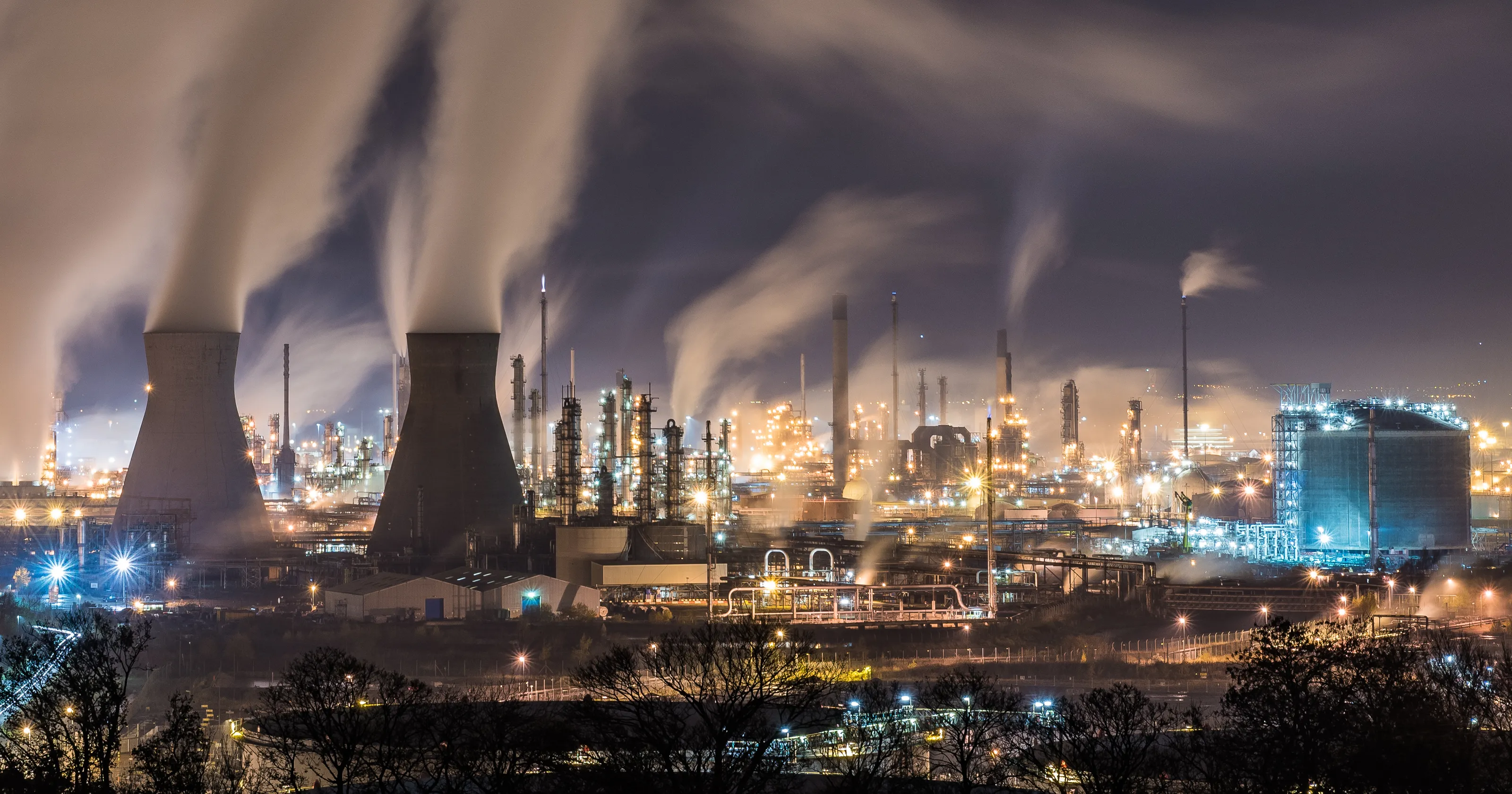
During 2021 we’ll run a series of contests exploring the problems that our environment is facing, and the solutions that are emerging to help us tackle them. Climate change is real, accelerating, and urgent. Humanity’s production of greenhouse gases is warming the world, resulting in increasingly large-scale shifts in weather patterns, and other damaging effects. In this contest we’re focussing on the things that we humans do that emit greenhouse gases, and that we need to stop doing, or do in fundamentally different ways, to slow down and ultimately halt climate change.
804 Photographers
41,228 Ratings
Meet the expert judge


I like this. It has an almost William Eggleston or Stephen Shore feel. It's simple and direct and elegant. That said, what would elevate it to a better image would be more thoughtful composition and more even light. I can live with the central column being shrouded by darkness but the light fall-off to the right is distracting. Images that work like this are about graphics and colour. Perhaps you might have gone back and worked on a tripod to make all the angles true and either (carefully) used a longer shutter to coax out all the light possible or lit the scene yourself. That said, this is well seen and on the right track.


I like this frame and it almost works to do what it's created to do - tell us about pollution (including I'd suggest light pollution) but I find the people in the middle distracting and there's a nagging though there that this isn't as abstract as it might have been - and consequently as strange and impactful as it might have been. It reminds me of Ernst Haas' early colour work on the city in Life Magazine and is all the better for that - and a little more thought might have made a really strong frame. Good effort though.


Not bad: on brief and an 'attractive' frame. That said, I wonder whether a bit more thought might have made it stronger? The cyclists are fine but I find the figure in the centre distracting. a good deal of photography is timing - it's almost there but not quite. Sometimes you have to work at a situation and this feels like a snap decision. Good effort in seeing the potential in the situation though. Nicely done.

Very nicely framed. It would have been easy to try and include as much of the scene as the photographer could - but this is a brave composition that isolates and concentrates the brutal shape of the pylons. I like the wires that carry one's eye in and out of the photograph and pull us towards and back from the pylons themselves. I even like the simplicity of the almost monochrome blue. Graphically strong, it just lacks a little something extra that would make this a winner. That said, a very good attempt.

This is a sound frame in that it illustrates a point about waste and pollution but it feels like a photograph taken in a hurry with too little thought about critical composition. This is not an easy image to make but I'd have liked to have seen the cows delineated more and a little less distortion to the pylons. There IS a photograph in here somewhere just screaming to be taken. But this isn't quite it. A different lower or higher viewpoint might have worked better. Good effort however.


I like this very much indeed. It's well seen and very well executed - a good idea well done. It ironically lacks however a focus - I love the repetitive pattern but a single colour of car or something similar to draw the eye would elevate it. Such a shame - these things are sometimes out of our hands as photographers. But this is as good as it might get I suspect. well done.

This is a strong frame with a great deal of potential. I like it as it is but if its to succeed as a strong portrait, it's the little details that matter. I dislike her hat overlapping the horizon and perhaps the rake could have been in a different (upright?) position to be clearer. I think it's also a little oversaturated. That said, I like the incongruity of it but perhaps I'd have preferred to see her working. Still, a fine attempt.


Despite the simplicity of this image and its compositional difficulties, it tells an important story. It works only because the man is looking backwards however its well captured and has an odd quality that makes one feel uncomfortable about being part of the process of flying causing such environmental damage. An interesting effort.


I like this and it does a decent job of showing Delhi's appalling air quality. That said, it feels very compositionally loose in that I can't relate to the people breathing the air at all because there is no emotional connection between them and the viewer. The Photographer feels detached and perhaps trying too hard to make a point. I like that the scene is clear and 'clean' but this is 'just' an image of a fog Red Fort morning - it needs more of the photographer in it. That said, it's a decent effort and nearly there.


This is a 'very nearly' image. It has all the right elements - the cars and the water and the lights - but it's a very distracting grey wall at the bottom of the frame that detracts from what it's trying to say. I wonder if the photographer had additionally focussed more on the traffic through the fountain we might have had a more intriguing, possibly abstract image. Good effort though for seeing the composition in the first place.

This is a really gorgeous frame - despite its obviously problematic theme. I like the composition that frames the chimney to one side and I like how the photographer has managed to 'balance' the smoke with the cloudscape. It has a dreamlike quality that is added to by the mono-colour. A fine image that has required careful exposure. Nicely done.


This is a really strong and emotive image backed up clearly by a great deal of technical knowledge about process. As a photograph however the composition is a little lacking. Tighter framing might have added to the impact. I like the plastic curtain at the top but the wall and the yellow signs distract - they're the brightest thing in the frame and one looks at them first before the eye settles on the (important) subject matter. Good effort though.

This is a really good idea but sadly the execution lets it down. The composition of the industrial plant is solid enough but the addition of the car - perhaps a polluting motive in itself - lets it down. It's just too distracting. A good idea that just needs a bit more thought about exactly what it wants to say.


