
The more I look at this image, the more there is to appreciate, and through my judging it crept up the places to reach the top! On first impression, the scene looks very casual, but I imagine there has been a great deal of considered thought that went into the composition and setup. The join across the wood is cleverly positioned across the upper third line, with the main subject elements on a diagonal across the shot. The smaller eggs and nest have been appropriately positioned across the join in the wood to avoid the line looking to harsh or distracting. The direct overhead view we have in this image is very attractive too, especially with this specific subject, as we can clearly get an impression of the smooth curves of the eggs and the rounded nest. Colouring across the shot is great, with the chocolate looking very realistic, and the grey/brown tabletop adding to the muted, rustic mood of the shot. A very creative shot, a subtle but very strong winning image. Congratulations.

A well focused image which, through your choice of a fairly wide aperture, draws full focus onto the chocolate stack to make it the star of the show. In my view the image may have been stronger still if there had been something in the far background on the right side to fill the empty space, which is also quite bright too. Alternatively, the spoon could maybe have been angled slightly, and then enabled a tighter crop on the chocolate, again removing some of the empty space. Minor points really, as I know set-up of a still life scene is usually more of a challenge than the actual capture. Great image, well done.
410 Images entered
305 Photographers


As a fair number of entries in this contest will confirm, food in general, and chocolate specifically, is extremely difficult to photograph well. For me, successful food photography should show the product in a realistic, natural way, well lit, in clear focus, and potentially stimulating not only the vision, but the senses of smell and taste too - the aim should be a deliciously tempting subject. You have been successful in your efforts here, hence a place in the top three. The chocolate being drizzled down from above really completes the scene, again not easy, as get it wrong, and the whole setup needs to be cleaned and redone, a potentially time-consuming and messy process. Being critical, I may have been tempted to crop a small amount off the right side, as the dark line very close to the edge on the background could be a little distracting. Also, the choice of "props" is a little mismatched for me, as the coffee beans do not seem to be related to the chocolate or mint - maybe some similar sized broken chunks or shavings of chocolate, or some hazelnuts, would have matched a little better than coffee beans. That is only a small point however. This is still a fabulous image, well deserving of its second place finish. Congratulations.


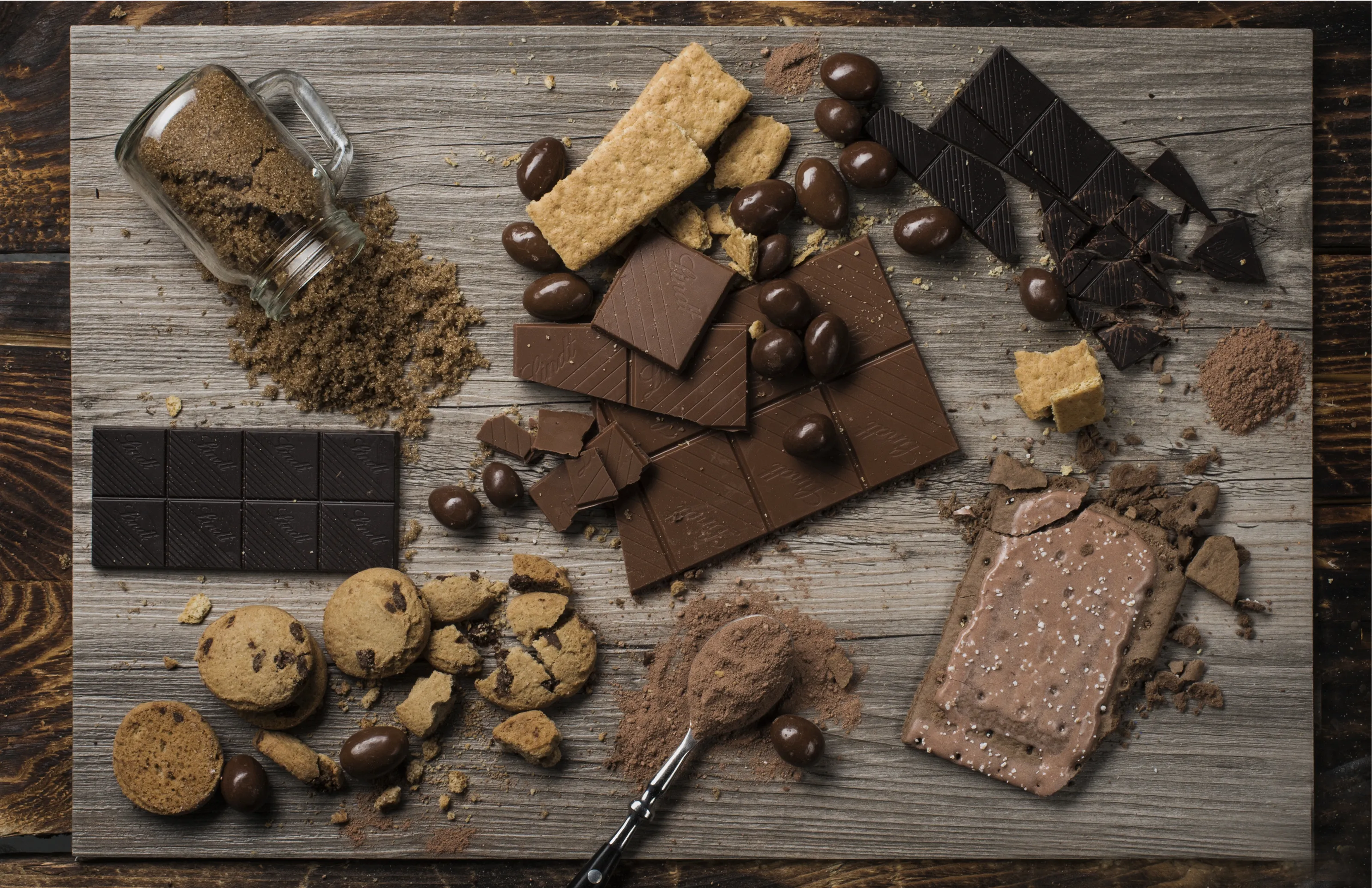
A scene of chocolate and spices which is very pleasing on the eye, simple but effective in the set up, and a well executed capture. I like the rustic feel to the shot, which suits the subject well. Lighting has been well controlled, with no harsh shadows or highlights, and the focus clearly on the squares of nutty chocolate. Great colouring across the entire scene, realistic for the chocolate, and the entire scene being composed of soft browns and cream works really well. Lovely image, very tempting, well done.


I was undecided on this image for a while, but eventually decided it deserved a place in the top ten. To get my uncertainty out of the way first, I am unsure of the purpose of the two floating chocolates. For me a better image could perhaps have been achieved by positioning the floaters, and a couple more chocolates onto the plate to create a more triangular display, adding some height to the chocolates on the plate. However, that is just my personal view. Why I felt it deserves a placing is the great lighting you have used, which shows the texture and form of these delicious looking chocolates. You selection of a narrow aperture has retained sharp focus from front to back, which allows us to see every detail. You have successfully been able to show colour difference between the milk, plain and white chocolates, and all look natural and realistic, ready to be plucked off the plate. Great image (floating chocolates aside!), well done.

An image which shows you are as skilled in making the chocolates as photographing the chocolates! Great product shot, and if you sell your products this would be a great image to use for the advertisment, as the chocolates and the box are beautifully shown in a stylish and rather luxurious way. The addition of the pearls, whilst nothing to do with chocolate itself, help describe the little moment of luxury someone would be buying into if they purchased these beautiful chocolates. Great viewpoint, capturing the best of the box and the chocolates inside, depth of field spot on to get the combination of sharp focus and softening into the frame, and importantly for the subject, accurate representation of the colours - as mentioned in other comments, not always an easy thing to achieve. Great image, well done.


This image has good potential. I especially like the tight crop and the clear focus on the swirls of frosting. For me what lets the image down is the very strong yellow colouration. I am unsure whether this was a result of some auto correction, over-correction of the colour balance, or deliberate choice, but for me the colouring is too unrealistic for a photograph of food, and has kept an otherwise great image out of the awards. (Should you wish to do so, toning down the warm yellows should be straightforward in basic processing, to bring the chocolate back to chocolate colour).


Meet the expert judge
17,049 Ratings
Brief
See more contest details
The sight of chocolate, arranged into some scrumptious scene, is enough to turn most people into photographers; but capturing its magic isn't as easy as might be expected. Chocolate is a truly sensory experience - involving smell, taste and touch - and the best photos imply all this through the eyes alone. Get the temperature and the lighting right before shooting, and you might just hit the sweet spot.


This image has good potential as it can add to a food photography image to include some human element, such as we have here. The focus on the chocolate chip cookie we have here is good, but what for me is unfortunate here is the choice of what looks to be some added processing effect, which strangely, in a food photograph, looks rather like mould or dirt - just the opposite of what a food photographer would hope to achieve in their message. My advice would be to select the processing effect with the subject in mind. Otherwise a shot with great potential.


There is a lot I like about this image, and it was close to a top ten placing. It can be very difficult to arrange a set up such as this, and it has almost been very successful. Where I feel the arrangement could be improved is that the little circle of five almonds look too formally positioned compared with the rest of the fruits and chocolates. If those five nuts could have been a little more casually placed, filling in the space to the right of where they are at the moment, I think that would have improved the image. Still worthy of an award, focus and white balance are all good, with the chocolate coming into the shot on a diagonal, which is pleasing on the eye. great work.


This is a well composed image, aided by the casual scattering of chocolate chips and the two packets of goodies cutting into the frame on the top left. The lighting coming from the right could maybe have been diffused slightly to balance the exposure across the scene and avoid the blown highlights across the front of each plate. For me however, what lets the shot down slightly is the dominance of the words on the plate, which take over from the subject of this contest, ie the chocolate, and viewed out of context, the actual words do not look to have any particular relevance to the subject. Maybe ideal as a promotion for personalised plates, but here slightly overtaking the chocolate subject. Still a great shot and worth a commendation.


A soft, gentle image, straight off the pages of a foodie magazine or cookbook! Your composition and framing have worked really well, as it is never easy when creating such images to know exactly where to crop and how much of the subject to show in the frame. I love the matte finish and the limited colour palette, with the grey, soft browns and red, all harmonising nicely. The choice of colouring of the cloth with the raspberry work perfectly together, creating a natural scene, which illustrates very well why chocolate is something many of us love! Well done on your top ten placing.

This is a lovely bright image, abstract in nature, with the frame filled with bold colours of the shiny wrappers. There were several similar images in this contest which photographed chocolate which was wrapped, and I made the decision not to include them in the awards. One of the skills in creating a great photograph of food of any description, is to accurately represent the colour of the food so it looks realistic, and therefore appetising. This is especially true of chocolate, which is notoriously difficult to achieve accurate colouration. That is the reason why this and similar images were not awarded, as I felt the actual subject of the contest should be visible in shot. A great image, but unfortunately not for me in this contest.


For me this image is nearly, but not quite. It demonstrates the great difficulty in arranging a scene for food photography, or indeed any still life setup. In many cases, the best effect when photographing food is achieved by an overall natural, casual feel to the shot, which obviously entails some precise (but very casual looking) placement of different elements. Overall I think the framing is good, and I like how the plate has been cropped into on two sides, so the frame is full. Where I think this image could be improved is by making some adjustment to the angle of the red cloth, having it more on a diagonal than horizontal to create more dynamism, and for the nuts in the foreground to have a more "random" scattered look, rather than precise placement with no overlap. Likewise with the chocolates on the plate - ideally more chocolates were needed to give a more casual feel (who needs an excuse for more chocolates?!) Technically no problems with lighting, focus, depth of field etc, but maybe worth experimenting with different set ups, and angles, where just a small alteration can make a great difference to the resulting image. Great potential though.

The bright, bold colours, contrasting with the black background, make this image stand out. Importantly for me in this contest, the chocolate is still visible for what it is, and whilst the bright colours of the surface decorations look great, you have been successful in showing the chocolate centres with a realistic colouring. Unfortunately there is no camera data attached so I cannot be sure what size aperture this was shot at, but I imagine it was a fairly large aperture which has rendered most of the scene out of focus due to a shallow depth of field. I would have been tempted to experiment with a slightly smaller aperture, which would have resulted in the front two chocolates being slightly sharper. However, the central chocolate is sharp and depth of field is a very personal taste. Lovely image.


Very close within the top three placings, this image is everything a photograph of food should be. Technically the image is great with regard to lighting, focusing, composition and appropriate depth of field. The front dessert is in sharp focus, with the others still recognisable, but falling softly out of focus further into the shot. Whilst I imagine this is a staged shot, the setting is natural and realistic, a table with 4 spoons for 4 desserts, nothing unnecessary or incongruous, making these rather delicious looking chocolate puds look especially tempting and ready to eat. A clear, clean, professional looking product shot, congratulations on your third place finish.

I had to include this one in the top ten, as when I first viewed it, it elicited a very audible "ooohhh" as it looked so tempting - a sure sign of the success of a food image! I think where it succeeds is in the close up view and the clear focus. What for me is especially inspired, is the tempting peak of peanut butter on the spoon - you may have been lucky in that it just looked that way when you scooped a dollop out of the jar, or you may have spent an age sculpting the peanut butter just-so, but it serves to make the whole shot irresistible. Maybe a slightly tighter crop on the left to balance the image, but a super close up image - well done.


I like the simplicity of this image, with the off centre composition, uncluttered background and natural colours. What sadly just lets the image down is that no part of the subject appears to be in sharp focus. Looking at the camera data supplied, the combination of slow shutter speed (1/30) and high ISO (3200) indicate the image was taken without a tripod, so it is possible your choice of shutter speed was a little too slow to hold the camera perfectly steady throughout the shot if shooting hand held. However, you obviously have an eye for a great image (and also making chocolates!)