


The connection between the two subjects is what draws me to this image, that little bit of eye contact is great!
The exposure is handled well with none of the sunlight coming through from the right-hand side blowing out the colours but I would have liked to have seen the two boys in one of the pools of sunlight just to lighten them a little and make them stand off from the background.


A really interesting shot that although roughly appears to conform to the rule of thirds also breaks nearly everything about framing you will ever be told by putting the subject in the bottom right of the image, but for some reason, it really works!
It's balanced on both sides and almost has a triptych nature to it due to the bridge separating the frame up and there is something to find in each frame.
Cool shot.


I love this shot.
The vibrant pop of colour stands out really well in the contest and I love your take on the theme using the "corridor" of sand down to the beach to frame your subject.
The quad bike just distracts my eye a little bit which is why I didn't place this higher but I think it's a fantastic shot!

A late addition to my top 10 but really glad i've added it.
A beautifully balanced shot with the opening spaced equally in the frame which really satisfies the eye.
The colours are great, which is what initially drew me to the shot but the addition of the young lady just walking out of frame is what really makes it for me.
3,448 Images entered

There's been loads of shots of this location for the brief and this is by far my favourite.
Having been stood here myself I think you have captured that wonderful atmosphere the stained glass windows create with the light inside the building and it almost looks like a painting.
A really good example of the Fibonacci spiral too, using the staircase to draw the viewers eye round the image is great.
1,290 Photographers

This image still has a great impact on me, I think in terms of a graphic shot, it's just great. and looks so good when viewed full-size on a large monitor.
You have handled the exposure well here, balancing the white and blacks beautifully and even getting a little bit of gradient across the grey in the back which isn't easy to do.
Nice shot.


Another beautiful shot, congratulations on two top 10 images!
Colours work great on this and make it really stand out which is what originally drew me to it.
This one really ticks the corridor brief and the perspective is great, really drawing the viewers eyes through the image to the subject of the gentlemen walking away from camera at the back of the shot.


This shot looks like it's come straight out of a coffee book.
That slight bit of motion on the cat from your slow shutter speed really takes the viewer's eyes to where it's walking and you have handled the exposure across the whole image really well as it goes from shadows to the bright white of the snow.
The perspective works really well here too and the ceiling works to take you further into the image.


This was in my top 10 for a long time but was edged out ever so slightly so congratulations on a great image!
Having walked these stairs myself I think you have captured the feel of the place brilliantly.
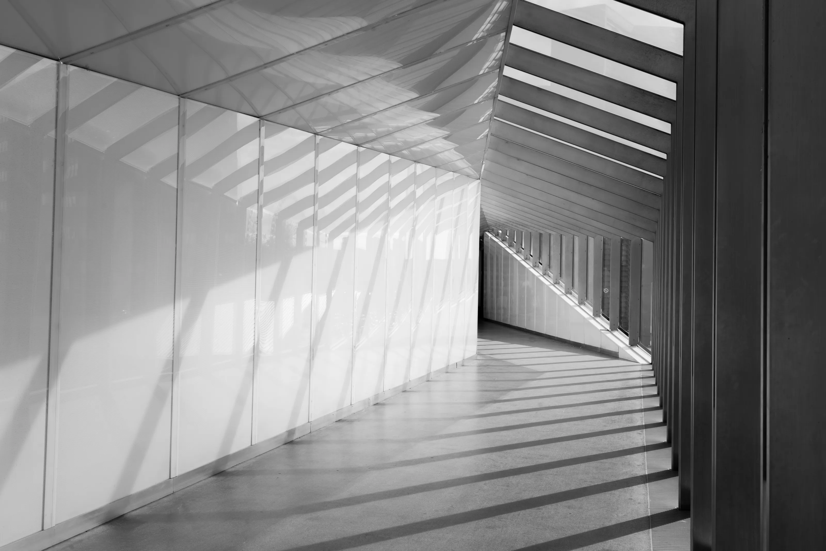
It's framed really well, with the perspective drawing the viewer's eyes through the image and the vignette works well to focus the viewer all the way down the corridor.


This is a great shot that looks like it's lit straight from a Broadway musical!
Great take on the brief with the corridor framing the subject really well.
The only reason I haven't ranked this higher is there are two points of highlights behind the subject (which I'm guessing is where the actual light is) which really draw my eye away from the subject.
Brief
See more contest details
Corridors and hallways range from bare spaces that do little more than connect rooms, to more elaborate affairs that welcome visitors with a grandeur that aims to set the tone for the house that lays beyond. They can often be overlooked as photographic subjects, but offer fantastic opportunities for symmetrical compositions, a focus on detail, and for other playful arrangements of the various door and wall joins that are packed into a relatively small space.

This is a really well framed image, ticks all the boxes for the rules of thirds lovers!
The colour treatment is great and works to transport the viewer to this area of the world.
I don't even mind the little bit of camera shake from your slow shutter as it almost matches the gait of the woman walking.

This a great documentary shot of a side of society which many people would feel uncomfortable photographing so kudos for having the confidence to go out and take images like this.
It's framed really well with the gentleman on one of those rule of thirds lines and the fact that area is the lightest really draws the viewers eyes to that area to highlight the subject.
Great shot, well done.
Meet the expert judge


I think this a really good documentary-style image and each time I look at it I see something a little different.
The gentleman in the foreground is obviously the subject but the security guard on the left just balances with him really well to create a nice triangle with the groups of people.
My one criticism is that the tower in the background isn't in the centre of the frame, a little step to the left and it would have gone from good to great.


Graphically, I absolutely love this shot!
It's framed really well, balanced nicely on the top and bottom and you've done a great job of keeping all the colours separated across the tiling which is tricky in such a bright shot.
It's not 100% hit me in terms of ticking off the title of the brief which is why I haven't ranked it higher but it is a great shot.