


The first thing that hit me was the bold use of colour. That said, it's not through overly saturated post processing, but a careful choice of subject matter. I really like the tightly controlled fall off towards the back of the image, retaining the viewer's attention towards the foreground, and that rather wonderful spoon of spice. Really nicely composed, lit and executed.


There's a lot to like about this image. I really like the colours, texture and lighting. The use of a single overhead light has worked especially well, bringing up the texture on each subject. A little more attention to the editing would avoid the light ghosting seen on right (yellow behind the green of the celery. Also a smudge above the peel of the garlic bulb). That said, still a very worthy Top Ten placement.


It's all in the detail. I love the detail in both the cloth and the aubergine, including the water droplets. Very nicely lit with a single overhead softbox, the contrast is controlled nicely provide excellent detail across the skin, but keeping it subtle enough so as not to become the dominant feature.
Really nicely done.


I'll hold my hand up. I hate overhead food shots, because it isn't a natural viewpoint. But... This is really nicely done. I'm not really talking about the viewpoint, but the choice of colours, the composition and the lighting. It all just works.
And yes, the overhead viewpoint definitely works here.
I'll just go eat my hat.


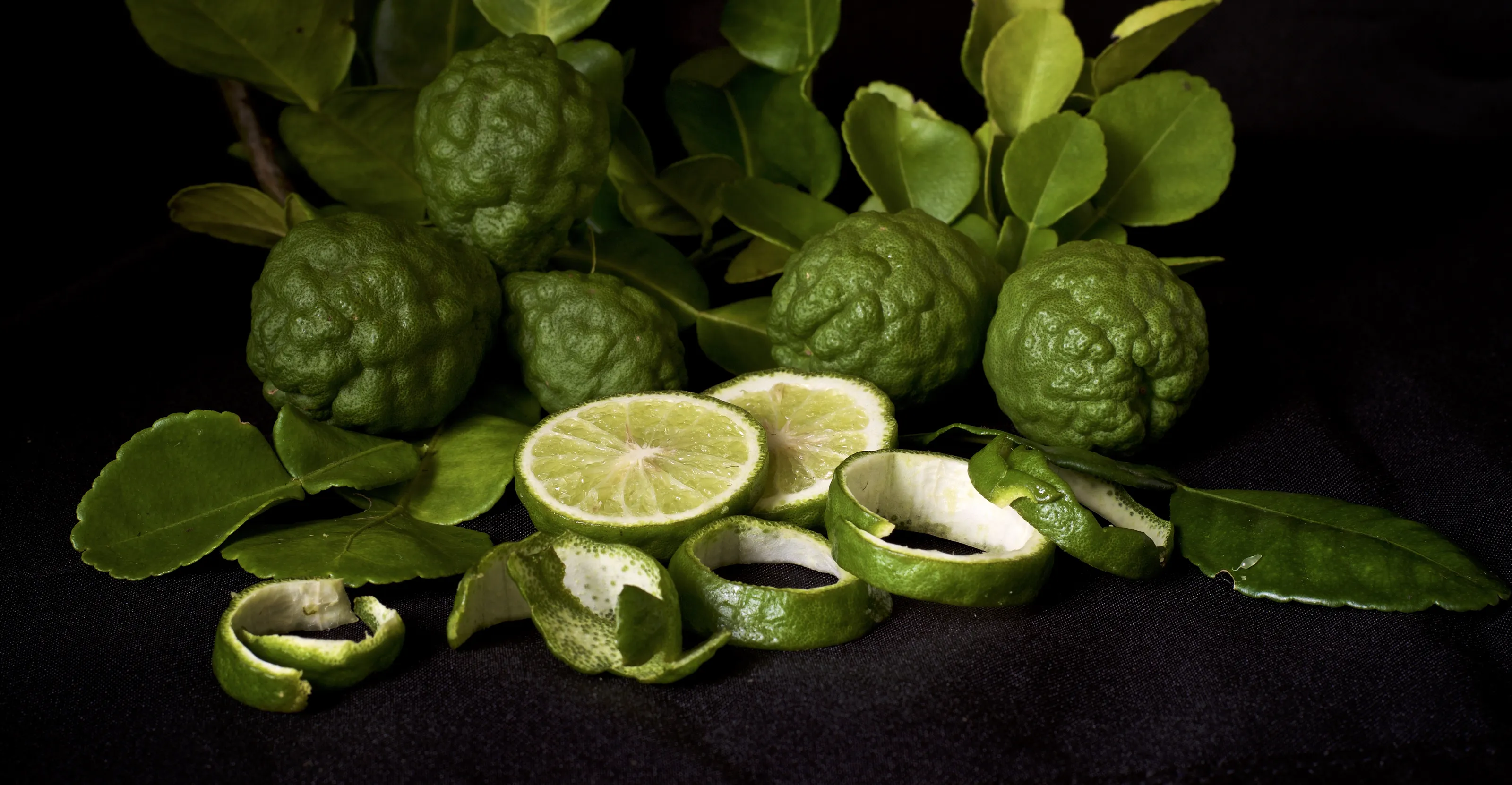
I love the idea behind this image. We've all seen the rude fruit in supermarkets, and the idea of an exhibition of said rude fruit for the fruit republic is certainly a unique one. The lighting is subtle, and lends an exhibitive air to the whole image. Fabulous concept, extremely well executed.
Well done
Meet the expert judge
3,013 Images entered

1,775 Photographers


Still life images are often a rushed affair, even when attempting to copy the artistic style of well known artists from the 17th Century. This image has been carefully crafted, with attention to detail regarding the placement of the fruit and the affect of the light placement. I've produced similar images myself for clients, but I hold my hand up. This is particularly nicely done.


This made me smile. The first time I saw this image, I almost missed the figure warming herself from the flame. Nicely exposed for the flame, without overdoing it, which would have lost the very subtle blue and yellow. It also provided a really nice falloff, causing the viewer to first see the flame, before exploring the image further, and finding our little friend.


Texture! This image just seems to scream it. The use of the egg box was certainly a good move, as the cardboard creates a very rugged support for the garlic bulbs. The dried outer skin of the garlic has been very carefully lit to accentuate it. I also like the splash of colour provided by the green shoots, declaring the image to be of colour, rather than black and white.


Brief
See more contest details
There are very few photographic subjects that are so readily available, and offer such scope for exploring one’s creativity, and approach to lighting and composition. Indeed, still life studies of food have been a consistent staple of art history through the centuries. As well as shooting them in a studio environment, there are opportunities to show them in their natural growing environment, in the markets of the world, or even in the act of being prepared, served up and consumed!
131,409 Ratings


