
This is the one I keep coming back to. The twisted, mossy tree, the cool morning fog flattening the background trees into pale ghosts, the soft directional light glowing through from the right, it's absolutely cinematic. Your placement of the main trunk slightly left of centre, leaning into the open ground, really does feel like the tree is dancing, which justifies the title beautifully. In my opinion you've nailed the postprocess too: nothing oversaturated, the greens stay honest. A standout entry.

What a scale game this one is playing, the tiny seagull against the immense torrent of Skógafoss really makes you feel how small a bird is in that landscape, and the dripping mossy cliff on the left frames the falls without overpowering them. In my opinion the choice to let the waterfall blow out slightly to near-white was right; it gives the bird something luminous to push against. Plus, it invoked my own memories of this place :).


You weren't kidding about the different perspective. turning the mantis shrimp into a neon-edge anatomical diagram is a bold creative call, and it does pull the eye in a way a straight shot wouldn't. Those compound eyes really pop against the deep field of stars. My honest reaction is that the heavy stylisation pushes it more towards graphic art than nature photography. As an experiment in post, though, it's properly striking.


This is so atmospheric. The mist, the warm low light, the three little wading birds spaced almost like notes on a stave, it all hangs together with real grace, and the reflections doubling them up in the still water a chef kiss. Personally I'd darken the foreground shadows so it would give the upper half of the frame more "glow". A lovely, unhurried photograph that sits squarely in the spirit of the brief.


This made me smile, which is half the battle. The cattle egret hitching a lift on a zebra is exactly the kind of cross-species moment people love about wildlife photography, and the graphic contrast between the bird's clean white shape and the zebra's stripes is very nice :). The bird's eye is sharp and its stance feels balanced rather than tentative. If I were pushing it, I'd wonder whether a touch more space above the egret would let it "ride" with more headroom, but the moment is the prize here.


Raw, primal power of nature this is the brief in molten form :D. I like that you've gone vertical, it lets the cone breathe upward and turns the cooling lava fronds at the bottom into a kind of root system, which is a nice visual rhyme with the eruption above. Maybe I would remove the steam from lava in the bottom of the picture, so it would be just black and blazing hot, but honestly the drama of the subject more than carries it.


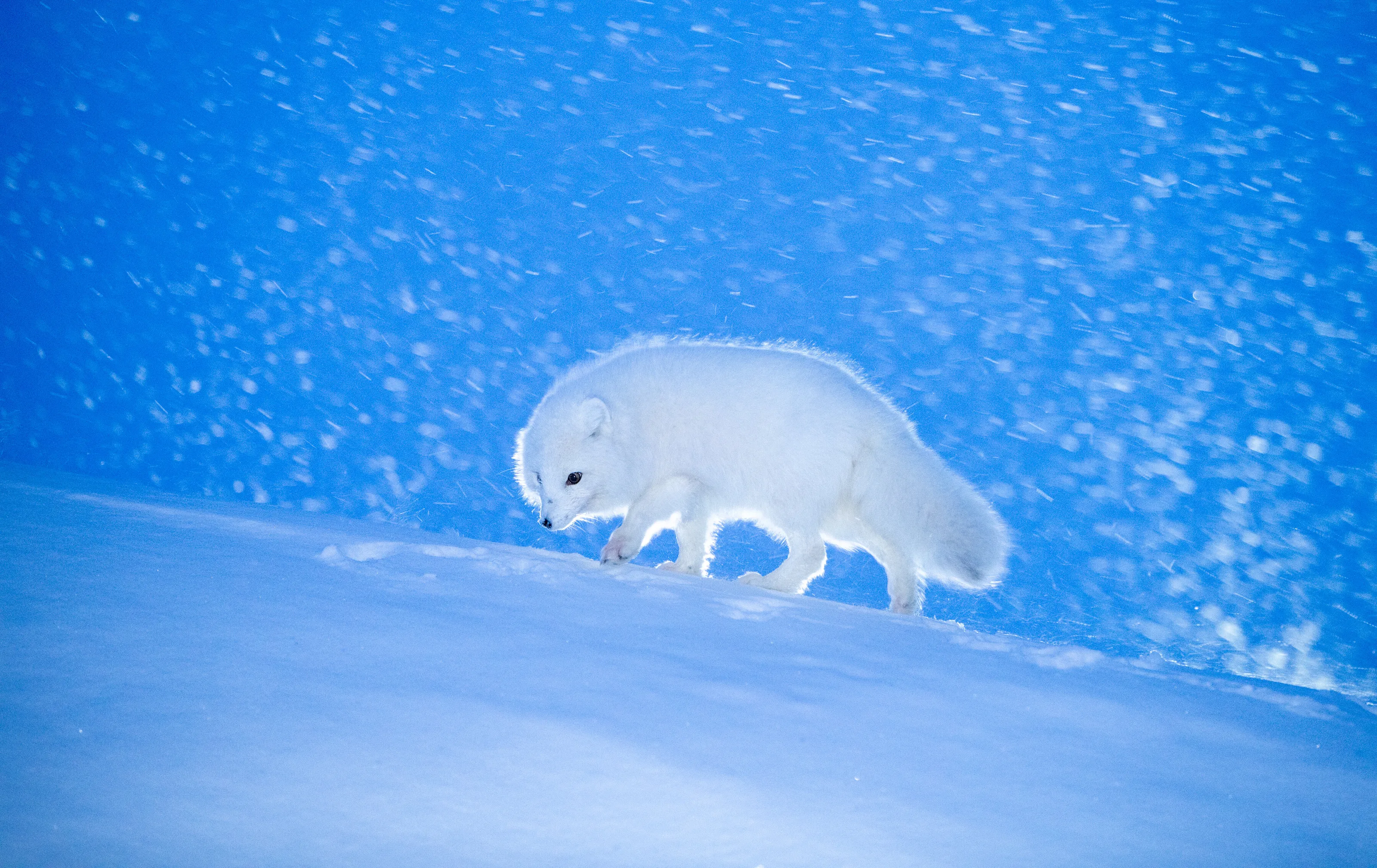
A really clean piece of bird photography. The barn owl is mid-wingbeat with its face turned just enough to read, and you've kept the background soft enough that nothing competes , plus the cool blue gradient does that job beautifully. In my opinion the negative space ahead of the bird is the quiet hero of the frame; it's what gives the owl somewhere to "go". I would just lighten up the owl "backside" just a bit ,not by much, to make it perfect :).


Those eyes do most of the heavy lifting and they're sharp where it counts. The decision to shoot on a reflective surface so you get that ghostly twin underneath was a really good call, it adds intimacy without being gimmicky. The black background lets every hair on the legs read. If I were being picky I'd wonder whether the reflection feels a fraction stronger than it needs to be in the lower legs; a touch less opacity there might give the "real" spider more authority. And Maybe I would add more breathing room around the spider.


Lovely. The avocet's posture is captured at the perfect moment, and the mirror reflection beneath it more or less doubles the elegance. Warm bokeh in the background is doing exactly what background should. The slim blue legs disappearing into their reflections is a nice graphic detail too. Personally I'd resist the urge to crop tighter; the breathing room is part of what makes this feel calm rather than busy.


A really intricate macro, the radiating seed parachutes spiralling out from the warm, dimensional centre give the image proper energy, and you can almost feel the fragility of those filaments. I like that the focus is squarely on the heart of the seed head rather than on the tips, which keeps the soft outer "halo" as halo rather than as the subject :).


Deadvlei is a much-photographed location, and this one rewards the work. The decision to backlight the dune so the trees become near-silhouettes against that radiant orange wall is exactly the right call in my opinion :). the few highlights catching the upper branches stop them disappearing entirely. Composition-wise, the central tree leans just enough to feel alive even as a relic. I love how the lower part of the pan is softly veiled with what looks like haze or light cloud, which gives the scene an almost otherworldly hush.


What a clever moment to recognise and press the shutter on, a whole murmuration briefly arranging itself into the silhouette of a single, larger bird. The warm sunset gradient behind does a lot of generous work too, keeping the swarm legible without competing with it. The only thing I personally wondered about is whether a slightly tighter crop on the right could lose a little of the flatter sky and concentrate attention on the shape, quite a small change, though. A genuinely original entry.


I love that you've gone for the wall of the glacier as the whole subject rather than pulling back for context, it turns ice into architecture. The cool blue/grey palette is glorious and the dirt streaks running through the crevasses give the eye proper lines to follow. One small thought: with such uniform tonal range across the frame, my eye does wander a little for an anchor; in my opinion picking a single dominant peak or shadow to crop around might give the composition a stronger pulse. That said, as a study of texture and colour it's gorgeous.


Meet the expert judge
5,233 Images entered
2,177 Photographers
132,992 Ratings

There's something quietly hypnotic about this one. The way the droplets march down the silk in graduated sizes really does turn the web into a string of pearls, and the soft tonal falloff from light to dark on the left side gives the whole frame a proper sense of depth. The B&W treatment was the right choice in my opinion, it lets the geometry do the talking. One small thing I wondered about: the larger droplet near the top right sits close to the edge, and personally I'd be tempted to give it a fraction more breathing room in the crop.
Brief
See more contest details
How has nature wowed you, and inspired you to capture it with your camera? This celebration of the natural world offers broad scope for you to share your images, with the sole exclusion of those documenting humans or our creations.


Beautifully graphic!The little curl where the tips almost touch is a quiet bit of magic.. If I were nit-picking I might wonder whether nudging the right-hand leaf a touch closer would push it into proper symmetry, but I actually think the breath of negative space between them is what stops it feeling like a wallpaper repeat. A confident, restrained macro entry.


