Get notified of their new contests


A very close runner up! The use of darker trees at the base and top of the image to hold the eye in the frame is superb. The abstractness of the white trees mixed with the younger saplings is the true genius of this picture. Very well seen. Less is more when it comes to colour, and a slight saturation reduction in greens might help the trees to stand out even more. Very well done.


What a fantastic image. I love how you have spotted this composition in the field. The use of colour tones to accentuate the yellow beech tree, and the capture of the natural light makes this my winning image. Your framing is left to right is excellent, giving the shadowed trees at the edges room to breath. With the slight bit of movement at the base of the image, if it was my image I might either take a bit off the top or tilt the camera in filed to centre the beech a bit more top to bottom, allowing for greater impact of the subject. Excellent work, one to be proud of!


Great image, I can see the work that you have put into this image. The composition, the blurred water movement to add atmosphere & the tasteful processing make an image to be proud of. Be very carful of blurring water to the point it loses definition and texture, less is sometime more. And if I was to be super picky I might add some more shading to the main rock so it really stands out. But, I hope you have this hanging on your wall as that where it deserves to be.


1,000 Images entered
Meet the judge
334 Photographers
Brief
See more contest details
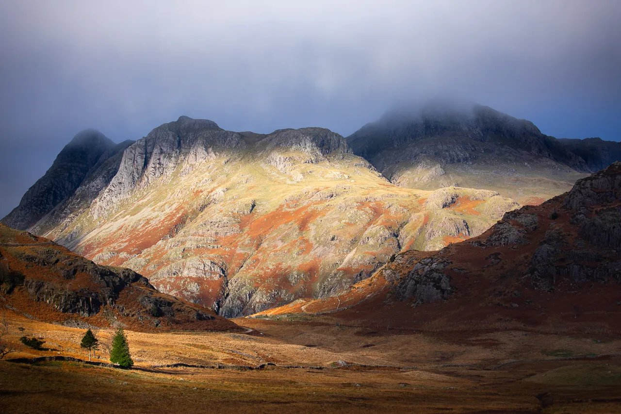
This contest is to show off your best landscape photographs, entering those images you are proud to have taken. Images can show any landscapes in any location and in any style. Photos can be in colour or black and white. I cannot wait to see all your photos.
26,616 Ratings


