
‘The young dreamers’ has many attributes of a winning monochrome picture. It has immediate and irresistible initial impact, but it also has staying power, continuing to reward repeated viewing without diminishing its visual power.
The strength of the finished picture relies heavily on viewpoint, composition and timing – key picture-taking skills. The action appears to have been beautifully caught and the picture elements balance perfectly in an almost too good to be true combination. The strong main elements are well separated and yet relate to each other powerfully in a way that tells a story of youth, naivety and fun. The heavy sky and low-key printing provide the perfect mood for this scene.
In a competition such as this, there is no restriction on post processing or requirement for visual veracity, only that the end product works convincingly to suspend disbelief, which this does. - TIM RUDMAN
In association with


Myanmar is rapidly becoming photographed to death and we are seeing a lot very samey images of temples, cute kids and fishermen. So this image instantly stands out as it's different and reveals creative thinking on the fly (pardon the pun). The positioning of the patch of light within the frame also shows a keen eye for composition. There are some distractions in the shadows, however, so the image would be stronger if these were removed, and the only elements we saw against the solid black were the pigeons. Otherwise an interesting and original picture.
624,321 Ratings


This is an image that reveals more as you look at it more. It's easy to miss the faces of the train passengers, for example, or the other slum dwellers in the background. The photographer has picked exactly the right shutter speed, keeping the boy as sharp as he needs to be, while nicely blurring the speeding train. My only real criticism is that the boy feels a bit hemmed in - a wider lens or looser crop would have given him more breathing space in the frame. On the other hand, the tightness evokes the forced intimacy and squalor of slum life. The boy's grin may be off-putting to some people, too, but expecting him to carry an expression of noble suffering would be very arrogant of the viewer. This is a powerful documentary image that tells a story and asks questions.

A good action shot of this much-photographed event, which got a good aggregate score from the judges. The central composition is strong and cows and rider are placed against an unobtrusive background thus commanding the viewer’s attention. The flying mud of course is a key element to the atmosphere generated in the picture. Although it does form a perfectly shaped background for the rider and a useful space filler on the right hand side for balance, for me the quality and post processing could be improved. Over-sharpening of the flying mud makes it very dominant and takes too much attention away from the man and cows. I like the way he has been caught with his mouth open shouting. It adds to the sense of action. - TIM RUDMAN

This is a very striking image. I have no idea whether this is a lucky capture (although being in the right place at the right time is more than a matter of just luck) or whether a composite created in photoshop. I suspect the latter. Either way the photographer's mission – to create a visually arresting image that stops us in our tracks – has been accomplished with great skill. My biggest criticisms are the heavy and unnecessary vignetting at the sides of the frame, and perhaps the lack of detail in the shadows around the perimeter of the dome. I'd have also cropped more heavily from the bottom to lose some of the dead space in the foreground.

This striking image has no pretentions of being a wildlife picture as we are told up front that it was taken in Miami Zoo. We are also told that the male briefly ‘rubbed his nose up and down her neck as part of a courtship ritual’, so we know that the two elements in the picture were captured by the photographer and not married up together in a photo editing app. A nicely captured moment of tenderness caught in a beautifully graceful design.
The use of high contrast and a black background for pictorial effect certainly complements and emphasizes the design on the coats of these elegant creatures and removes any background distractions, focusing the viewer’s attention firmly where the photographer wanted. The risk of producing a high contrast flat graphic has been avoided by the lighting, which gives a sheen and a beautiful 3D roundness to the bodies and a tenderness to the whole. I very much like the uplifted chin of the female. - TIM RUDMAN


Beach huts and a foggy day = a perfect (and predictable) subject for a minimalist long exposure. The photographer here has gone the extra mile however, and produced a wonderfully serene and satisfying image. The fading huts far right really make the image, as does the interesting shape of the steps and hut supports. The editing is restrained and sympathetic, too. Maybe a tighter crop from the left and a more conventional 16:9 format would have been more visually satisfying, but otherwise this is a masterclass in minimalism.


As a dog lover this image perfectly encapsulates what is so special about the bond that exists between man and dog, and even though the subjects are some distance from the viewer, and are in silhouette, the sense of love, devotion and companionship is still palpable. Better still, these qualities are conveyed with consummate photographic skill, combining as it does an idyllic setting, wonderful centre jour light, and an interesting composition. I love the long shadows on the jetty, the silhouetted swan and church, and the backlit swan anchoring the bottom right corner.
Brief
See more contest details
**Black & white photography** has always proved popular. When we remove colour from the equation, the rules of composition, framing and lighting shift their parameters and require you to see the world in a very different way. Many photographers who work exclusively in black & white maintain that colour is a distraction. Remove it and the viewer is free to focus on the graphic elements, such as angles, shapes, lines and textures. Light is the other key factor here. When black & white and atmospheric lighting combine, the power of an image can seem all-enveloping. You’d do well to look at the work of black & white photography masters, such as André Kertész, Bill Brandt, Michael Kenna and Sebastião Salgado. Whilst our main focus here is on black & white, please note that we use the word ‘monochrome’ meaning that we’ll also accept images using toning, such as sepia. Bear in mind that not every subject will necessarily work, so give some real thought to what you choose to shoot.


The first thing that strikes me about this scene are the atmospheric beams of light streaming through the holes in the wall to illuminate the monk. He is perfectly positioned, his face and open book are delicately lit. For me, the book symbolises a story to be told and leaves me pondering. The scene is beautifully composed in thirds and feels well balanced. The exposure is spot on and I like the way the light softly drops off on the left hand side of the frame. This is a well executed image and one to be proud of.


Young monks meditating - hardly an original subject for travel photographers but I like the execution here. Window light is highly prized by experienced photographers, and the grille adds an extra layer of dramatic effect and interest in this image. There's an ambiguity here, as it almost feels as if the monk is imprisoned; I think this rather unnerving effect could be lessened by choosing a portrait crop and reducing the number of elements in the scene. This would also make the leaning-in verticals on the walls less noticeable. Otherwise a hugely evocative image.

Meet the expert judge


This image has a serene and calm feel to it, which draws me in. The long exposure has smoothed out every single ounce of texture in the water, which can sometimes be too much but in this scene it works really well. It gives the image a surreal, dream-like quality. The simplicity of just a single subject sitting along the horizon is brought to life with the addition of the white fluffy cloud above it. This is another excellent example of how using the rule of thirds can aid composition. I also love how the tones work together in the scene - the bands of dark grey tones that run along the top and bottom of the frame contrast nicely against the lighter tones in the centre, giving the image a balanced feel.


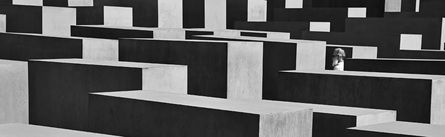
I like this image: the high angle, the placement of the sole human subject sitting within the shaft of light running down the steps. There's just one thing that spoiled it for me – the clipping of the top of the arch at the top of the frame. I kept returning to this image, and each time found myself irritated by the unfortunate crop. Had it not been for that I think this would probably have been a top 20 image.

This image is crisper than a bag of kettle chips. You can almost hear the crunch underfoot as the photographer walked through the snow to this precarious looking spot that seems scarily close to the edge, especially given the slippery conditions. The things people will do to get that perfect composition – and this one really is perfect. The lone, frozen tree makes for a perfect foreground subject for the majesty and power of Niagara Falls behind it, beautifully softened by the use of a slow shutter speed. The cool toning adds to the sense of chilliness. A lovely image, definitely worth getting out of bed for.


This surreal image, makes uncomfortable use of the one thing that should give us comfort – the eyes. Why are these the only eyes allowed to see the world? Why must the others be hidden from sight, or perhaps even removed altogether? This is a notable use of manipulation. So much post-production work can lead to garishness. But here the method, while widespread throughout, is surprisingly subtle. Most importantly, it inspires questions, as all good photography must.


This is one of those impressive images that somehow manage to find a distinct focal point in what is perhaps the most visually chaotic image in this selection. Our eye is instantly drawn to the upturned face of the man at the bottom of the composition. His expression, full of struggle and determination in the face of overwhelming odds, is a visual component that grabs you immediately. It’s a perfect anchor that allows you to then move your eye around the conical composition, and take in the details of the frenzied group.


This must be one of the most elaborate selfies I have ever seen! From the hair shaving and dirt rubbing to the way the photographer has successfully managed to convey two different expressions on each half of his face. Not sure how he did that! Technically this is very accomplished too: pin sharp, good lighting and excellent tonality


A popular staple of street photography is the pedestrian juxtaposed against a billboard, poster or street sign, and there was a lot of potential in this situation. Sadly it didn't quite come off because the relationship between the subject and the poster doesn't quite work. I get the old man/young woman contrast but the man's pose is a little awkward for me. I can't help but feel that if the photographer had waited around a bit longer and taken a few more frames, perhaps with a variety of passers by, that a slightly better image would have presented itself. This is still a good image, just not quite top 50 good.


I agree with the photographer – fog and backlighting really are a great combination, and he has used them to great effect here. This looks like a scene from the X-Files or some supernatural thriller. I love the letterbox composition, the use of dark tones at the top and bottom of the frame, and the narrow strip of light running through the middle, punctuated by the strong black and grey vertical lines of the tree trunks. Simple but effective.


This is a extremely simple image but one that really stood out for me. The photographer has resisted the temptation to try and boost the highlight detail in the snow and as a result the bottom half of the frame is almost entirely devoid of detail, but this is made up for by the subtle tonality of the grey sky above. The lone tree provides a satisfying focal point on the horizon.

