

I think that there's a potentially interesting image here but both the framing and the exposure could do with looking at. Firstly, the woman's smile is lovely and expressive - so make that the image. That means getting closer and composing so that the background doesn't distract. Secondly, the highlights are almost completely blown so concentrate on the technical basics. Well done for seeing however.

There's something both intriguing and sinister about this. It reminds me in a way of Gregory Crewdson's cinematic images with perhaps a dash of David Lynch thrown in. I like the framing and I like the exposure - but critically it isn't sharp and when something's this simple, that's a real issue. Keep on with your strange (good for you) but engaging vision!


This frame, despite being taken on a phone, has a nice feel to it. I like that the photographer has followed format with the rod casting out and leading us into the landscape and I especially like the subtle hand gesture of the fisherman. The shadow detail is rather clogged because the sensor has decided that it's priority is to deal with the sky and highlights - but for all that, a nice effort.


I think that this is a good effort: the figure of the roofer echoing the vertical lines of the buildings in a rather dramatic way. I think that you've handled the tricky exposure rather well - both highlights and shadows are, from what I can see, pretty well exposed (seeing this was shot on a phone). I wonder whether however moving the device to the right so as to obscure the lettering, might have made a stronger frame? In any case a good effort here.

Whilst there are numerous examples of photographers using the frame of a vehicle to make images (Lee Friedlander being the most obvious) this feels more surreptitious. Sometimes you can be lucky but there is no substitute for engaging with the subject - either overtly or more discreetly. The good thing is that you've seen something interesting - the next step is to work out the best way of making a strong image of it. And there are usually no shortcuts to that. Keep pushing.


This frame is all about timing and anticipation - and it almost works. If the boy's feet weren't obscuring the third figure, you'd have a cracker. As it stands, this frame is a testament to getting yourself in a position where you think the action will happen. It's a good effort and with practice these moments will be better captured.


Sometimes, simple is best and here the photographer has filled the frame and made the face the centre of the image. It's nicely balanced although in terms of exposure it could be a little more accurate in the rendering of the highlights which are on the edge of blowing (on the cigarette). Still, nicely done.


A straightforward but entirely engaging image that succeeds, not by its framing nor its exposure but by the directness of the woman's gaze that indicates a successful collusion between photographer and model. There are various ways to make a street portrait and this - a direct and obvious intervention - is certainly one. I'd like to see a more defined composition (this looks like a crop) but for all that, a very successful frame.


A really well-worked frame that despite its technical limitations gives a very good idea of this man's working life. In addition the harmony of shapes and overall framing make this a success. I'd have liked it to be sharper on the man's face (likely the result of central autofocus) and I'd have liked a little more careful exposure that wasn't centre-weighted but overall, this is lovely.

There's an image here but it's lost in the confusion of the composition and exposure. You've rightly identified the subject but by using a long focal length you've made the lens do the work as opposed to moving yourself into the scene to compose. This means that the frame gives equal visual weight to the background and has allowed the figures (frame right) to invade its space. It takes a bit of practice to move with a camera but it's worth trying because your photography will immeasurably improve.


I think that there are a great many considerations when making and displaying an image like this. Firstly, the intent of both the photographer and the subject, but perhaps most importantly, the agency of that subject.
I've chosen this frame firstly because of its shape and tone which are aesthetically harmonious but also the evident technical care taken to create it. In that sense it reminds me of Jodi Bieber's image of Bibi Aisha but this is actually more guarded. The eyes are closed and I think (I hope) that that indicates a level of control that Maryam had here. This is a poignant and worthy winner but it's worth reminding ourselves that when we evidence the pain of others we do so with care and in cases like this, collaboration. The purpose of creation goes beyond a 'good' photograph. Whatever that is.

Sometimes the camera catches things that we can only describe in other avenues of our lives. Here, I suspect that the girl's expression says more about her to her sister than any amount of simple descriptions - and that is the beauty of the photographic image. Yes, the image isn't sharp (a bourgeois concept according to Cartier-Bresson) and yes, it's not brilliantly exposed - but it has an elusive quality that makes it significant to someone.


This has the feel of an image taken some time ago on film and while that isn't really relevant to the photograph per se, the framing and composition is. I think that the intense stare of the child is the main focus here and I wonder whether a change from landscape to portrait shape would have isolated her and obscured the distracting hands and chin that seek our attention? Anyway, well seen.
95 Photographers


Like all the best images, this is both striking and intriguing. It somehow suggests to me the menace of Margaret Atwood's 'The Handmaiden's Tale'. I like the concept and the framing and the darkness of it - but that's where I think some things might be re-considered. Principally, in terms of exposure, this has the feel of something darkened down in post-production and I'd have preferred a greater control over both highlights (which are starting to blow) and shadow detail. That said, not a bad effort by any stretch.


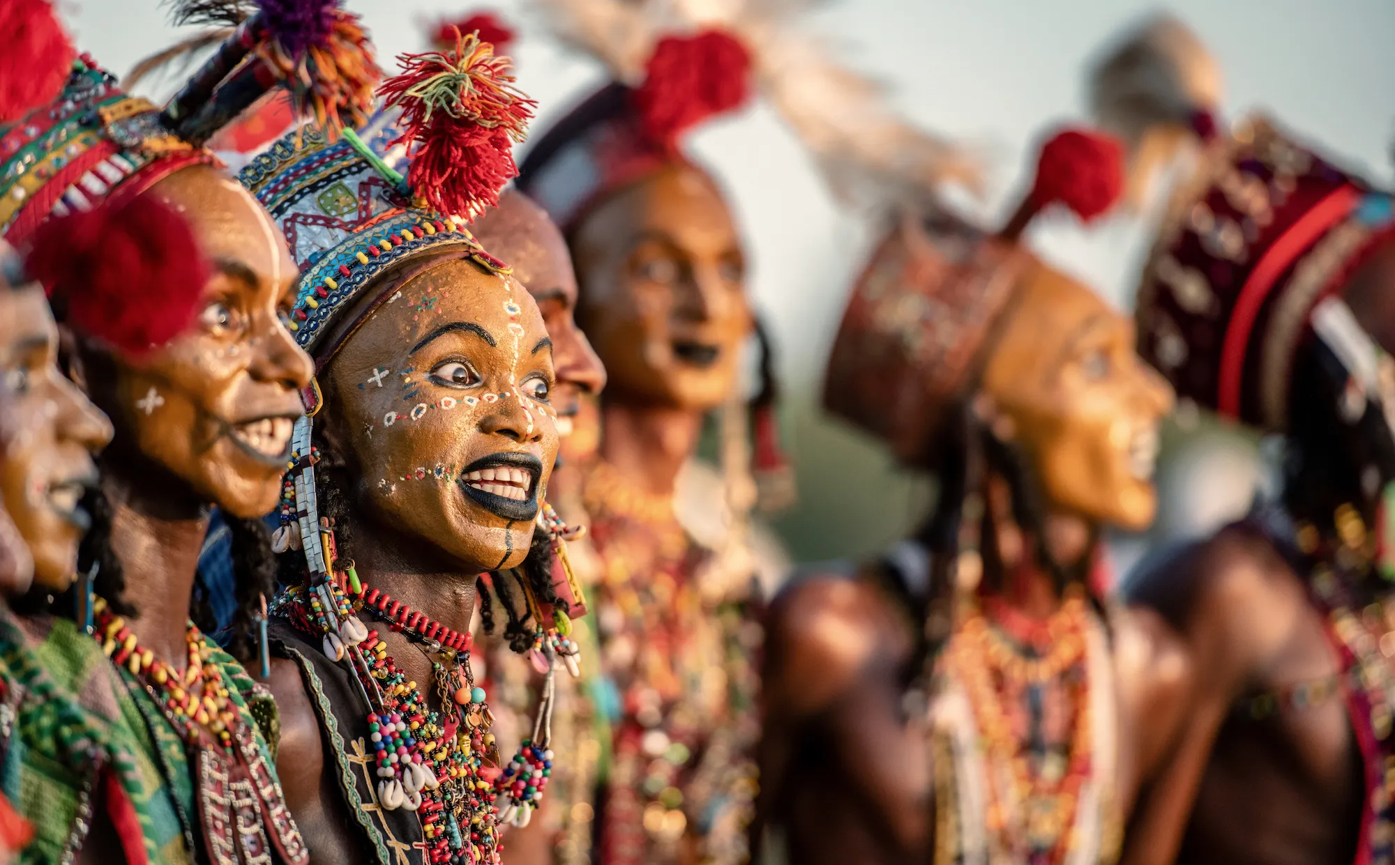
An interesting face but how might we have improved this? If we're working in colour we have to consider the quality of the light and the issue here is that it looks like midday sun - the harshest light to work in. Personally, with situations like this I'd steer clear unless you have to. Better light can be found in the early morning and late afternoon. Main bathing times at the Kumbh coincide with the morning as I remember and at an event like this you have to plan where you want to be at what time. Keep pushing.

Brief
See more contest details
Welcome to Photocrowd’s ‘People’ contest for New Joiners! These contests are a chance for new members to introduce their photography to the community, and get a taste of how Photocrowd contests work. They can be entered by anyone within their first 28 days of joining Photocrowd. After 100 images have been submitted the contest closes and the Crowd will start rating the images. The Expert Judge will also be judging the images and writing reviews at the same time. All the winners, both Crowd and Expert, will be announced after 3 days of judging. Make sure you also check out our two other New Joiners contests - ‘Animals’ and ‘Landscapes’.
100 Images entered


As the caption suggests, this is a moment of pure, unadulterated joy and I think that this both celebrates a moment as memory and as a decent photograph - which isn't always the case. I like the balance that the frame has. The child is clear and the message of the image is equally straightforward. Additionally, all the figure are relatively equidistant from one another and it feels balanced. Nicely exposed too - well done.


Meet the expert judge
6,954 Ratings

