

Whilst this is a technically well exposed and captured image, I just wonder whether this could have been improved by a little movement on the part of the photographer... Clearly from the text, this is a 'grabbed' image - and that's fine but how much better might it have been if they had been shot against a more 'even' background as opposed to one that is compromised by the street behind. That might have been achieved by moving a few inches to the left and framing them against something consistent. This is not a bad effort by any stretch but thinking about and scanning the frame before pressing the shutter might have worked more to your advantage.

This is a good effort and the overall effect isn't bad at all but I wonder if we might improve it? Firstly, I like the angle of the portrait and the gesture. The lights of the Bay are at the same level as the model's eyes and so perhaps varying the height of the camera might have helped a little with their distraction. However, the lighting is very harsh and perhaps a little too close. From the small catch-light in the eyes it looks like the result of a small flash. If this had been diffused - perhaps through an umbrella or a soft box - it might have made for a softer and more complimentary light. Still, these things are there to learn from and I think a bit of practice and also trying to reverse engineer some more successful lighting will help a great deal. still, a good effort.

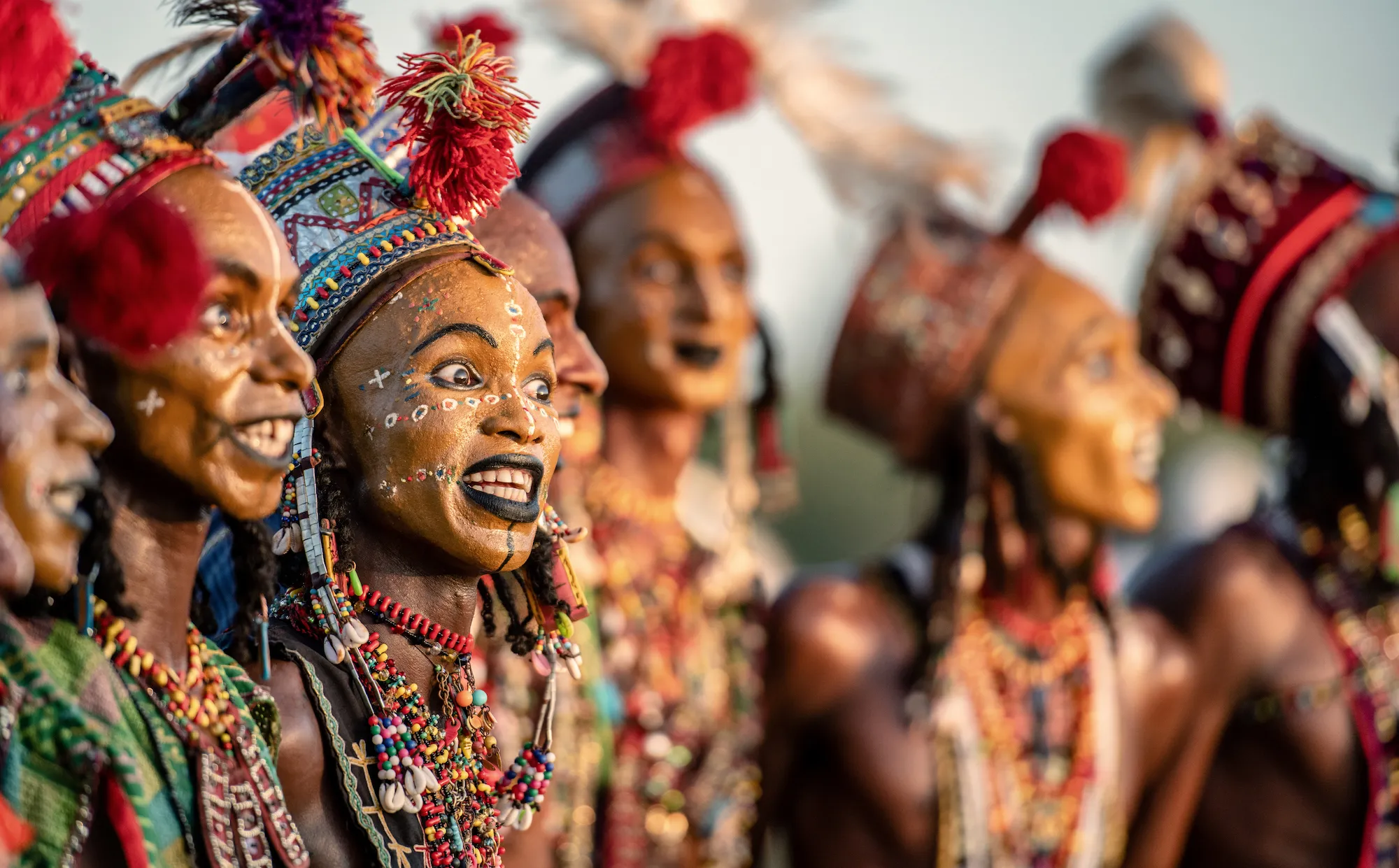
This is a good idea that doesn't quite come off. I like the shape of the portrait and I like that the model is leaning back - a nice take on a profile image. However, this is a simple case where the background really unsettles the portrait itself - not only by overlapping with the details of the bandana but by compromising the figure. Keep pushing with this idea.


Nicely done. I like the way that the musicians stare is direct and revealing and I pretty much like the tight(ish) framing with a contrasting colour behind. However the exposure is a little loose and the tonal range is muddy. A decent exposure from the face or a more accurate reflective exposure all over would have rendered the accordion a fine shade of black and the skin tones more accurately. Keep pushing.


Although this image more or less conforms to various conventions - sharpness, exposure and so on - I think it 'shows' but doesn't 'tell'. Partly I think that is to do with how the frame is constructed but secondly, I think it has to do with how the photographer has positioned him/herself. It feels like a bit of a 'grab' - a longish lens capturing something when the pandit is unaware. Sometimes that's fine but it means that the foreground is surrounded by a less than complimentary and quite distracting background. More, although this is a candid frame, there is little or no emotional involvement with the subject. Again, sometimes that's fine but this feels cold and mechanistic - rather formulaic. Banaras is a a very difficult place to make images that feel 'new'. Michael Ackerman ('End Time City') was perhaps the last time that I saw a new approach to work here that said something that didn't fall into the cliché of a travel image or one that tacked onto the tropes of 'spiritual romance'. I think that sometimes it's worth remembering Cartier-Bresson's advice about not making a frame that you've seen before but trying to create something new and different.


This is a potentially interesting image and, for a photography taken on a phone in strong light, it's pretty well exposed. The issue is about composition. What are we trying to say here? Two men looking out top sea? Great - but why are the feet cut off? More, why is there a detail of a car in the left hand corner? As a photographer you're responsible for every inch of the frame and so you need to be scanning that frame to exclude extraneous distractions. Not a bad effort but next time have a think about what you really want in there.


I really rather like this - it's a strong composition that utilises movement and aperture to control exposure and inevitably, mood. I'm not sure how it signals to nostalgia at all (apart from all photographs being 'momento mori' [Sontag])but I do like the playfulness and experimental feel of it. Sometimes that experiment can uncover real breakthroughs with photography. I would say that rather than using post-production outside of the camera, why not try altering the colour temperature of the exposure in camera? That way, rather than relying on algorithms, you'll get to learn what and how light and its temperature give different effects, Well done anyway and keep experimenting.

90 Photographers

100 Images entered

Although I tend to be less than enthusiastic about post-production that may involve elements added from outside traditional photographic practice, I really like this frame. I think it's simple, elegant and well exposed and in terms of concept, is well executed and readable. Very well done.


Sometimes an image - whether by luck or judgement - speaks to the essence of people and this visually* signals to the elements that are important for capturing the essence of a person. Firstly, I like the brave framing that has decided to concentrate on the eyes but do so in a way that the shape of the nose is retained - this is not just happenstance. Secondly I like the wide aperture that means we're forced to look at what the photographer wants us to see. Lastly I like the gentle pattern of the hair that allows us to explore texture. Overall, an excellent effort.
Meet the expert judge

This has all the components of a strong portrait - a tight and considered composition that gives (inevitable) attention to the patterns and tones of the sitter's dress and make-up but it's really let down by the exposure. Whilst the shadow detail is relatively well rendered the highlights on the face are blowing. A more accurate (spot) reading - even in camera - might have avoided this and if one is not using a hand-held meter (which is ALWAYS) a good idea, switching between metering setting in camera is a good alternative. A nice frame though and with practice, these simple technical skills will become second nature.


Brief
See more contest details
Welcome to Photocrowd’s ‘People’ contest for New Joiners! These contests are a chance for new members to introduce their photography to the community, and get a taste of how Photocrowd contests work. They can be entered by anyone within their first 28 days of joining Photocrowd. After 100 images have been submitted the contest closes and the Crowd will start rating the images. The Expert Judge will also be judging the images and writing reviews at the same time. All the winners, both Crowd and Expert, will be announced after 3 days of judging. Make sure you also check out our two other New Joiners contests - ‘Animals’ and ‘Landscapes’.


5,866 Ratings

Excellent. Firstly and perhaps fundamentally, this is well exposed with a good range of tones. Building on that is a solid composition - perhaps more by luck than judgement - but that is often the way. I really like how the frame is 'interrupted' by the moving figure which bisects the central figure's face concentrating our gaze on his eyes. Lovely - complex and intriguing - a very strong frame.


Firstly, I do like this - but it has its limitations and I think that has to do with framing but ultimately, involvement. If the image is about the street vendor, then we might well need to see some context about where she is. What this frame does however is give far too much context whilst trying to 'get it all in' on a 17mm lens (hence the distortion). I think if you'd have shot this closer in somewhere between 35mm and 50mm it would have looked more 'natural' and been more intimate. Vert wide angle lenses make everything look dynamic when you're composing but less so with the final product - unless they're utilised for a specific purpose. Keep pushing.


I think that this is a charming image - one that speaks to memory and a moment in time, caught. I like it on that basis - but as a photograph it's limited both technically and as a text. Let me explain. I've no idea whether you knew these people or not but indeed, a capture of a candid moment is often more 'natural' but in that moment, you've included details in the image which are distracting. I like the 'golden' sun, but why are other people in the shot? They distract from a very human moment. Additionally why is the frame shot at 1/30th of a second - a shutter speed that even an experienced photographer would find hard to hand-hold. The technical aspects can be learnt - but additionally have a think about why you took the frame and how you might have taken it better for next time - perhaps a better framing would be the place to start. Anyway - good luck and keep shooting.

Well, I'm a little confused as to what I'm looking at here and its motivation. Photography has a long and distinguished history of a being a medium that records our everyday experiences but that usually contingent either on its ability to reproduce actuality or to do so in a creative way. Clearly something caught your eye here but it isn't clear what that was because the frame is not ordered in a way that anyone else might understand it. It's always worth thinking, 'what is it that I'm seeing?' and then 'how can I make an image legible to others? Don't be put off but it's worth thinking more on this - your photography and understanding of what it might achieve - will improve.


