

Firstly, thank you for entering my competition. I find the attraction in this image would mainly be based on it compositional qualities.The framing of the blossoms around her face tend to work ideally. In my opinion the colour of green, especially on her lips doesn't seem to have the impact than if it could've if been done done in another colour ( such as pink) - making it look a bit natural.The fact that the model is looking directly into the camera and feeling quite comfortable means that you obviously posses the skills of a great portrait photographer.


Firstly, thank you for entering my competition. What attracted my attention to this image was the macro view and angle at which the image was photographed. The slightly darker shades of pastels tend to work well in an image that differs from the norm. One would expect the colour of beach huts to be , big, bright and bold and this makes for a refreshing change.. Congratulations and well done!


1,759 Images entered
611 Photographers
41,884 Ratings


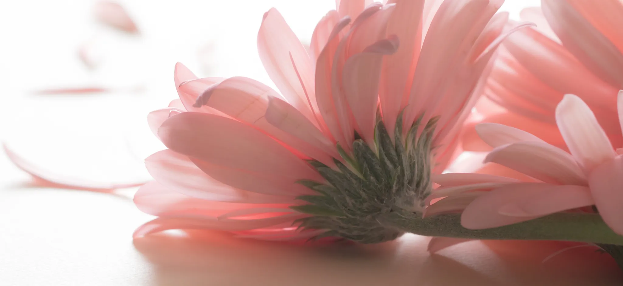
Firstly, thank you for entering my competition. The portrait styled crop of this image works perfectly and tends to compliment the shape of the dark pink vine perfectly. The extension of the vine growing upwards tends to draw the eye into the image.This darker pink vine contrasts well with the pastel pink background making us aware of the softness of it's nature. Congratulations and well done!


Firstly, thank you so much for entering my competition.. The pastel contrast of blue and pink work work ideally in this image and does justice to the description of the term "pastel". The unusual crop is different from the norm which tends to make it more catchy on the eye than would've otherwise been the case. The attention to detail such as symmetry, the shadow behind the shutter and the locks tend add to the reasons for this being my number one choice. Congratulations and well done!


Firstly, thank you for entering my competition. What attracts me most to the image is the beauty of the abstract nature.and creativity involved .The soft flowing feeling which emanates from the women's clothing as well as her delicate display of movement tend to accentuate the pastel colour, pink.Congratulations and well done!

Meet the expert judge
Brief
See more contest details
***This contest is open to subscribers (members on the Challenger, Pro and Master subscription tiers). However if you're not a paying subscriber you can still purchase entries for £2 (GBP) per image.*** When a fully saturated colour is diluted by white, it becomes a pastel colour. These shades are generally more delicate, so it’s better to photograph them in a softer, diffused light, to avoid making them look washed out. A carefully composed photo that uses pastel colours can have a gentle and unique quality to it.


