Get notified of their new contests

The combination of colours you have captured here is what first attracted me to this image, with the little pops of red contrasting with the bright greens and blues. There is no specific focal point, but I don't think that matters too much with this type of subject, as the eye is left to wander and explore the little shapes and patterns across the image. Well done on your top ten placing.

This was a late entry into my top ten, but one I kept coming back to and it rose rapidly up the placings. Initially I had not placed the shot as the image seems quite soft, possibly a result of some soft focus or diffusion filter in post-processing. However, I do like your composition and the colours you have captured, and the softening does give a rather pleasing effect. With subjects such as peeling paint there is sometimes a temptation to over-exaggerate the tonal contrasts and end with an image looking a little too grungy, but I really like what you have achieved here by seeming to do the opposite. Congratulations on your second place finish.


Such a colourful image, one wonders how bright this scene would have been in past times before the paint and plasterwork started to peel away! A simple composition, but with lots of textural details. The colours are nice and bold, but you have avoided the temptation to over-saturate them. Great image, well done on your top ten placing.

The colour harmony is what attracted me to this image, with the little pop of complimentary yellow. Even with such an abstract image, there looks to have been care taken with the composition, as the key focal element - the patch of yellow - is well positioned on the intersecting thirds. Some great capture of the textures too. Well done on your top ten placing.

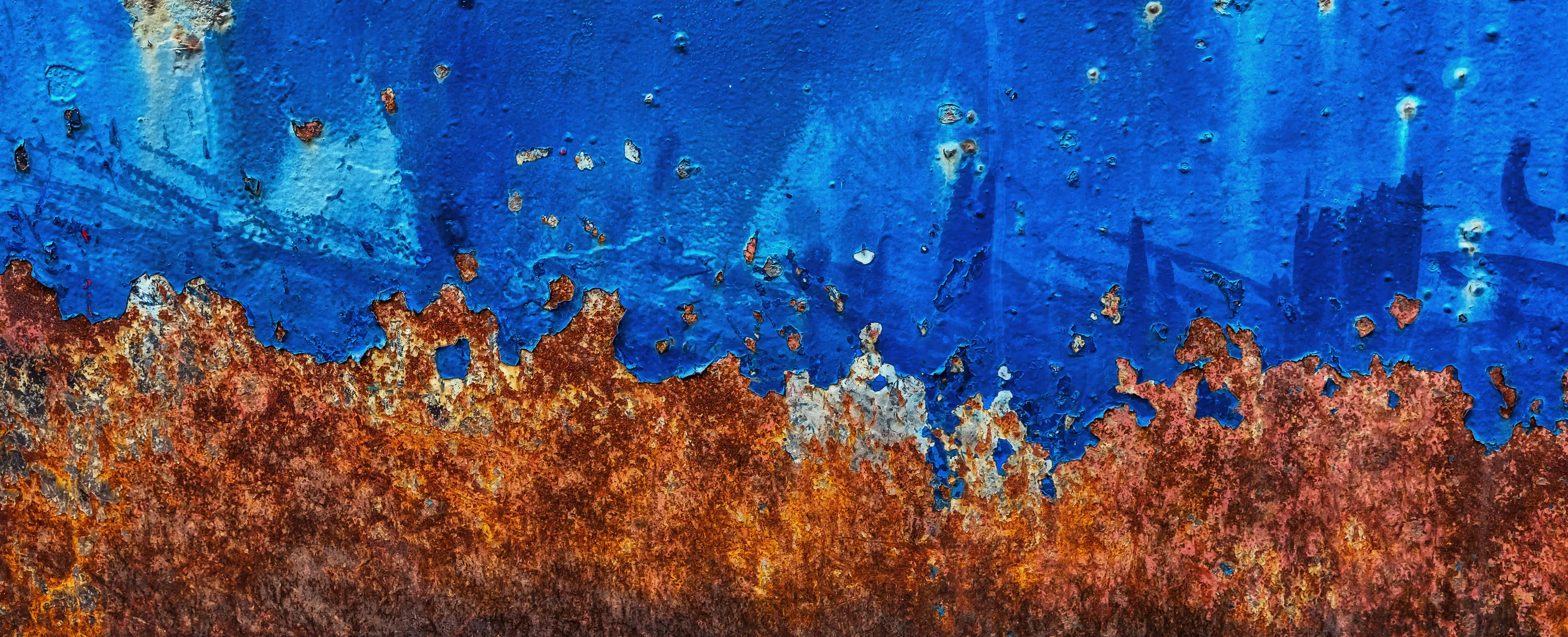
Another image in the top ten which has no obvious focal point, but the combination of colours is appealing and gives indication of the textured surface. An interesting little description attached to the photo, I wonder whether all boats in the area are painted in similar hues, or whether this wall is filled with a rainbow of tester colours. Well done on your top ten finish.


This image stood out from the start and was always in my top three placings. I love the simple composition of the two shuttered windows surrounding the central door, with just enough space around the subjects to avoid the shot looking too tightly cropped. Colour contrast between the peeling blue walls and the orangey brown wooden door is great. Good focus and exposure overall allows us to see plenty of details in the paint and plasterwork, and get a real sense of the slow decay of the architecture in towns and villages such as Burana which are built on the water. Congratulations on your winning image.
533 Photographers


798 Images entered
Meet the judge
Brief
See more contest details
In this contest I would like to see your best images which show peeling paintwork. The subject with a deteriorated painted surface can be anything you choose, whether large or small, but the peeling paint should be clearly visible in the shot. You may wish to show your subject within a wider scene, or move in closer to show the peeling paint in a more abstract way. Images can be in colour or black and white. I look forward to your entries.
31,271 Ratings


Sometimes harsh lighting can ruin an image, but you have made the most of the strong lighting here to help show the textures and forms of the paint-peels. Nicely contrasting colours, and well composed too. It can be difficult sometimes to decide what to include and what to leave out of a shot, but here I think you have been very successful by settling on the magic "three" for your main subject, and have left enough space around these rusty patches to avoid things looking too cramped or cropped off. You have made the most of a simple subject at an non-exotic location, and ended up with a great image. Congratulations on your third place finish.
