Get notified of their new contests


I rarely take photo's of people. Landscapes yes, buildings yes, composite images yes, city scenes yes but people rarely. The reason for that is that there are few photographers who can make it look natural and that can do it in an environment that does not look entirely contrived - it's a rare talent. This image is a superb family portrait and is full of fun and shouts spontaneity. At the same time is has obviously been well planned and has required some prior set-up. The title says it all. Well done.


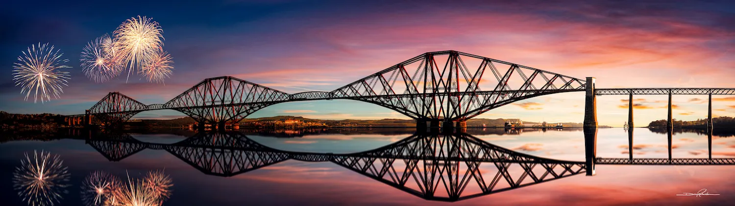
A proper Christmas card image. Subtle tones and nothing hugely striking but the composition and contrast in colour really works well. The water is obviously a simple top half vertical flip made to look like a reflection and there are some areas at the waters edge which need further blending. However, in a similar note to another top 10 photo, that really does not detract from an otherwise great photo.


This image has already won awards and well deserved praise on Photocrowd. I, like a lot of others, think the composition is superb and the only detraction from an otherwise perfect image is the poor line around the mountains in the distance. It looks like a composition - and for some that is sacrilege. I personally don't mind combining photo's but it needs to be done well and done in a way that obvious 'join lines' are minimal. When you look closely at this image their are flaws but when you step back and look at it from a distance...wow!


This image confuses me...at the same time I like it and I can't explain why. It's obviously a composite image and there's a good degree of manipulation and editing - some of which isn't technically that good - but the overall effect reminds me of a Christmas image for some reason. The mix of the view through a window, the puddles on the floor and the false reflection make for a complicated and messy mix which seems to somehow keep my focus for longer than most. Maybe it's just me trying to see how it's been put together.


This photo exemplifies the competition brief and there's so much going on that I spent a good while examining the detail and playing 'spot the difference' between the image and the reflection. For me it has, perhaps, a little too much of the HDR look which is why it didn't make my top 10 but ultimately it's a very good example of this style of shot.


The competition theme is reflections, in all their forms. There's actually very little reflection in this shot. However, if we agree there is the smallest hint of a reflection then the photo itself is very good. This style of shot, merging an identical day and night scene, is difficult to do and get right. The top half of this image is very good and has a wonderful feel about it that keeps you focused - I just wish there had been more of a reflection. I think perhaps it would have worked better if the bottom of the shot had been cropped more so that the focus was on the building and away from the dead space within the water - or if the water had a strong reflection to focus upon!


This is simply a great photograph. The concept of foreground, middle ground and horizon are well represented but it's the foreground that really grabs you. The 'reflection' aspect within this image is more subtle than most but the gradual blend of foreground detail into the mountain reflection works well. Great colours and textures and it has a different look to it than most photo's of this type. It was difficult to separate the top 4 or 5 images but in the end I just kept returning to this as my first choice...well done.
Brief
See more contest details
Reflections: Whether it’s a landscape reflected in a still body of water, a portrait viewed in a window, an image seen in a mirror or simply a scene captured in a puddle of water, we want to see your photographs incorporating reflections, in all their forms.


I understand why this image might not score too highly in the popular vote but each and every time I view this photo my eye is drawn to that central bright mountain reflection and it just works for me. I keep thinking that some detail in the sky (contrasting colour, clouds etc) would perhaps add to this image and then I change my mind as that could, potentially, take my eye away from the lovely detail in that reflection.

This is yet another popular photo amongst Photocrowd users and deservedly so. It's quite simply a stunning image and the detail and composition is everything that it could be. My personal preference - and lets face it we all have one - is for landscape images and this is the first photo in this competition that I've rated that is not in that genre. My test of any image, again something personal to me, is would I have this on a wall in my home. The answer here is a simple yes.


This is my highest rated 'still life' image. I'm not naturally drawn to still life but the detail and tone of this image cannot be ignored. It's not a typical subject and it's so simple that it looks easy - and that's the trick. The depth of field is perfect. An excellent photo composed of very simple components yet technically superb.
1,652 Images entered


This is yet another example of a great photo which is well framed and superbly composed, I only wish the foreground detail was more apparent. I would love to edit this image myself and make it my own. I'd increase the shadow's, increase the overall exposure, highlight certain detail whilst adding shadow to other areas to give it some texture. I want to 'develop' this image so so much. After saying all of that, I still wish I'd taken this shot. The best photographers and photo manipulators can work wonders in post processing but nothing replaces getting the original image right and this one has so much potential.

1,224 Photographers
133,896 Ratings
Meet the judge


