


The selection of these two photos is just perfect. Not only only do we have this amazing alignment in the middle but the two compositions really balance each other out beautifully. All the movement of the people adds a real energy to it all and makes it feel like the perfectly captured moment in time. It has a real air of a Cartier-Bresson picture and his iconic "decisive moment". And I think the contrast in the backgounds of the two shots really elevates it all. A lovely image, well done.


I absolutely adore the textures in this. The way they flow from one image to the other. Such different subjects yet they sit together so well. The colours are lovely too, they give it a real timeless element. To make this even stronger I would conisder removing some of the background elements so you can really concentrate on that subject texture!


i just find this image so beautiful. It really captures an essence of what a diptych is all about. The parallels in the composition are really pleasing. And I love the repetition of the flowing shapes of the dress and the jellyfish. This is enhanced by the angle, looking up out the water seeing all the distorted reflections and backgroud. All similar shapes yes really contrasting subjects just makes it really pleasing.
Meet the expert judge

This is such a stunning image. perfectly executed. The repetition of shapes really ties the two images together and the contrasting colours of the backgroud makes them sit together beautifully. Technically it's very impressive too, That focus is immaculate, something extermely difficult to do with macro subjects that can move! Some reall fantastic work here, well done.
Brief
See more contest details
Diptychs in art are traditionally two illustrated panels, often hinged, that together form one artwork. In this context we’re referring to two images that have been placed next to each other within one image, and that complement each other in some way. Maybe they tell a story, they are two observations or states of the same thing, or could be contrasting or jarring. Or simply be two images that together produce an image that appeals to the senses. Images can be brought together easily nowadays in your retouching software, and should be next to each other, rather than overlaid or blended in any way.
1,415 Images entered


really enjoyed this one. There's a subtle comedy to it. I love the mirroring in the compositions, both between the invigilator and the paintings and between each separate image. My only suggestion would be that there's no need for the textured background behind the 2 images, it distracts a little and isn't necessary. This is only a minor thing though. It's a lovely diptych, well done.

This was a clever way to interpret the breif. I like the multiple layers of interaction between the two image, with day and night and the perfectly blananced circles. It's also a really beautiful execution of the images, Both of which are really quite difficult to do well so it's very impressive. I do think creating a separation between the images, like a white frame, would have added to the way they interact and made a true diptych. Still amazing imagery regardless though. Well done.


There's just something about the way this image sits together when it's been mirrored that is so beautiful. And I really think the colour/black and white split enhances the shapes and forms of the composition. It reminds me a little of. a stain glass window. I feel like I'm looking at two different things at once. the base image of a mountianside over a lake and a completely abstract geometric structure, I love it! Fantastic work well done.

537 Photographers


There's something about the simplicity of this one that really caught my eye. This allows the viewer to appreciate the little subtle differences between the two frames. And I like how compositionally they are almost perfectly identical which for me adds an interesting almost eeriness to it. Something not as easy as you might think to achieve either, well done!


I really loved the juxtaposition of the two subjects in this diptych. I think this is what the format is all about. Creating this forced comparison for the viewer opens up so much intreague. I would have liked to see a definite frame around each picture to give us a true diptych and perhaps a little less negative space. But these are only very minor changes and it still a lovely image regardless. Well done.


Of the many images of flowers I saw in this competition this was one of my favourites. The different angles of the same subject make it feel like an anatomical study. And even though the flowers are very different angles the stems still nicely mirror each other linking the two images nicely. The colours are beautiful too, the pink and green really contrast making the whole thing pop. And I love the way the focus of the backgounds is super soft in both but also different between the two creating a lovely separating and delination between the two shots.


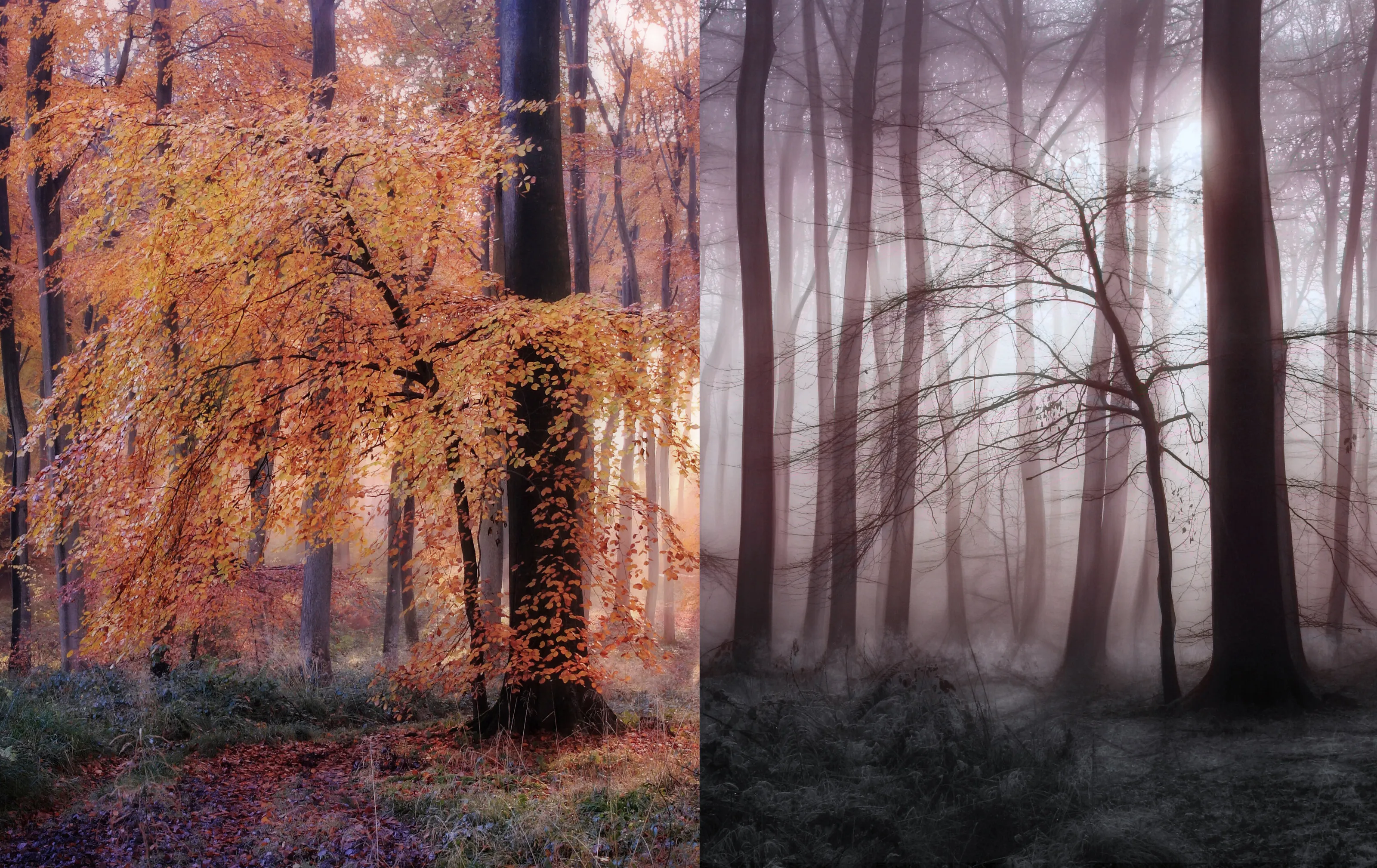
There's something about this image that invokes a real mood that I love. Sort of rich and gloomy. The other thing I think is great is the way the two images at first glance look like they're one image split. The fact that the two separate photos aren't the same size really invietes the viewer around the composition in an interesting way.


