
I’m not entirely sure what this is a photograph of, but I really like it. The yellow shed/fishing hut and accompanying wooden structure is very surreal. The colour palette, reduced and accentuated in post-production, also emphasises the surreal nature of this photograph. I particularly liked the photographer's observation and decision to photograph this structure, which looks pristine, almost new and rejects the cliché of falling down buildings. The image could almost be a piece of contemporary sculpture, such is the lack of information, the ambiguity of which I really enjoy.


This long exposure photograph of a tent under a starry night sky is my favourite photograph from this contest. The composition is strong with the tent placed off centre (although possibly it would have been better to have included the whole tent?), and the expanse of blackness on the left makes for a very elegant composition. I couldn’t see the stars that well, so perhaps the exposure could have been lightened very slightly to show the outline of the trees better. Shooting at night is always very difficult due to the problems of noise, but this is a successfully executed photograph.

Brief
See more contest details
Upload your images of the most unusual huts, tents, shacks and dwellings of all kind. Live crowd voting, expert judging by Sue Barr, and great photobook prizes for the winners.


I love the minimal composition of this photograph of Shingle Street in Suffolk. It really reminds me of an analogue, chemical photograph (this is a compliment!) - the beautiful deep black tones would have been a joy to print in a darkroom! The framing is perfect: the positioning of the huts on the crest of the shingle bank and their reflection in the water below. For me, possibly the sky is a little overworked in postproduction, but this is only a slight hesitation as the high contrast suits the aesthetic of the composition.


This photograph of a stone cottage nestled between large rocks has a wonderful a-symmetry to it. Although the land and reflection are perfectly composed, what I really like is that the hut, the main narrative drive of the photograph, is off center. It would have been too obvious to place it in the center of the frame. I also love the colour palette of the image, shades of grey and blue. Has the photograph been desaturated? Possibly, but the result is very successful nonetheless.

Meet the expert judge

The intensity of the green colour palette in this photograph of an allotment shed really captured my imagination. You can almost smell the moist, mossy foliage surrounding the building. My only concern is that the composition is slightly too distant. I assume that the photographer's shooting position was compromised by a lack of access, which is something we all experience, but it's unfortunate. It would be interesting to know how the composition would have changed if the photographer was a bit closer to the structure.

This photograph of a full frame elevation of tower blocks, devoid of any other contextual information is nearly perfect. Unfortunately though this type of photograph requires 100% perfect composition to achieve its desired narrative. Annoyingly there are some streetlights creeping into the bottom of the frame on the left side. Also the horizontal lines of the architecture appear slightly warped – perhaps from a wide-angle lens and the right side could do with cropping slightly, but all of this is very easy to rectify in post-production.


This photograph of a snow shelter is very nearly perfect. I would have marked it higher if it wasn’t for the vignetting around the edges, which I feel is unnecessary. Apart from that the composition is very strong and you can almost feel the warmth of the interior candle light radiating out from the photograph. The reduced colour palette of blues and oranges is very elegant. Again the off-center composition makes for a strong image; the photographer's decision to not show the entirety of the entrance makes the viewer more engaged and intrigued by the photograph.


This photograph of what people leave behind when they relocate is an interesting interpretation of the competition brief. There is something very poignant about this image of an empty room, with the half-painted walls and remainders of children's party bunting. Unfortunately, the composition needs a bit of tweaking to make it the stronger photography that it deserves to be. Firstly, the composition is a bit distorted, possibly from a wide-angle lens: the bottom line of the frame where the wall and floor meet needs to be much straighter. Also the crop on the right, where the wall turns the corner, is unresolved, it needs to be straighter and more rigorous.


This photograph of an upturned boat on Lindisfarne has such a strong and confident composition. The photographer has also made a great observation to frame the keel of the boat in conjunction with the shapes in the distant background of the photograph. It's another very minimal photograph that provides the audience with everything they need to enjoy the image. I also like the slightly squarer format of the photo as it concentrates the composition so successfully. The colour palette and flat sky all aid this composition.

Another strong minimal photograph of sea defences on the beach takes 6th place. I debated for a long time over the positioning of the horizon line in relation to the concrete structures framing the composition, but I think the placement is correct. The decision of placing the horizon above, below on inline with the structures is a strangely significant one mainly due to the minimal nature of the compostion, where one's eye is drawn to such small details. I love the graphic nature of this photograph - the composition reduced to just five minimal planes.

Another night photograph wins the second place in this competition. This photograph of beach huts at night is a very minimal and confident composition. I love the eerie glow on the right-hand hut, presumably from a nearby streetlamp. The shadow on the left-hand hut is perfectly placed. Also, the inky black sky perfectly suits the artificial colour palette of the photo. The photographer does not explain if the colours were manipulated in post-production, not that it matters as the final photograph is so satisfying.
406 Images entered
240 Photographers
52,422 Ratings


I find this aerial photograph of a half-built building/rooftop to be very intriguing: I want to know more! The image has a beautiful warm glow, perhaps from early evening light. My only concern is that the photograph could have benefited from a slight degree of cropping. There are two extraneous details entering the composition at the bottom of the frame and on the right, next to the telegraph wires. The removal of these details would have strengthened what otherwise is a very strong and simple compositon.


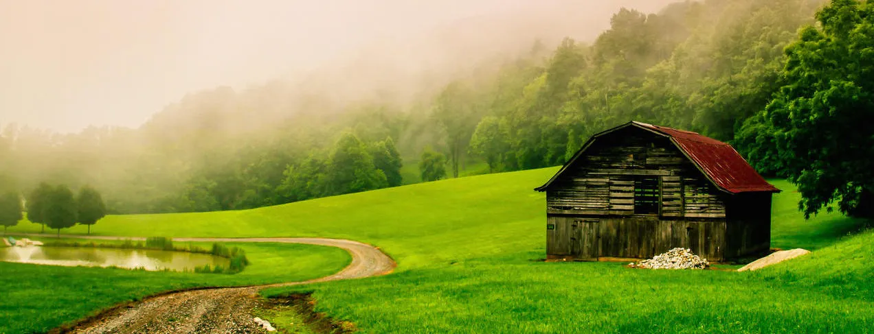
It was the steely grey sky that really grabbed my attention in this photograph of an 1800s outhouse: you can almost feel the approaching storm within the image. I love the light this type of weather condition produces, and the bright sunlight is perfectly accented against the grey sky. My only concern is the inclusion of the white rubbish in the foreground of the photograph - it's very distracting and could have easily been removed before making the photograph. The positioning of the outhouse within the frame is perfect though, the ¾ angle allowing for the shadowy black interior to be revealed.


What I really like about this photograph of an alpine mountain hut is that it's been shot from the back of the building, a much less obvious framing than showing the front. It's another very minimal photo, but its composition needs just a little tweaking to make it perfect. The back line of the corrugated roof looks a bit distorted in comparison with the line of the framing. Also it would benefit from just having a little more breathing space around the building as the framing is just a bit tight.

