


I think that there's a really interesting image in here which you've alluded to with the dancers at the front - but the onlookers spoil the overall frame with their complicated positions. Sometimes all we can do is move ourselves around to find a clear frame and although I like the blur of the shoes in this, we have to (ironically) also be part of a dance when we photograph these moments make sure we're where we need to be. Keep pushing.


This is well seen and I think it works decently enough: one foot sharp, the rest blurred to give a sense of movement. I like the multiple and confusing reflections (although the logo and bag (?) at frame-top/ single show is a little distracting - but overall, a pretty solid and wry look at passersby. Well seen.


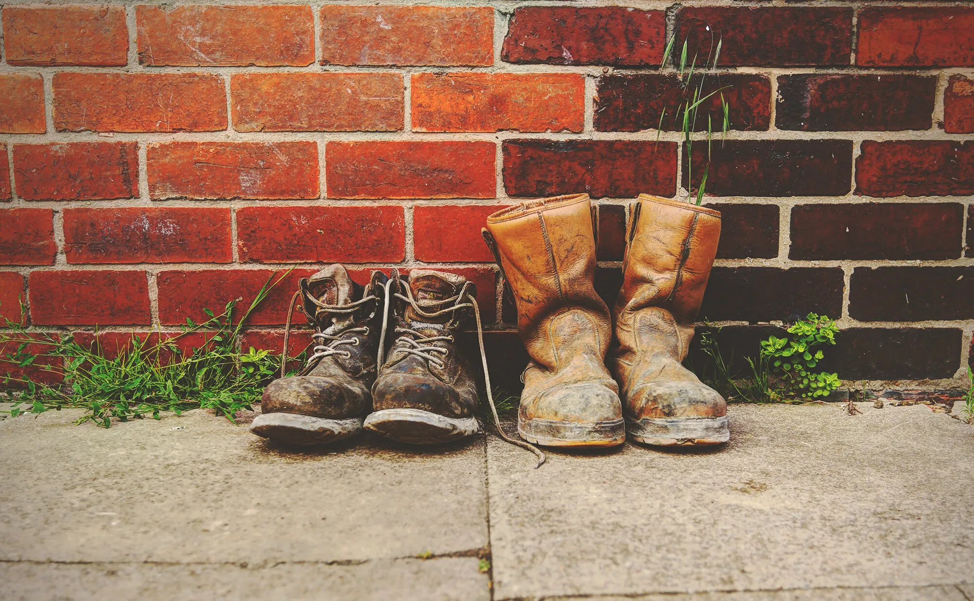
I like this very much: often, less is more and this is a controlled and rather sparse image that does what it needs to do. The frame is graphic - emphasised by the monochrome - without being showy and I like the shape that the shoes make together and singularly. Overall, this is just well observed - a different viewpoint that forces us to reassess the theme of the competition and our relationship to how we see shoes. Well done.
1,164 Images entered


This is a nice idea - a raking light examining the contours of a well worn shoe. In practice, it needs (to use a footwear idiom), a little polish. I presume that the main light is daylight (by its intensity and that the image is taken at a wide aperture). That's fine but there's insufficient coverage of the shoe away from the hot concentration of light. Either we might angle the shoe to get a light coverage that gives us a sense of its whole shape (or we might use a reflector of some sort to do the same) or concentrate solely (sorry) on the illuminated area of texture. Either way, this is a fair go but with a little thought, could be a cracker.


407 Photographers


A really nicely balanced frame with the main third both a meditation on colour and shape - and of course, power. The second third - the disappearing figure - framed by the rope and architectural features. I particularly like the well caught moment of the red-gloved shoeshine and her nicely draped hair. Simple and balanced. Well done.


Well, this is nice enough: a decent composition with the lines of the bench and shelves leading us to the cobbler. What lets it down I think are the blown highlights on the lasts next to the window - and that's where the eye is first drawn. It's a shame because a little more careful metering might have solved that - especially as I can see that this is an HDR image. Keep pushing.


Meet the expert judge
Brief
See more contest details
**This contest is open to photographers ranked between 251 and 1000 in this week’s <a href="https://www.photocrowd.com/photographer-community/">Leaderboard</a>.** We spend a lot of time choosing our shoes, making sure they match our outfit, and taking care of them. But the poor shoe rarely takes centre stage in our photography, situated as they are so far away from the smiles and shining eyes we're usually pointing our cameras at. We'll change that here, for one contest at least, so let your imagination run free as you think of interesting ways to showcase shoes.


