Get notified of their new contests

This was a late entry to my top ten, but one I kept coming back to. The subject was a refreshing difference to the predominantly architectural shots that dominated the contest, and the "rectangles and squares" in the scene are at the same time obvious and subtle. The image creates a lovely mood with the early morning mist and the contrast on the fencing is just enough to avoid becoming too dominant. I would have preferred the image without the distracting watermark which draws the eye away to the bottom left corner, but I decided not to let that keep me form placing the shot, as I like it a lot. Well done on your top ten placing.


A nicely composed image, clearly architectural, but abstract in nature due to the framing. Lovely capture of the lighting, which highlights the shapes in the design of the ceiling, and the colours are beautifully rich and warm. A simple composition, yet full of interest. Well done on your top ten placing.


I can't help but be attracted to the bold and varied colours you have captured here. What sets this image apart from many others of similar subjects, is your well-considered composition, where you seem to have the diagonal crossing the frame in just the right place and angle for an abstract image which is pleasing on the eye. Plenty of details and textures to explore give this image interest, and despite being abstract, can hold the attention for a good while, as there are always new patterns and shapes within the textures to discover. Great abstract, well done on your top ten placing.


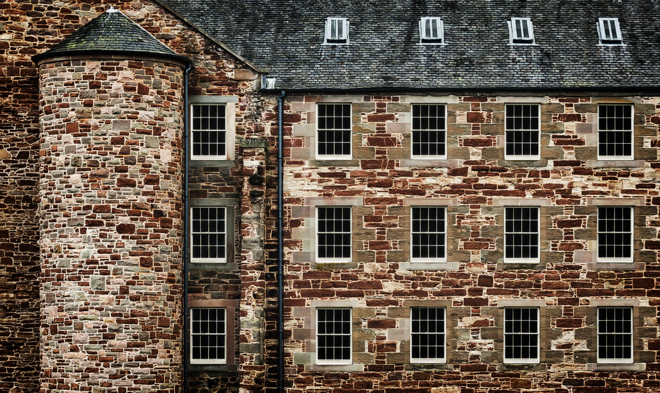
There were numerous entries in this contest which would have benefited from some degree of vertical and horizontal adjustment. There is no such issue here however, as this is a great example of precision in architectural photography, which greatly strengthens the visual impact of the image. The rectangular blue windows are perfectly placed on the contrasting yellow wall, and I like that we can get a little glimpse inside the windows too (also evidence that you have not used one window and digitally placed in on a blank wall!). I am unsure how much this accuracy was achieved in camera, and how much a result of correction in post-editing, but whichever, it has been very well done. The inclusion of the lamp adds a focal point and a contrast to the straight lines of the windows. Congratulations on your second place finish.


The success of this image is largely due to the decision to convert the shot to black and white. By removing all colour, the subject, whilst clearly still recognisable, becomes a little more abstract, an image of strong shapes and lines. The conversion to black and white has been done very well, as there are a full range of tones from black through to white, which gives the image a vibrance despite the absence of colour. The horizontals and verticals are all true, which gives the shot further strength and visual impact. A lovely architectural black and white image, congratulations on your first place finish.


This image attracted my attention from the start with such a simplistic, mundane but unusual subject choice, which is bang on brief for the contest. With all the elements of the composition, there was a risk that the image could have become too "busy" with a lack of focal point. However, you have selected a wide aperture, and chosen a focus point around one third of the way into the image, which has given a relatively shallow depth of field, nicely blurring the background and some of the near and far hanger squares. Bold but natural colouring compliments the scene. Great work, congratulations on your third place finish.


1,577 Images entered


Meet the judge
1,000 Photographers
Brief
See more contest details
This contest is for your best photos of anything which is square or rectangular in shape. The subject can be anything you choose, either large or small, a single square/rectangle or several, and in any setting. You could try photographing the shapes from an interesting perspective to add impact to the shot. Please ensure the squares or rectangles are a focal point of the image and the shapes are easily identifiable within the shot. Images can be in colour or black and white. I look forward to seeing your entries.


The slightly unusual angle of view helps this image stand out for me. I like the composition and where you have placed the figure within the frame. The checked pattern on the man's shirt contrasts in colour with the painted crossing, to help the subject stand out. Although the gent does not look to be moving especially fast, your shutter speed is high enough to keep the details crisp and sharp. An interesting shot, well done on your top ten placing.
68,583 Ratings

This image may not turn out to be a crowd pleaser, but it caught my attention for its simplicity, the mundane subject matter, and your eye for an unusual but great shot. The slightly melting snow on the three square slabs are key to the shot, both as the theme for this contest, but to somehow give the image more meaning. I love the capture of the little footprints too. For me this image shows that a location or subject does not need to be exotic or far-flung to capture the essence of the season. Great work, well done on your top ten placing.


The strong shadows in this image are as much the subject of this shot as the actual basket. Composition looks to have bern carefully considered, as it can be so easy to forget about where the shadows are falling, and instead focus too much on the object before you. That has not happened here, and the strong light has cast deep shadows, and make a rather mundane subject into an image which is far more interesting. Well done on your top ten placing.


There were a number of entries in this contest which showed wide city views, which did just about show squares and rectangles, if I searched long and hard enough to find them. Here however, due to a very effective black and white conversion, the tiny shapes of the windows in the distance pop out of the image. Lovely capture of the light, with a great range of tones from black through to white, producing a beautiful black and white cityscape. Well done on your top ten placing.


