Street Signs
KR Milne

Street Signs

December 2022

I think that this is a interesting interpretation of the brief. This is a simple yet effective abstract photograph which I feel has been executed and edited well. I really like the striking composition of the yellow lines which are immediately familiar against the gritty street textures.

I really like this interpretation of the brief and think that the photographer has captured the feeling of loneliness in the vastness of the sea in the background of this photo. The clean white lines and the shadow against the texture of the sea makes this a good photo in my opinion.

I really like the way that the photographer has used the surrounding architecture to isolate and bring attention to the street sign as the red pop of colour in this photo. The clean straight lines make this visually interesting and a good entry.

I like the simplicity of this image and think that the photographer was right in their choice to submit this image in portrait as I do not think it would have worked as well if it had been landscape. The black cables against the clouds in the sky draw focus to the street sign. A good image.

Expert
winner

I really like the simple composition of this photo for this brief. The photographer has taken the subject of street signs and used an ordinary roundabout to draw the viewers focus whilst creating movement from a passing car. An interesting and atmospheric photo. Well done.

I was drawn to the way that the photographer has framed this image. The vast and grand background with the soft texture of the clouds with the multiple warning signs in the foreground. Animals, possible falling debris, humps in the road and many others there's so much information to take in all at once that this gives creates interest for the viewer.

I really liked the interpretation of the theme in this image. There is something very cinematic about the angle of the shot and the tones used in the edit. A few minor adjustments to the lines in this photo would make it an even better image in my opinion. Good work.

I was immediately drawn to this photography due to the point of view of the image. The symmetry and colour draws the eye of the viewer and I really like the balance of colour and tone in this image. A unique interpretation that is well executed in my opinion. Well done.

Brief

See more contest details

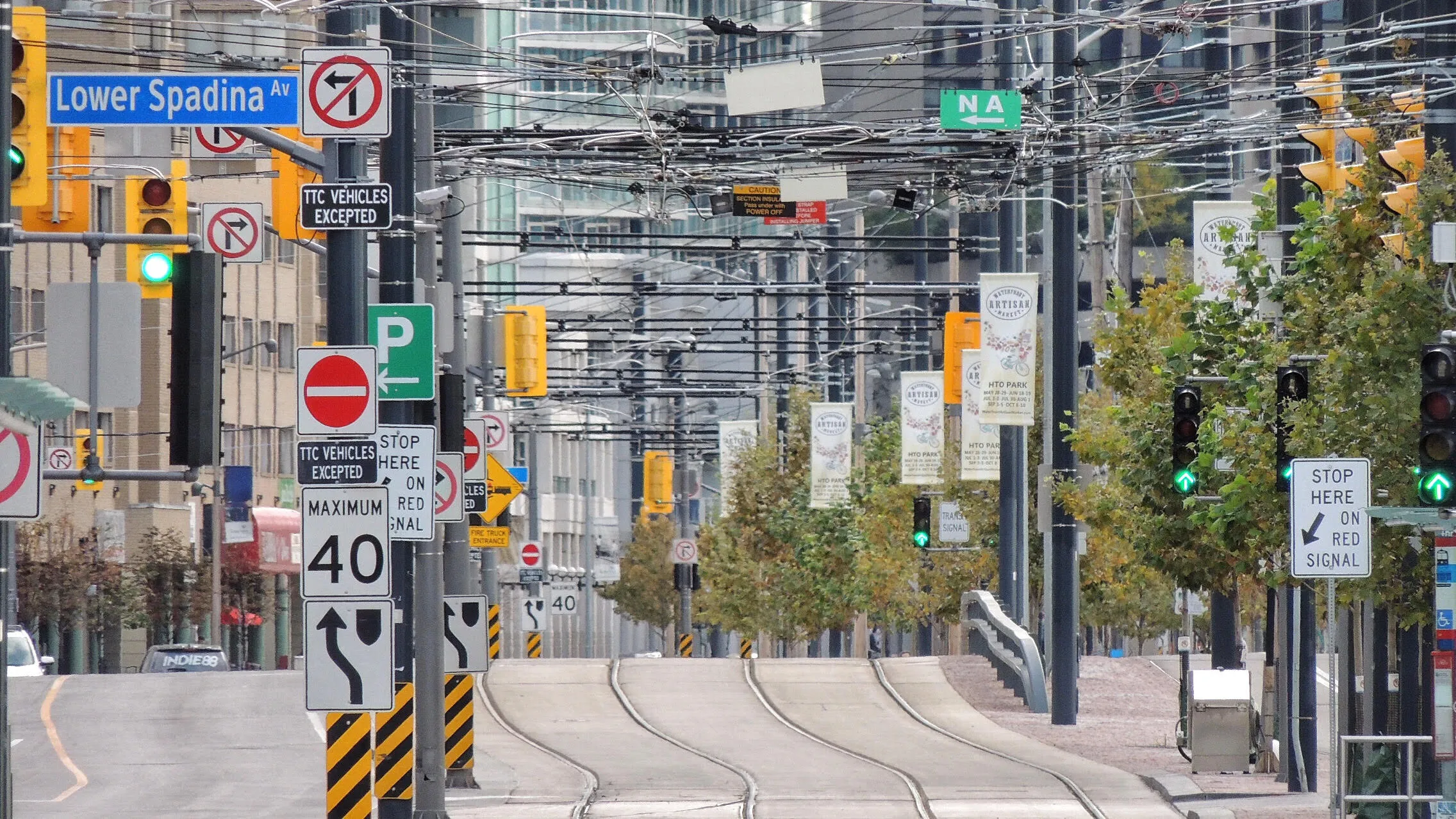
There's a wonderful website called <a href="http://www.Geoguessr.com">Geoguessr.com</a>. It drops you somewhere in the world on Google Maps, in Streetview mode, and you have to guess where you are. Pretty quickly, you become obsessed with street signs. What language are they in, what design are they, and do you recognise any of the place names? Street signs are one of those things we might find ourselves drawn to photographically when we visit somewhere new, embodying as they often do the reality of being somewhere far from home.

I like the colours and layers created by the buildings in the background of the photograph. The iconic New York yellow traffic lights bring interest to the front of the photo and add additional interest with the street signs nestled subtly in the photo.

1,598 Photographers

2,789 Images entered

I really like this photo and love the clarity considering it was taken from a hotel window. Simple and effective whilst being nicely balanced for the viewer. A clever interpretation of the brief and use of point of view. Well done.

I really like the simplicity of this photo. I think that it is a brave decision to have the red of the sign clash against the building, and on this occasion I feel that it has worked well. I feel that the photographer may want to keystone / correct the angle and lines to improve it, but this would only be a subtle improvement in my opinion.

With so many street signs I think that the photographer has done a good job to capture them with their use of depth of focus. I think that the decision to submit this in portrait rather than landscape was a good one as it gives the viewer perspective and draws the eye. Well done.

I really like the way that the photographer has composed this image. The editing gives a haunting impression on a dark night. I like the tone of the edit and textures that have been retained in the edit. Well done.

I really like the composition of this photo. The angle of the photo has created horizontal shadows that frame the image and draw the eye of the view to the centre of the photo. I also like the tones of blue used in this image which compliment each other well.

I really like this interpretation of the brief. This photograph tells a story and gives me chill just looking at it. The motion of the snow across the image is very effective against the trees and the person carrying an umbrella. I think that the decision to make this black and white was a good one. Well done.

Meet the expert judge