
This has a fantastic use of geometry and lines. The composition is stunning and the story being told is great.
What I love most about it is it looks like the architecture is guiding this person, almost like an outstretched hand navigating those who walk among it with safety and reliance.
It is a fascinating take on an architectural challenge as it not only showcases the architecture in the image but also how people interact with it. It is stunningly abstract yet successfully literal. I am stunned by this one.
1,839 Images entered
1,173 Photographers

58,160 Ratings
Brief
See more contest details
*Blake's brief*: For this contest, we want to see those incredible buildings you've found on your photographic journeys. I know I have a collection of barns, churches, and skyscrapers that I love to revisit in my portfolio from time to time. For this contest, you can show us interiors or exteriors of any structure. We would love to see what architectural wonders you have captured!


The most colorful of the top five, yet almost lacking color. I found the processing of this photo to be mesmerizing. The strong use of pink plays perfectly against the rest of the colors with as it juxtaposes the saturation of the other colros, yet does not distract from the overall composition. The subtle undertones are wonderful as the colors and tones are kindly balanced with one another.


I find this image captivating, very similar to the winning image in that it shows the architecture and how we are to interact with it. The line work and composition are spot on and everything is in perfect order.
I appreciate your subtle use of color, a simple monochrome would have been good, but it wouldn't have swayed my mood in the direction you took me with the subtle hint of blue. It almost feels like a chrome finish. A very polished piece of fine art.


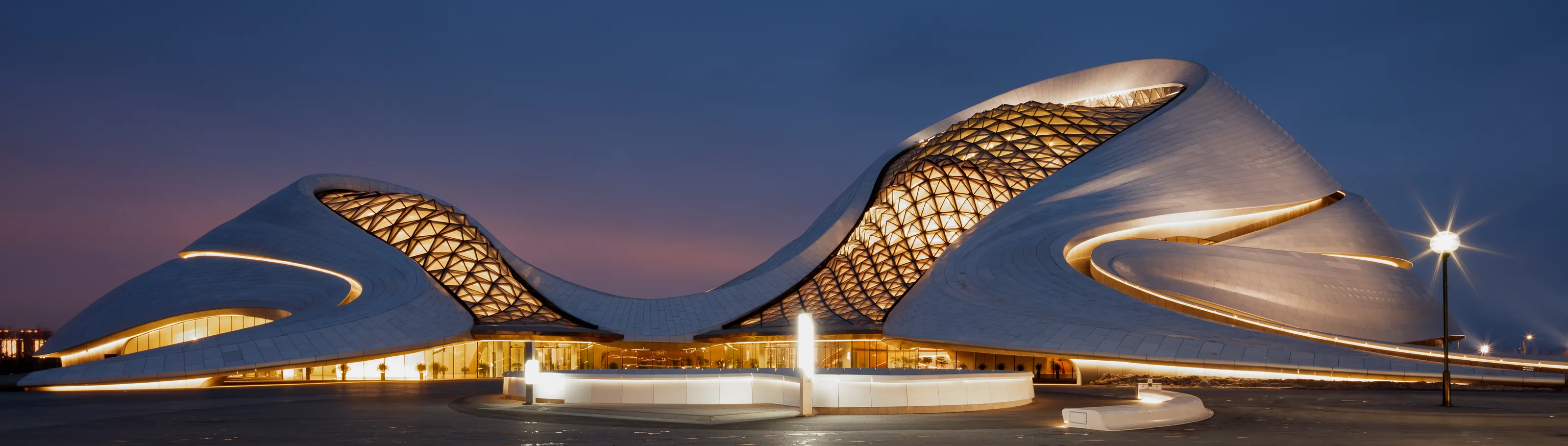
This image perfectly showcases the phenomenal craftsmanship that went into creating the curves in the building. I really feel like this image goes on forever because of your use of framing. It is perfect, it shows me just enough to know what it is, yet leaves the rest of the structure to my imagination.
To me, this image shows us that finding tight compositions in buildings can really pay off big time for the final composition. My eyese are swaying all over the canvas, almost as if they are on a visual rollercoaster!


Meet the expert judge


Compositionally I really enjoy this photo. It is a great representation of the structure. I just have two main concerns with it.
The time of day. This would have benefitted from a sunrise, sunset, or a blue sky with clouds. The blue in the background makes it appear dull.
The tourists. In this image I would have used a neutral density filter on a tripod to extend the exposure over a longer period of time, then the tourists would start to blur away. If more than one exposure were necessary, I would combine multiples and mask out the areas where people were.
Tourists, unless they are used as a compositional element can make or break a good photo.


