
My eye wanders all over this image. I just love it.
I have never noticed "fur" on a leaf- so cool!
But most of all I love how you are inclusive of all the shades of color in fall. The frame is just full of color. I ALWAYS tell people find what the interest point on an image is, then MOVE IN ON IT!
Here you have done that. Makes for a VERY unique and winner of an image!
And the water just adds another dimension!
Thank you!
Dave


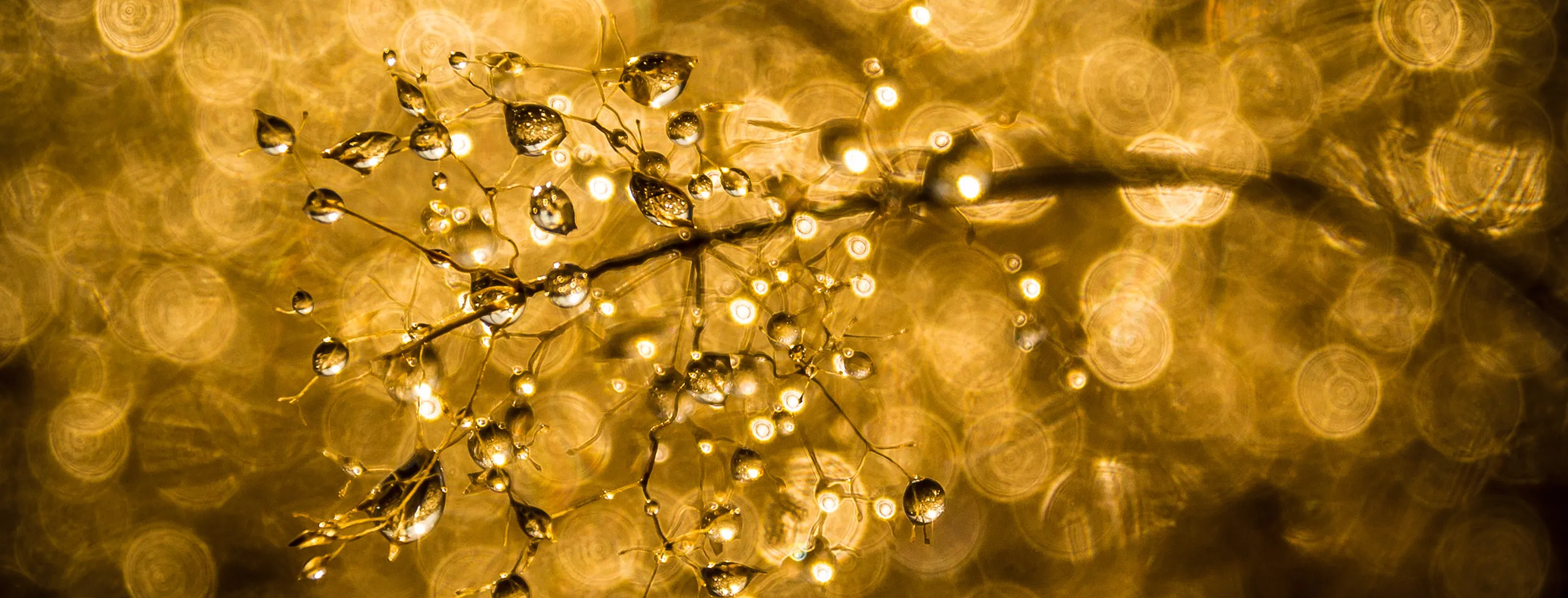
Gold
Gold Gold.
GOLD GOLD GOLD!
Ding ding ding we have a winner.
What can I say that this image does not already make obvious to any viewer? Just perfectly done. A view for miles. Great gradual haze.
Most of all it makes me jealous I did not shoot it! :) (I hope you read that in the way intended- I mean this ion a totally [positive way!)
Thank you very much for entering, and congrats!
Dave


You dont know how anal retentive I am on straight lines and centering objects in architectural photography. I am positively driven to perfection in lining up this sort of image. Just ask the 100's of people I have critiqued when they try this sort of image.
But you NAILED IT. Your verticals work, and your symmetry is right on.
There is a bit of burn in on the domes at the top, and the light bottom center, but that is minor. I would have brought the highlights down, and worked on the windows more.... but I am OK with what you did, too!
Wonderful image, and I appreciate all the work that went into this!
Dave


The impressionism is strong with this one!
Such a simple image, and so much beauty in it. This is a hard image to even see.... much less take.
This is GREAT proof you dont need grand views and incredible sunsets to make great images. Sometimes simple, poetic images shot in a backyard or just down the street are just as inspiring as a sunset at Zion Canyon.
Thank you so much for entering!
Dave


Exotic and exciting!
There were not a lot of portraits in this contest.... and I always like to include a portrait in the finals. I like to have an assortment across styles and subjects.
This far and away was the most exciting and fun portrait in the contest. Technically wonderful- you did not blow out the BG, her lighting is just spot on. Shadows are beautifully soft- just what the image needed!
Thanks!
Dave


Thank you for entering the contest!
I do like this a lot... but.
I hope you don't mind a but. The light and the moment captured are GREAT! The tint looks a little green to me, but thats not too much of a problem.
Where I think this could be better is the exposure. I look at this, and 400 ISO is not bad, probably about where I would be. Since we have a central subject in a nature scene, I would have pulled back some on the aperture f/11 or even f/8.... but even more so because you needed a faster shutter speed.
To my eye, the central person is slightly motion blurred. I THINK he (she?) should have been crisper.... or completely motion blurred. My preference would be crisper.
But the partial motion blur here I think takes the picture down. I would have also maybe silhouetted the main figure, at least just to see how it looked. (It may have looked bad... but I would have tried that)
So maybe this was one of those instances where you were shooting one thing, and this just happened and you had to grab it fast. Cool, I have been there.... I was a news photographer for a number of years, so I have been in positions many times where I had one shot at a quick ly unfolding event.
So great idea, great light, great comp. I wold just trade up some aperture for some speed on fast moving objects!
Dave

Thank you for entering this image.
This is a beautifully composed, well thought out image. You have edited it well, and the lines and perspective are perfect!
I discount a LOT of images because they do not pay attention to details like straight lines and such. That is HARD TO DO, and I recognize that. Plus the unique perspective- this is an image a LOT of people can learn from!
Good job!
Dave


This image just blows my mind. Is the reflection natural, or did you do it in development? I dont care, I love it!
This made my short list.... so you were up high in my picks here at the end. Other pieces just seemed to draw me more.... but that does not mean yours is bad. Yours is VERY good!
Thank you for entering!
Dave


I dont have a CLUE what this is. Not at all.
But OMG I LOVE it!
The colors and the shapes are... I don't know- just INCREDIBLE. Beautiful.
Please PM me and tell me about this- I REALLY want to hear the story.
In the mean time, just know that I find this incredibly beautiful, and one of the best pieces I have seen in a LONG time!
Thank you!!!!!
Dave


1,591 Images entered


Great capture! Good light and great subject. Wonderful treatment in post. Reminds me of a painting.
This made my short list.... so you were up high in my picks here at the end. Other pieces just seemed to draw me more.... but that does not mean yours is bad. Yours is VERY good!
Thank you for entering!
Dave


Thank you for entering this image!
And what a GREAT image. I see a lot of building images, and single point images.... and so many are "almost" there. You NAILED it! You were in the exact right spot for this image, and you got the symmetry just perfect!
So I had to comment and commend you for such a good image.
And what a cool room, too!
I have been there, too- I KNOW how hard something like this is to get, and under adverse to just HORRIBLE conditions. You did GREAT and I had to commend you!
Dave

Thank you for entering the contest!
A truly lovely picture, and a great building! I thuink you had the right idea in this image, and you did a pretty good job of capturing it. But I THINK you can do better! I KNOW you can!
Like I said, you have the total right idea- shoot this centered. That is called "Single Point" and while it looks REALLY cool, it is REALLY hard. Many people dont know exactly what it is and what to look for, so I will point out a few things. Then you will be like me- CURSED!!!- to always see this in images! :)
What you recognized correct here is that chandelier and the rope it hangs on is the dead center of the image- good job!
That line extends down the center of the doors... and then through the centers of the hexagons on the floor. That has to be a full, complete, unbroken and 100% vertical line.
If you have a tripod and time, and no one bugging you it can be done with a lot iof work. I realize you may NOT have had all those luxuries.... so I am going to tell you how to do that in the heat of a tourist rush!
First, do as you did and fine that center line.
Next, get yourself l;ined up EXACTLY on that line. More specifically, get the axis of your lens EXACTLY on that line.
Now (hopefully) in your camera viewfinder, there are center lines. Line the top one on the rope, and the bottom one centered in the bottom hexagon.
Shoot. Shoot again. And again and again! Move SLIGHTLY back and forth. Keep shooting. Have 20 images or more.
Now in post find the most perfectly aligned image. Start with that, then start straightening and flattening your lines.
Its a HELL of a lot of work, and the image will only have a slight appearant improvement in image. But it will be correct, and that is what matters.
It may not be worth all that work for you.... and thats cool. But if you want to up your game, this will help! I hope! :)
Good luck and THANKS for an absolutely gorgeous shot.
Oh- I forgot to mention: your exposure is SPOT ON! Excellent job!
Dave

Thank you so much for taking the time to enter the contest and even to make this picture.
You have done so much right here I really think it is worth pointing out. A lot of REALLY HARD things were handled very well.
First the exposure- just great. because I am so compulsive i probably would have toned down the ceiling some.... but you are NOT over exposed. I just find it draws my eye to a place I really dont want to draw eyes to. I think if the exposure of JUST the ceiling came down a stop and maybe a bit more, your eye would go more easily to the altar (which I feel is the focus)
I THINK you used a tripod. I hope so- I wont leave home without one! at 1/6 a second, you almost had to to get this clear a shot (or you got VERY lucky!)
I would have shot an image (maybe multiple, one for the ceiling, one just like this, and maybe one under to bring out the chairs in the foreground)... then waited 1 minute and done it again. Then again a minute later. You do that, and you should be able to mask out the people with layers in Ps. Whether you mask them out from multiple exposures or clone them out, I ALWAYS feel you should remove a few people. If its masses of people, leave them... but remove just a few if that is all there are.
Finally, and this is SUPER nit-picky- but you are slightly right of dead center. For architecture, you should either be at least 15 degrees off center or dead on center. If you shoot from inside that center 30 degrees and you arent dead center it just looks off.
Here the chandeliers show you are slightly right. The should all line up and be centered on the altar.
Overall, this is a really nice image! My comments are minor compared to all you did so well here, so dont be down- you have a great eye and know what you are doing!
Dave

WOW!
I REALLY LOVE this image! While I love the color, my first thought is how would this look in black & white? I bet it would be super cool!
I think you also did the cathedral, right? Here as there your center line is a bit off. Its close, and I had to measure to be sure, but it is-slightly left here. This one may be correctabkle in Lr and Ps.
I want to end there- I REALLY LOVE this, and I do not want to put this down- it is GREAT!
But....
OK, this is so dang picky I hesitate to put this in. And I do NOT know if I am right- probably not! So take this as just where my mind goes when I see this, not as what is good or makes this better. But I do think the tables on the left are distracting.
I would (at least as an experiment!) copy the right side and flip it onto the left. Layer it and mask it in. That would do two things. One, it would let you get this framed EXACTLY centered and symmetrical. And two it would remove the tables. And you dont need to use the WHOLE flip- you can just bring in parts of it with masking.
Like I said, it may or may not work, it may or may not look good. But that is how I think when I see something like this. And I said all this not because I think it is right, but to inspire YOU to think beyond just shooting an image, and get top the point of thinking about MAKING an image.
Its OK to do "fake" things- this is ART! There is no limit. SO have some fun, play with it!
Dave


This is all about the color. Love the contrast of the colors- the warm yellows vs the cool blues and purples.
This made my short list.... so you were up high in my picks here at the end. Other pieces just seemed to draw me more.... but that does not mean yours is bad. Yours is VERY good!
Thank you for entering!
Dave

I read your description. Half way through I said to myself there is no way this is a single exposure. I TOTALLY AGREE that is what you have to do sometimes.
When you see something, as an artists you chase it and you make it. Itis NOT cheating to combine images, or use tricks, it is CREATING.
I think you did great here, I love it!
This made my short list.... so you were up high in my picks here at the end. Other pieces just seemed to draw me more.... but that does not mean yours is bad. Yours is VERY good!
Thank you for entering!
Dave


I really like this image. Such a cool and interesting image. Just really intriguing and fun, draws you right in!
I had a quick comment if yoiu dnt mind. Pay close attention to your edges. IMHO, its a good idea to not cut off objects with your crop (Specifically upper left and mid-left bottom). I think either show a whole object or cut it out entirely; half-shown seems so unfinished. A minor thing, but clean edges would clean this up some I think!
Thanks!
Dave


OK, so I get down on a LOT of people who do building shots with bad verticals. Usually they are shooting single point, which HAS to have perfect verticals.
You took a canted angle here, which means you CAN have converging lines. Overall I like this- the lines and the light all pull you in to the dome.
This made my short list.... so you were up high in my picks here at the end. Other pieces just seemed to draw me more.... but that does not mean yours is bad. Yours is VERY good!
Thank you for entering!
Dave

Do you know how many images of this building were entered ion this contest? I dont.... but a LOT.
Dont get me wrong, it IS a cool building, but its getting old looking at so many versions of the same thing.
You at least found a new and refreshing angle on the building. Thank you! :)
This made my short list.... so you were up high in my picks here at the end. Other pieces just seemed to draw me more.... but that does not mean yours is bad. Yours is VERY good!
Thank you for entering!
Dave


I love this for the tone.... and the feel. I get a stream punk vibe from it, very Captain Nemo!
This made my short list.... so you were up high in my picks here at the end. Other pieces just seemed to draw me more.... but that does not mean yours is bad. Yours is VERY good!
Thank you for entering!
Dave


Thank you for entering this piece!
VERY nicely done. I like the composition and the balance of this piece! The colors are just terrific.
If I can make a slight comment, you are slightly right of center... you can see the main Buddhas hands do not quite line up with the arms. The way I have found to best solve this is first realize you are shooting something that NEEDS an exact center (a symmetrical shot like this).... then, usually in your viewfinder there are ticks or marks at the center top and bottom. Line up that center line with those ticks and shoot- that should help a LOT!
FWIW, even when I do that, I am usually off a bit! :) Its a TOPUGH shot, and you did a great job here!
Thanks!
Dave


Proper beer has a head! You are an Ozzie, you should know that! :)
Just giving you a bad time, mate. If I am not mistaken, this version has the green taken out of it, right? I noticed that in the other version- I thought there was too much green. I think! Maybe it was another picture- I have looked at a lot!
I am NOT a product photography expert, so take what I say with a grain of salt.... but I think your contrast is too wide here. I THINK (and I could be wrong!) but I think the light table is too hot or bright and the tops of the bottles are too dark.
Again, not what I shoot daily, but I would think the beer should be equally lit top to bottom.
I do LOVE the water on the bottles- great job there! And how you poured a beer that full with no head, wow!
Ozzie Ozzie Ozzie, Oy Oy Oy! :)
Dave

HI! Thank you for entering the contest!
this is a GREAT time of year, isn't it? I LOVE fall- we get some great colors here in Utah, too- but you would not think so would you?
hey, I am going to make a comment here, and REALLY- I mean this in the kindest way possible. I REALLY am trying to help. I must say, I am SUPER GUILTY of this, too. I LOVE color. But sometimes I push saturation a bit too much. I THINK you have here.
I say that because, well, look at the road. See how its turning a bit blue? That is a sign I use to tell me I am going too far. I think all the colors are just a bit too high/ Again, this is my personal tastes- I do NOT want to say it is right, correct or that you are wrong. Ultimately, what you want is what is correct, and I would NOT try and say anything different!
I would also never criticize without giving you (my opinion!) of how to fix it. The obvious fix is to take down the saturation. But I have a better way!!!!! (Don't tell anyone, this will be just for us!)
Try this- take the saturation down, maybe even a bit lower that you would normal. The in Lightroom, or Camera Raw in Ps, go to the HSR controls and just bring up the Yellow or just the Red- just one of the colors. And MAYBE even saturated the green. I think just having one color pop may be a real cool thing to do here.
So there ya go, I hope that helps!
Dave


Really cool doors- whoever created them, well, I just think they are great.
As to the photograph.... I think you did a pretty good job on it. So as an image, I like it.
In terms of judging a contest, though, I have to get REAL PICKY.
Something like this needs to be perfectly centered and perfectly symmetrical. This is CLOSE, but just enough off I can see it.
However, you can clean this up in Ps or Lr.... I would recommend doing that if you are going to show it. Make sure ALL your verticals are perfect, and make sure the center of the door is perfectly centered..
Minor tweak- I would also dodge and burn some so the expose is consistent across the image,too. The right side is a little dark.
Except for my silly little critiques, this really is a fun and pretty image! Good Job!
Dave


571 Photographers

Meet the expert judge
Brief
See more contest details
***This contest is open to subscribers (members on the Challenger, Pro and Master subscription tiers). However if you're not a paying subscriber you can still purchase entries for £2 (GBP) per image.*** Gold is a colour that draws the human eye, magnetically. Wars have been fought over the beauty of gold and its connotations which, although typically linked to manmade items such as jewellery and plates, can also be found throughout the natural world. Whether it's in the form of light, flora or the colour in a lion's eye - gold has been capturing the human imagination for thousands of years.

Thank you for entering the contest.
I love cool abstract images, and this one is GREAT! Strong compositional lines and leading lines. Just a great composition.
I assume you layered and pulled color/saturation from the windows- good call on that, it makes the image stronger!
Overall very strong and well thought out!
After the last two images, I looked at your portfolio. I now feel like I am preaching to the choir- you do KNOW architectural photography.... so I am guessing nothing I say is new to you! You obviously know this stuff inside and out. So I have to ask you (and I am serious!).... when you see a building picture with bowed lines... or with converging sides, does it bother you as much as it does me? Ha ha!
Anyway sir, I am s glad to have seen your work. It is beautiful and well done.
Dave


48,328 Ratings


