The letter Z
Sarah Murrell

The letter Z

June 2018

Crowd
winner

588 Images entered

435 Photographers

26,637 Ratings

Entry 1992934
278th
53

This one was just a hair (pun intended) from being in top 10. Nice lines, nice directional light, nice color contrast between the zipper and fabric, clear letter Z and point of focus adds dimensions. But competition is fierce and in detail superior. Keep up good work, just pay more attention to editing.

I really like the tight crop here. Puts focus on colour contrast and flowy zigzagging lines. I think a lot of people would be tempted to photograph the whole scene and lose this nice detail in the whole picture. Good work!

It is easy to just take a photo of an interesting building, scenery, etc. and call it a day. But I feel this is not the case. Very well chosen drammatic point of view and rather a tight crop makes most of the zigzagging lines of building. The sign in the corner spices things up nicely.

Entry 2016703
420th
138
Expert
winner
Entry 2028897
12th
146

I am going to pass on the fact that this is a reversed Z. But apart from that, it is a perfect shot. Clearest Z by far, but still abstract at the same time, almost graphic as the letter stands out. Great eye! Congratulations!

Entry 2064579
5th
2
331

Meet the expert judge

Entry 2010862
141st
8
Entry 2076336
178th
38
Entry 2088334
128th
89
Entry 2116329
7th
47

Masterfully composed. White water making Z shape naturally leads eyes to the lighhouse. Dramatic, but somewhat colourfull sky with well placed highlights fixes the attention at the desired spot. I really like the editing, especialy fact that you kept the scene quite contrasty with pure black, while maintained detail shadows. Subdued highlights keep sense of darkness. Nice job, indeed.

Finding Z in places where no one else looked at. Focus and highlight on petals really leads eyes of the viewer and helps him/her find the Z. Another thing I like is the overall atmosphere of the picture – very soothing.

Entry 2132515
53rd
64

Clearest of the zigzags made of almost nothing. Nicely used negative space supported by well chosen image ratio brings a beautiful result. Color grading adds just a bit extra to create mood. You truly have a photographer's eye, very original!

There was ton of zebras, but nothing like this one! Yeah, luck plays big part on this one, but that is what photography is about, isn't it? It certainly did not catch you unprepared. Great shot, great timing, great composition!

Brief

See more contest details

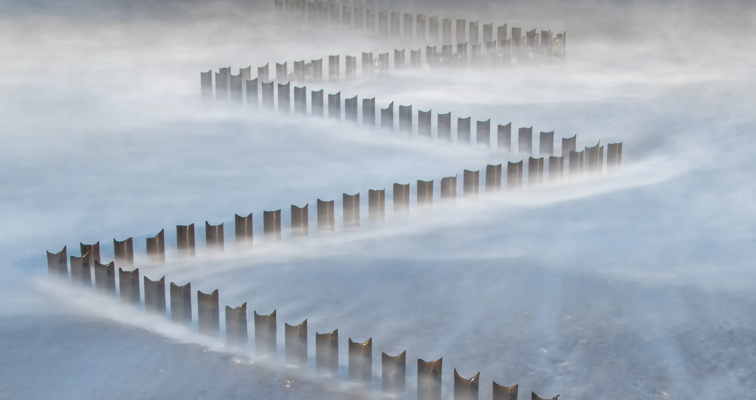
In association with <a href="https://www.zoner.com/?utm_source=photocrowd.com&utm_medium=contest&utm_content=link&utm_campaign=2018-04-photocrowd">Zoner Photo Studio</a>, we want to see your representations of the letter Z. This might be a literal interpretation of z-shaped objects, cleverly composed images built around zig-zagged leading lines, simple shots of subjects that begin with Z, and much more. Here's a real chance to show your creative interpretations around this iconic symbol – show your zest for all things Z!

Entry 1993594
62nd
327
Entry 1994801
52nd
106
Entry 1994802
36th
102

This one belongs to my favorite pictures. Clear story, great moment, great light, nice depth, nice edit rather embracing the contrast than fighting it. Unfortunatelly did not fit in the brief. Keep on and surely you will score in more contests to come!

Entry 1997040
67th
34
Entry 1999008
64th
19
Entry 2076352
39th
14
Entry 2081678
30th
7
Entry 2131349
38th
22
Entry 2132514
19th
65
Entry 2133784
25th
165
Entry 2135399
26th
28