


How many of us have thrown money into a fountain as a symbol of a wish or dream, but perhaps never thought about what happens to it thereafter? This image is great at provoking this question but still yields no answers. By revealing the everyday workings beneath the usually hallowed water of the Trevi Fountain, this image reminds us of the more mundane side of a monument's maintenance. On a technical note, it is a shame that the hard hat, T-shirt and some rocks behind the worker are over exposed as these hot spots encourage the eye to these areas.


Many photographers take images of people begging on the street, and to stand out an image needs something above and beyond. I like the colour palette in this image, the shape of the woman's posture and the warm light that is falling on her. The location is an interesting one too. However, the image could have been stronger had we been able to see some of the emotion in her face and perhaps a few more obviously well-heeled feet passing by, or, indeed have no one else visible, though keeping the strong graphic lines in the stairs to take this image to another level. This way we might have had a very strong image screaming isolation and poverty. Another idea might been to have photographed someone acutally giving her some money and seeing the gratitude in her face.

I was intrigued by this image and loved the sense of time that oozes from these weathered, bent coins. The contrast between the living texture of the bark and that of the inanimate coins becomes entangled through the age these pieces of metal have been embedded. It's a peaceful image full of contemplation, and we know these have been placed here to signify notions of hope and good luck. The image quickly goes out of focus at the top left of the image, and while this helps to give it a depth I feel it would have worked slightly better had the focus been retained or indeed had we seen along the length of the trunk a little more - albeit with it going out-of-focus.


This striking image intrigued me. The background is akin to an eye shining light onto the subject creating an almost James Bond-like silhouette. The mannequin's confident gesture and styling combined with the minimal number of items on sale scream out exclusivity and wealth. The composition is strong and the image is nicely balanced. To strengthen the picture a little more I would have made a crop on the left hand side to remove the pole and so to stop one's eye from wandering over to the sliver of light at the edge of the frame.

This image is like eye candy. It's bold, over the top and fun... and oozes wealth. There were many images of sleek and expensive cars in this competition but I felt this one stood out well above the rest which were more descriptive and every-day. The abstracted detail has a cheeky feel to it, kitsch and cartoon-like, which could in itself make a comment on these fabulously costly toys. The wonderfully rich (though predictable) red colour works well with the detail in the design, reminding us that we are looking at a fine machine. To the delight of the owner perhaps, this image can't help but be noticed.


This image nearly made it into the top 10 due to its blatant drama, provocation and originality amongst the entries. What let it down was the lack of focus on the most important feature of the image, the yellow paint. The text to the right hand side behind the glass is almost sharp but this isn't where we need our eye to settle. The flakes stuck within the paint ideally need to be pin sharp to maximise the impact of the shot.


This is a powerfully provocative image full of sadness and contrast. I feel this image has strength through the dishevelled, heavy shape both he and his belongings take on, the layering and textures and the fact that we are unable to see his face - we can only imagine his expression. Black and white works well for this image as it has reduced it to the essential components without any colour distractions that are often present in street scenes. I might have been tempted to crop out the bicycle on the left hand side so one's eye is held at the man and isn't tempted to wander beyond him.


I can see what the photograpeher was attempting to portray with this range of jewellery, but unfortunately the luxury and opulance of the objects isn't enhanced by the composition, the viewpoint nor the way the image has been lit. Instead of evoking notions of wealth (e.g. sparkle, colour, design, intrigue, etc.) the image simply documents the muddled objects. Next time, try to simplify your set by considering interesting compositions that isolates a few pieces and play with the lighting so that it enhances the sheen, richness of colour, sparkle, design etc. Having 'negative space' where there is little in the image can greatly enhance the composition and meaning of an image.


I'm drawn into this image by the incredible detail the photographer has managed to capture, which is enhanced by the meticulous attention to balancing the image symmetrically. Often in these opulant environments there is insufficient light to retain enough detail in the darker recesses of the celing, never mind keep much of the detail in focus in low light conditions. There is a slight distraction of a plant frond visible at the bottom of the image, which ideally would be removed.


117 Photographers


Brief
See more contest details
Upload your photos on the theme of wealth, whether taken last year or last week. Live crowd voting and expert judging by <a href="https://www.photocrowd.com/b/108/judge" target="_blank">Zoe Whishaw</a>. One-to-one portfolio review with Zoe for the expert-vote winner and great photobook prize for the crowd-vote winner.

There is an opportunity in this situation that might be worth revisiting. As it is, this image is rather literal, just describing the moment in front of us with very little that is meaningfully in focus. It could be interesting to get in much closer to where the action is - a pin sharp shiny, expensive shoe and crisp hem of a trouser leg justaposed next to a moving soft buffing brush. By getting a low, tight viewpoint you might even glance over the nicely arranged brushes on the floor hinting at the immaculate service this shoe shiner is providing.

This image is a great attempt at bringing togehter various components to generaate a conceptual image relating to growth, success and wealth. It didn't quite make the top 10 as I felt it was rather dated - images with this ultra saturated background and clearly fake components were much sought after and used back in the 1990s but not so much today. Stock has moved on a great deal and more realistic representations of these classic concepts work better these days in communication terms.

The strength of this image lies in the comic reality of this wonderfully found observation, and enhanced by its tight crop and enriched colours. The centrally-composed banner has been carefully considered to further emphasise the absurd wording. The directness of the image could have been much less effective had the photographer included more of the surroundings, in which case we might have drawn a range of different conclusions about its origins and created a more complex narrative. As it is we are able to enjoy the provocative wording and muse over its origins.

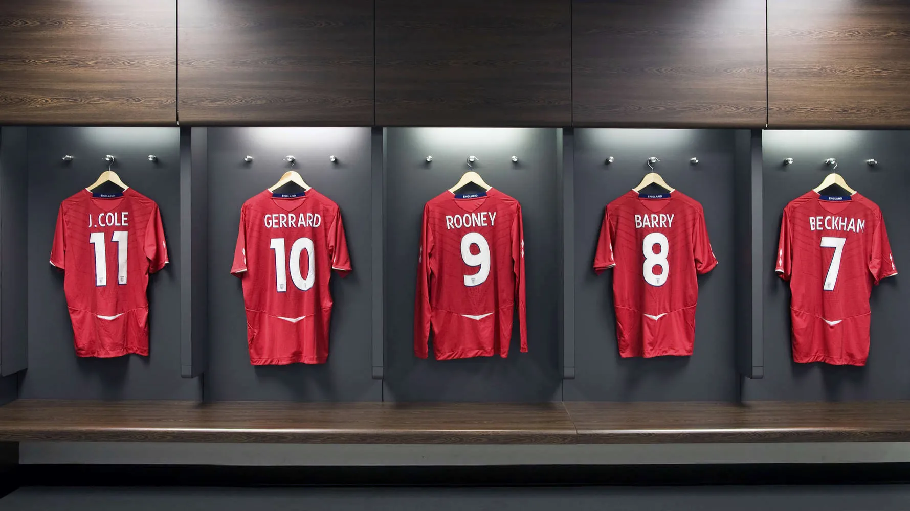
Footballers certainly have a reputation in the wealth and money arena and this image is a nicely different way to remind us of their presence without seeing them directly. The lighting is well balanced across the whole image despite two fairly strong downlights that we can see above. I like the almost perfect arrangement of the shirts, and while this may well have been a situation happened-upon by the photographer rather than created by them, their keen eye spotted the opportunity and composed the image in such a way to create a comment that was enhanced by excluding any surrounding paraphernalia.

185 Images entered
26,611 Ratings


I was pleased to see this picture as it was noticeably different to many of the entries in that it was a more lateral interpretation of the theme. Interesting ideas for images can often be generated by considering the opposite notion of a concept in a brief to make us think. The photographer here has thought beyond the more obvious opposite of homeless people, by instead considering the effects of a lack of wealth and money. The added contrast along with a vignette towards the top of the image helps draw our eye into the central, empty iconic object of the shopping trolley.
Meet the expert judge


What a great opportunity to have been this close to a wonderfully unique horse. However, to enhance this fact, this image needs to go a step further so that it too stands out. At present it is as much about the man leading as it is the horse. Take a look at the fabulously silky hind querters of this animal - they speak luxury grooming, bristling health, attention to detail, immaculate turnout... all the things you'd expect from a horse of this calibre and the wealth surrounding it. I'm sure its whithers would similarly speak volumes about his strength and pedigree. While I realise the moment was very transient, it could have been interesting to have tried a shot of him just after he'd passed you by where you might have captured a more 'alternative' close-up vision of wealth and captured some lovely curves and textures in his muscle/body shape and immaculate coat.


I like the rather super-real nature of this image and I certainly paused on it for a while. However, I feel it didn't work for a few reasons . Had there been a few people occupying the tables in the foreground it could have made the immensity of the building even more surreal. As it is, the image is rather sterile. 1950's postcards (as you were trying to emulate) almost always had people enjoying their location! When doing any sort of post production it is important not to leave a trace of your activities. I can see a white halo around part of the tower block and the buildings on the right hand side as you tried to rein in the exposures, which is distracting.

