


A lot of the jobs I shoot for mobile phone or clothing brands call for images that look caught in the moment or like they are taken by a close friend or family member. This image has that quality in spades! It looks so spontaneous and just shows so much personality and spark. The framing of the moment is also really nice - you get enough of the scene to figure out what's going on but with nothing to distract in the background due to the shallow depth of field. The only downside? That logo in the corner!


I love this. I'm not sure if he's been caught making this mess or not, but that expression is great. I remember the fridge being VERY appealing from a young age (and now, come to think of it!). I'm surprised that this was taken for a catalogue - I really thought it was a captured moment. I'm not always a fan of wide lenses when pointing down like this but here it works well to show the whole scene around the boy. It's nice to see some 35mm film as well.

This is a really great image. I like the look of concentration on the faces of the two kids. It would be the obvious thing to do to wait for them to interact or smile, but I think this moment says more. There have been a lot of staged photographs in this competition, but I prefer these more natural compositions, and this one looks genuine. I also really like the treatment - skin still looks like skin (which is good as it doesn't always with this kind of thing), but it has a distinctive look that adds to the mood.


I love this! What a great image. I'm not sure what she has just found out, or what someone has just said to her, but it's a moment I recognise from being that age. It could almost be accompanied by the phrase 'oh noooooo'. I like the use of on-camera flash here - really punchy. Personally, I would like to see more of her and her surroundings, so using a 35mm or 50mm-equivalent lens would have added more context, which would have been good.


Great colours and great choice of angle. The viewer totally feels the moment of this image. Obviously the photographer could have chosen an angle to show more of the surroundings, but really this choice of angle says it all - hot summer, friends, music and a multitude of colours and patterns. It's great that we have either legs or shoulders or bags heading out of shot on all four sides - this makes it almost an abstract image. This was a good decision cropping wise.


This is a really lovely evocative moment. I love it when shots without faces can say so much. The composition is fabulous and has just the right amount of information. That nice late afternoon/early morning light with long shadows is also lovely. I always look at the images and make notes without looking at the information about each image. I like it when images stand or fall on their own merits. However I just looked at the info for this shot and have one technical comment - There was ample natural light for the image, so I would suggest bringing that ISO down from 1250 to a maximum of 320. Then your file will be so much richer and will print well if required. You don't need a shutter speed of 8000th of a second for anything other than a rocket! It doesn't effect my emotional reaction to the shot, but is something to bare in mind.


Here is an image that really jumps off the page and communicates a genuine moment. I have seen quite a few staged shots of younger kids whilst judging this competition. Often photographers wanted the kids to pose almost as adults but for me it's best that kids are kids. So this image is great - an uninhibited moment, mid-chew and with a face that needs wiping - perfect! I also like the warm tones and the simple background, all tying in nicely.


This is a great image of youth - it has great attitude with the girl's confident, direct-to-camera look. It looks like an image taken by a friend of the girl - she is relaxed and it shows. The colours here are really really nice and the on-camera flash has been used in a good way. The whole thing has a retro feel due to the clothing and items in the room. At first glance I thought she was holding a long cigarette holder, but it turns out to be the old radio.


This image has a lot going for it. It has a great graphic composition, simplicity, colours that work really well; but mainly it's just a lovely endearing and funny moment. Is it a photograph of a young child marvelling at the amazing height of the giraffe or is it a photograph of the giraffe wondering why everyone else is so short? Either way it's a wonderful moment. I'm sure the photographer didn't consider this at the moment of taking the shot, but I can imagine this image making a fantastic poster for a zoo or maybe even a book cover. Simply place the book title/zoo information in the middle of the image and there you go!


This is a really nice photograph of a long hot afternoon, of relaxing and drawing stuff on the tarmac. It's a nice composition with the house in the background and a little bit of dappled light in the foreground. It's really hard to shoot in such harsh light. Often on jobs we'll have a big break in the middle of the day so we can shoot in the really early morning light and late afternoon light with less contrasty longer and softer shadows. Sometimes, however, the moment is happening and you need to photograph it. So here I would look at doing two things in post production: reduce the density of the blacks in the girl's clothes, in the shadow and in the house; I would also adjust the almost day-glo colour of the grass. I doubt this was how it looked to the eye, but it's just that our digital sensors can't deal with grass very well (this is why I reminisce about colour negative film and go all dewy-eyed for the beautiful greens!)

This is a great image, full of energy and tension. Technically these kinds of shots can be tricky, but not only is this shot in focus, it's also a great composition with the three leaders up close, mirrored by the three trees in the background and the out-of-focus English houses. It just says English school days really well. The thinner crop works well here, although I might have looked at bringing it all down a little bit, so we can see just a bit of the closest girl's legs. It's a minor point, but I think it would just help to balance it out.
Lastly, that ominous looking sky shows us that this is definitely not the Mediterranean! Hopefully the 'egg and spoon' race wasn't ruined by a downpour!


This is a timeless image that really represents youth. The moment between the couple in the foreground and then the younger kid peering round. This photograph has a story; I don't know quite what it is but it's intriguing. I'm not quite sure if the couple here are both boys or not, but it doesn't change the impact of the image either way. It is, however, unusual to see images like this of boys, usually it's the domain of magazines like Vice but this feels like a genuine documentary photograph rather than a study of young homosexual romance. The framing and the feel of the image are great. I like the slight blur and the black and white conversion - it has a classic photojournalist feel, like something by Don McCullin or Mary Ellen Mark.

There are a many things I like about this image. It's a great, considered static composition with strong lines through it, but the running girl adds energy and focus to the image. The image has lovely shadows and it looks great in black and white. Aside from all this, it just makes me want to go there. You could say that about any image in the sunshine by the sea, but this image has a timeless, classic feel (and not just because it's in black and white!).


Another great moment - I can almost imagine what's being said here as one girl is animatedly telling another about her day, or a boy in class, or the argument she's had with her sister. In this case it's actually nice not to see faces - we 'get' the photograph anyway. Technically speaking the eye is drawn straight to the girls through a combination of using a long lens to focus on them and by simplifying the surroundings. It could be taken in the UK, or the States or anywhere in northern Europe really. It's a universal moment.


This is a very very nice image indeed. It has simplicity yet it says a lot. It leaves the viewer wondering who she is, where she is, what's going to happen next. It's about discovery, freedom, wonder, plus that light is beautiful. It's all just very cinematic. Technically I think the image would have benefitted from being in focus on the head. This doesn't ruin the feel of the image, but the focus on the head (or else stopping down to f2.8) would have just helped a touch. The colours are really well rendered. Often digital sensors will render foliage as a brighter yellowy colour, but here the colours are perfect.


I love compositions like this. At first glance it might appear to be a simple image, but these kinds of things are really easy to get wrong. The angles in the image are just right, and the guys in the image are in the right place; and the moment of their walk is good too. It's got attitude. Personally I would have loved to see this in colour. I don't like images where too much colour confuses things, but I imagine we would have just had the blue of the water and the grey of the concrete and then the two guys would just jump off the page (unless their whole outfits were blue and grey of course!).


Creating a frame within a frame can be a really nice technique at times and here it works well. It's an evocative image of a long hot lazy summer and looks to be genuinely 'caught in the moment'. A lovely shot. I like the treatment with the slight hazy feel and the low contrast blacks. For me it could've been a bit too much with all of these primary colours in one area of a shot but the treatment helps to rein them in.
293 Photographers


Even though this image is not pin-sharp, it kind of doesn't really matter. It's an expression and a moment that is totally genuine and the whole thing makes total sense, which is hard to do in one still image. Sometimes the moment is WAY more important than anything else. I'd be interested to see the whole frame, mainly to see what is just to the right of the girl - I think it would help to balance the shot out if we had just a bit more to the right.

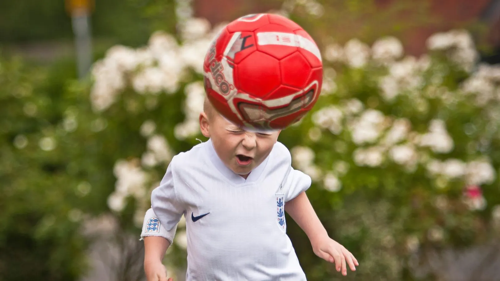
Boy picking his nose with a defiant expression - what's not to like? It's good that we show these kinds of moments of youth as well as just happy times and this image just made me laugh. I like the simplicity of it as well - there is nothing distracting me from the boy. I like the light too, although I think in this instance this boy was in no mood to be moved across the room into 'better' light! The square crop is also great for this image.


A shot of a crowd in the midst of a gig is a surefire way to get some youthful energy into a photograph, but it can still be done well or done badly. This is an example of that shot done brilliantly. There are a few things that make it stand out to me. Firstly, although this is a very busy shot, my eye goes to the chap in the middle just to the left-hand side. This is the best place for the eye to go, his expression is great and he is truly in the moment. My eye goes next to the two guys in the foreground with their hair flying - there's just so much energy. The black and white conversion is also really well done. I actually had a second glance at this and looked for film grain, it seems to have a very filmic Tri-x /HP5+ kind of feel and reminds me of Nick Knights first book about skinheads.
Brief
See more contest details
Upload your best shots of on the theme of Youth, whether taken last year or last week. Live Crowd voting, Expert judging by Kerry Harrison, and great prizes from Pholio for the winners.
Meet the expert judge


I like brave images and unusual images, and it is brave to shoot something this simple and to chop the person's head off. It's a minimal shot that does just say 'Youth'. It's great that it's in colour and I like that it's all so tonal aside from the bright wristbands. The low contrast testament is nice but it would also look lovely with some punch in there too. Sometimes I find it tricky to know what direction to go with an image. Also, you could almost just add a Nike/Adidas logo bottom right and call this an advert. It's tailor-made for putting copy on it and being used commercially.


71,128 Ratings
524 Images entered
