Get notified of their new contests


A simple image, but one which works well in this abstract architecture contest. Well composed and framed, with the shape of the silos being mimicked by the negative space of the sky. Some may be irritated by the open windows, "spoiling" the harmony, but for me it adds to the shot, as does the little chimney structure peeping up from the lower level. You could have decided to clone it out, but I think it was the right decision to keep it. In shots such as this it can be a struggle to get the horizontals and vertical as perfect as possible without pulling the shot into distortion, but I think you have just about managed it here. Great image, well done.


A very crisp, clean image which suits your subject very well. Excellent use of light, shade and negative space which accentuates the abstract nature of the image. Whilst obviously viewing a set of spiraling stairs, the composition transforms it to something else. The lighter edges to the steps and the handrail help draw the eye down the spiral. I do not know whether the colour is true or altered, but it works well and produces an image which is very pleasing on the eye. Great work, well done.


This is a captivating image. What I especially like is the light, airiness it portrays, with the gentle curving folds and waves. In this abstract view, we only get to see a small section of the structure, but it must be a magnificent building to visit, and your interpretation of the architecture you saw when visiting is inspiring. The limited tonal range works really well, as does the gentle colouring of the soft grey and greens. Very well captured, congratulations on your second place finish.

This is a structure which I imagine can be quite daunting to photograph, trying to decide the best view, the best angle, whether to go wide or zoom in close etc. I love what you have opted to go for, and for me it is a great composition. Technically well accomplished regarding exposure, focus etc, the eye is drawn up around the curve into the image. The sky looks to have been softened afterwards, but that helps enhance the architecture, as a "busy" sky could distract and lessen the impact of the abstract. Great black and white conversion too. Well done on your top ten finish.


When photographing large, tall buildings, it can be sometimes very difficult to know how to compose the shot for best effect, what to include, angle of view etc. I think you have succeeded on all scores here. The position of the curving line which divides the two different planes of the building seems just right, giving the image a roughly one third/two thirds split. The black and white conversion works well with this subject, and accentuates the small black dashes, which add to the abstract look of the image. Well done on your top ten placing.


This was a late entry into my top ten, but one I kept coming back to. It initially stood out as being very different to the sharp, clean lines and structures of the modern architecture represented in most of the entries. I like the colouring of the rust and browns, although being picky, I think I would have been tempted to try desaturating the blue and green graffiti, as those brighter colours tend to pull the eye. As an abstract, the square crop works really well too. Not an obvious subject choice in this contest, but it works for me! Well done on your third place finish.

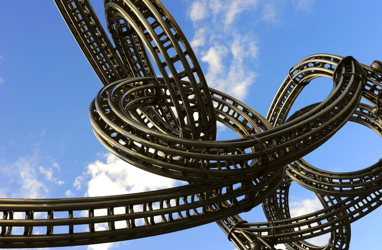
What a great image - this crept up through my initial placings until it reached the top! This architectural structure obviously lends itself to the theme of abstract, but your work in processing has elevated it further to a fabulous abstract of curves, waves, light and shade, and a beautiful blue colouring. I imagine the original image before the inversion and toning was very different, but this works perfectly for this contest. I am not usually a fan of adding a digital frame to an image but with the theme and the subject, it works well and contains the shot. Congratulations on your winning image.


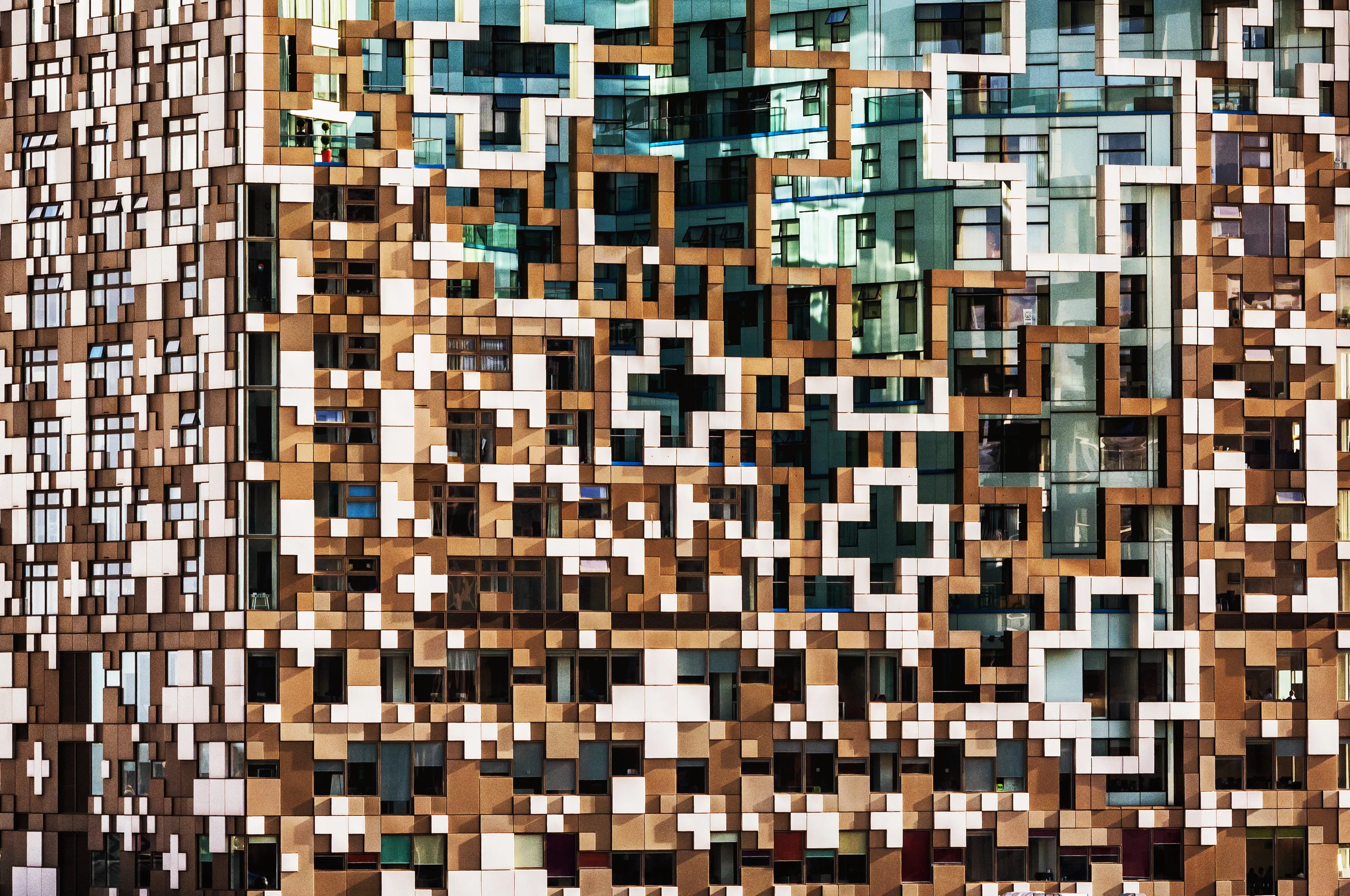
The superbly bold and contrasting colours mean this image cannot fail to be noticed! Well siuted to the abstract theme, the scene, whilst recognisible for what it is, is transformed into a series of coloured blocks and shapes. It would be interesting to see images taken from a similar spot without the signage, to compare the results, but I think on balance, the signs add something to the shot, and somehow enhance the randomness. Lighting has been well controlled, as harsh dark shadows have been avoided, keeping the colours bold and bright. Well done on your top ten placing.


987 Images entered
688 Photographers
35,356 Ratings


Brief
See more contest details
This contest is for your best architectural abstract images. The subject must be an architectural structure, which has been photographed in a creative, abstract way. You may decide to show a wider view of a building which through its architectural design can be viewed as an abstract structure. Alternatively, you may choose to move in close and focus on the details of lines, shapes and patterns within the structure, to produce your abstract architectural image. Photos could work well in either black & white or colour. Please remember, your image must show architecture in an abstract form. I look forward to your entries.
Meet the judge


I initially placed this image, as I love the effect of the strong composition, with the perfect lines and bold contrasts. However I am uncertain how much (if any) of this image is a "real" photograph and how much has been digitally created on a computer, so it sadly slid out of my placings. But looking at it purely as an abstract image of architecture, it is well composed, with effective use of light and shadows, presenting a set of lines, colours and shapes, brilliantly representing a modern architectural structure. Overall, this creates a very effective image which I really like, however it may have been created - well done.