Get notified of their new contests


In a contest with a generally excellent standard of entries, this was the standout image for me, which caused an audible "wow" when I first saw it! There were several great entries in this contest which I have seen many times before, and whilst they are still good images, once seen many times, the initial emotional reaction to a shot (a vital element in my judging) becomes watered down over time and so naturally affects my placings and awards. This image however is new to me, so full of powerful impact. I love the contrasts you have captured within the image - between the soft warm browns and cool grey/blues, and between orderliness and chaos. You have captured this structure in beautiful lighting which subtly shows off the curves and lines, nothing too bright or hidden in shadow. A beautiful, expertly executed architectural image, full of impact. Congratulations on your win.


I couldn't resist placing an extreme wide-angle ceiling shot! There were a lot to choose from, but this was my favorite, as it combined several of the elements I was looking for in the entries. Great angle of view, to my eye you look spot-on with your positioning to get the appropriate symmetry. I think the main reason why this shot works for me in this contest, is the beautiful colour of the ceiling, which contrasts strongly with the stonework of the walls, and so accentuates the details and shapes. Stunning image, well captured, well done on your top ten placing.
1,191 Images entered
822 Photographers

What a fabulous image you have captured here, which gets better the more I look. A perfect subject choice for this contest, as the architectural details you have shown are wonderful. Crisp focusing, exposure and balance of tones and colour are spot on. Whether an image was captured with perfect verticals and horizontals, or adjusted in processing, the straightening here makes this shot stand out - sometimes in an image that does not matter, but here it adds to the impact. I love the little pop of red on the lower windows and the small emblems across the bottom too. Super image, a well deserved second place.

I love the abstract nature of this image, as we have little sense of scale of what we are viewing. Excellent focusing and very well controlled lighting, leaving just enough shadow to show shape and form, without distraction of areas which are too dark. The limited section of red at the top works well - it would have been easy to be seduced by the bold colour and be tempted to fill the frame, but here we have lovely contrast between the colourful patterns and the smooth plain whiteness. Great image, well done on your top three placing. (Thank you too for adding the interesting detail in your accompanying description, always nice that someone makes the effort to educate and inform, rather than leaving a blank which gets filled merely with "untitled")


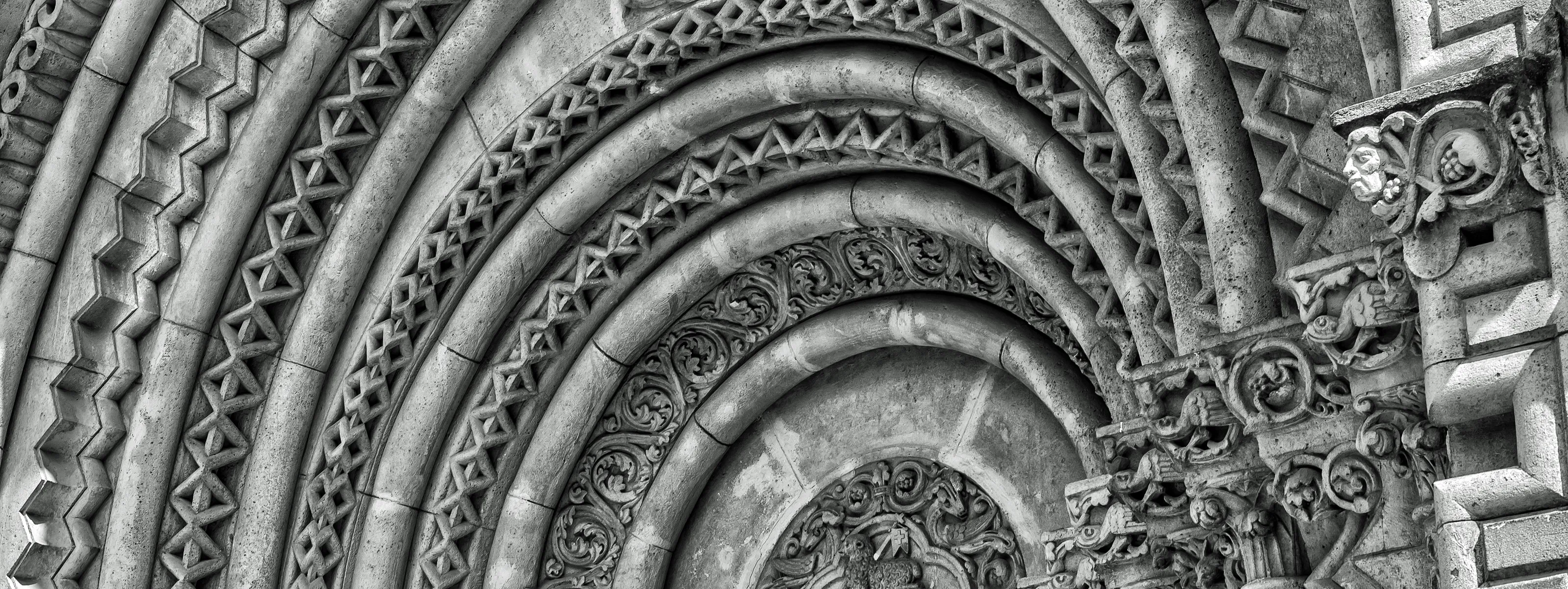
This is a great image, with your composition giving a taste of what we may find within the entire structure - the decorative arch, the windows, the large archway and the two-toned stonework. I imagine shooting conditions were not easy, trying to balance the indoor dimness with the bright light entering from the high ceiling windows, but you have managed this really well. I think the real strength of this shot is your decision of what to put in the frame and what to leave out. For me we are close enough to see the details, but far enough away to get a good sense of place. Great work, well done.


You have captured such a limited section of the Pantheon, but in this small view, we get a great insight into the building as a whole. The image has a very "solid" feel, possibly a result of the darkened tones and contrasts, yet we can also see the gentle curve of the walls, which hint at the round shape of the structure. The detail at the top of the columns has been very well captured, with great focusing and depth. What I really like here too is the very limited colour palette you have used to produce the final image. Lovely shot, well done.


Some people will go out of their way to avoid getting people in their photographs, but this image is a prime example of why sometimes, they are essential. Although the figure is relatively small within the frame, and just creeping into the corner of the shot, without it the image would be fairly dull and lifeless. I don't know whether the figure was posed, but the stance you have captured is great, as we get a sense of casual watching and waiting, at the same time as admiring the fantastic architecture on show. The black & white conversion has worked well, as with such a "busy" pattern, it would have been easy to be overwhelmed if colour had been retained. Great work.

What I really like here is the simple colouring, with nice soft contrast between the grey and sandy coloured stonework. You look to have taken the image in fairly strong lighting, but you have managed to lift the shadows under the arch to allow all the beautiful details to be revealed, without looking flat or unnatural. The angle of view gives us a feeling of the size of the building, and the intricate details in the architecture are clearly focused. Well done.


51,540 Ratings

A very strong monochrome image, highlighting the shapes and patterns perfectly. The conversion to black & white has been done really well, as you have picked out a great deal of variation in tones of the stonework. If were being picky, I may have slightly lightened the two sections on the very top right and left of the frame, as the darkening there could distract the eye slightly from the rest of the image, but that is a minor point. Beautiful image, great work.
Brief
See more contest details
In this contest I would like to see your best images which show the details of the architecture of a building. A detail is a small piece of the whole, so to capture this you will be best to avoid a wide, street view of a building, but instead move in much closer, so the details of the structure are the focus of your image. Whether it is patterns, shapes, colours, carvings or another architectural design feature, try to show the detail in a way that somehow defines the character of the building as a whole. Images could work well in either black & white or colour, and show modern or older architectural styles, but please keep your image focused on the detail of the architecture. I look forward to your entries.
Meet the judge


There were numerous images of spiral staircases entered into this contest which no doubt will score highly in the Crowd vote, who usually seem to become mesmerised by the spiral and award high marks! Personally, I find those spirals very cliched and I generally pass them by when judging, but this was one of the stand out spirals for me. Great combination of good focus, exposure, and composition and a super black & white conversion too. Well done


There were numerous images of spiral staircases entered into this contest which no doubt will score highly with the Crowd, who usually seem to become mesmerised by the spiral and award high marks! Personally, I find those spirals very cliched and I generally pass them by when judging, but this was one of the stand out spirals for me. Great combination of good focus, exposure, composition and colour. Well done


There were numerous images of spiral staircases entered into this contest which no doubt will score highly with the Crowd who usually seem to become mesmerised by the spiral and award high marks! Personally, I find those spirals very cliched and I generally pass them by when judging, but this was one of the stand out spirals for me. Great combination of good focus, exposure, composition and colour. Well done.


I love this image, and I find it somehow captivating! The central composition is solid and strong, suiting the subject perfectly. The processing treatment you have used works really well too, as the image has a beautiful tone and feel to it. Lovely sharp details, and a great range of contrasting tones across the spectrum from black through to white. In essence such a simple shot, but one I could stare at for an age. Congratulations on your top ten placing


