Architectural Repetition
Dariagufo

Architectural Repetition

July 2024

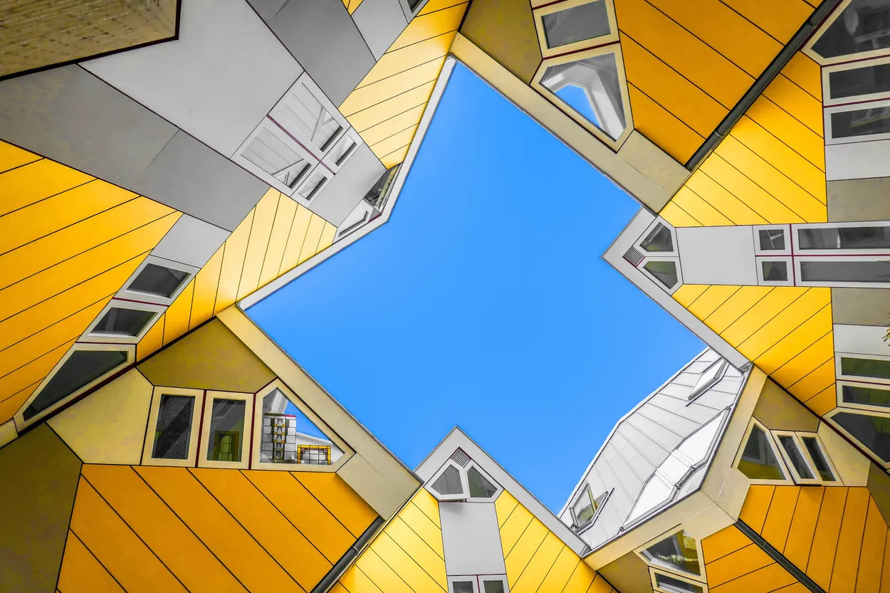
This is a great perspective and a wonderful use of such a wide angle lens to capture a view point that most people wouldn't see.

The treatment of the image is great, I would maybe just have a little play with the gradient applied to the sky to add a little more realism but it really works from a graphic view.

You've done really well here to control the gradient from white to black throughout the image and the graphic impact of your framing is what drew me to this image.

I'm not usually a huge fan of black and white images but for this subject I think it works really well.

Something really drew me to this image, it perfectly lines up with brief and the almost copy and paste nature of the building looks great from this angle.

I like your treatment of the image, there's just the right amount of contrast in there to make it really punchy but also not over saturate it or darken the blacks too far.

Well done.

Entry 20185839
148

I like everything that's happening in this image.

The repetition of the lampposts covers the brief and the children almost gazing out towards the future by looking out to the wind farm is a great addition.

It's a very British image and reminds me a little of the work of Martin Parr.

One of the only aerial images in the competition and I think it really works for this brief capturing a view that 99% of people wouldn't usually be able to see.

I like your treatment of the image and it adds a slightly dystopian feel to the image.

Great image which ticks all the boxes for the brief.

The lady walking through frame is perfectly placed and you have handled the gradients from black to white throughout the image really well. There are no burnt out areas and nothing is lost to true black so well done for that.

My only slight change would be to remove the child as I find them a little distraction but overall it's a great image.

I love shots like this which offer us a little view into the lives of others, somehow without feeling intrusive.

There's a little bit of barrel distortion and you're not quite horizontal which is why I've not placed it higher but I'm really splitting hairs there and it's a great image.

This is a great shot.

I really like the almost graphic, pop art nature of the framing which makes the image pop and you have got the perfect time to shoot this building with those shadows.

The treatment and warmth throughout the image works well to show of the facade too.

This is a fantastic image and it was very nearly in my top 10!

Black and white works really well and your treatment and cropping is great too.

I would just want you ever so slightly to the right so you are perfectly central and I think this image would be perfect.

Entry 21084003
173

A late entry for the competition but one that instantly stood out for me and I knew it had to be in my top 10.

It's framed really well with everything straight which really adds to the repetition effect.

Fantastic image and one that wouldn't be out of place hung on a wall of a gallery somewhere.

Brief

See more contest details

Architectural design features are often repeated, and are a gift to photographers looking for engaging compositions. Windows, panelling and cladding, brickwork, arches and types of ornamentation can all be used en masse in buildings both new and old. They offer an opportunity for symmetrical compositions, or ones shot more obliquely, to create an image with greater dynamism. Be sure to spend plenty of time exploring your architectural subject from different angles, to find the most satisfying view.

4,578 Images entered

Meet the expert judge

This is a great little image and good proof that the best camera you have is the one that's with you.

You have done really well to keep everything straight, it really adds to the impact of the repetition and that pigeon just completes the image.

I really like the dream like nature to this image with all those clouds drifting through.

Great use of a drone to capture a view of something most people would otherwise not see and I appreciate your description for the image too.

1,555 Photographers

I'm a big fan of brutalism so concrete is the way to my heart.

You've kept everything straight and I think your cropping of the images works really well but somehow I want to see more of the building so I can get more of a story of the area.

Entry 19632118
2
399