Get notified of their new contests


It may turn out that the older, more mundane style of architecture does not capture the crowd voter attention, but this is a great image apturing a scene of the everyday. Although the verticals are nicely upright, the composition looks unforced, and I love the contrast between the straightness of the architecture and the stooped posture of the figure with their walking aid. Everything looks naturally processed with no unnecessary editing effects - just a great image well captured. Well done on your top ten placing.

Just an initial comment on the contest judging overall: There were a number of great entries which had one person as the main subject within the architecture, but also with other people in the background, even if very small. In the interests of fairness and being true to the brief, these images have not been awarded.
On to the winning image: This image is a great example of how a figure in the scene can really elevate the shot. I love the tones of the image, which has really accentuated the textures of the stonework. Composition is especially strong, with the curve of the road leading the viewer into the scene. Care looks to have been taken with ensuring the verticals are true and not distorted, and these strong uprights help convey the size and sturdiness of the architecture. The lone figure is perfectly placed in the image, as we can join the figure on their journey through the city streets and discover what lies beyond. Congratulations on your winning image.
1,232 Images entered
Brief
See more contest details
This contest is for your photos of architecture that also have one lone person in the scene. There should be only one person in the image, with architecture being the dominant subject of the photo. The person could be relatively small within the frame, but try to capture the shot so that the lone person is a key element to the success of the composition. The architecture can be interiors or exteriors. Entries can be in colour or black and white. I look forward to seeing your photos.

This was a late entry into my top ten but is an image I appreciate the more I look. A strong architectural shot, brought to life by the included figure walking towards the camera; close enough to be an important part of the composition, but not too close as to be a distraction. What I especially like is the contrast between the built and more natural environment, with the lovely greens harmonising well with the metallic grey, and providing some lovely soft foreground interest. Great work, well done on your top ten placing.


An interesting perspective of this fine building. The viewpoint looks to have been carefully selected to frame the waterfront landscape in the distance, and the well-placed figure provides a good initial focal point. I may have been tempted to try cloning out the sign on the right (along with its reflection) as that tends to pull the eye. Colouring and processing look natural, and highlights the shapes and form of the architecture. Well done on your top ten placing.


A striking architectural image with strong graphics. The sunlight looks harsh, which casts strong shadows and bright highlights. The image looks to have been processed with a filter that has created an unusual colour cast on the water and sky which I would not usually go for, but somehow that suits the subject and adds a certain mood, completed by the inclusion of the sunbather relaxing by the poolside. Great capture of the lines of columns running into the distance too. Well done on your top ten placing.


On the face of it, a very simple image, but one that is very effective. Due to the design of the building the image has a rather retro feel, and creates a lovely mood. I like the brighter tones, prefectly capturing a bright sunny day. The figure has been well placed in the composition, and even if a set-up scene, still requires skill and timing to get them in just the right position to be framed by the central window, and be captured mid-stride. Well done on your top ten placing.


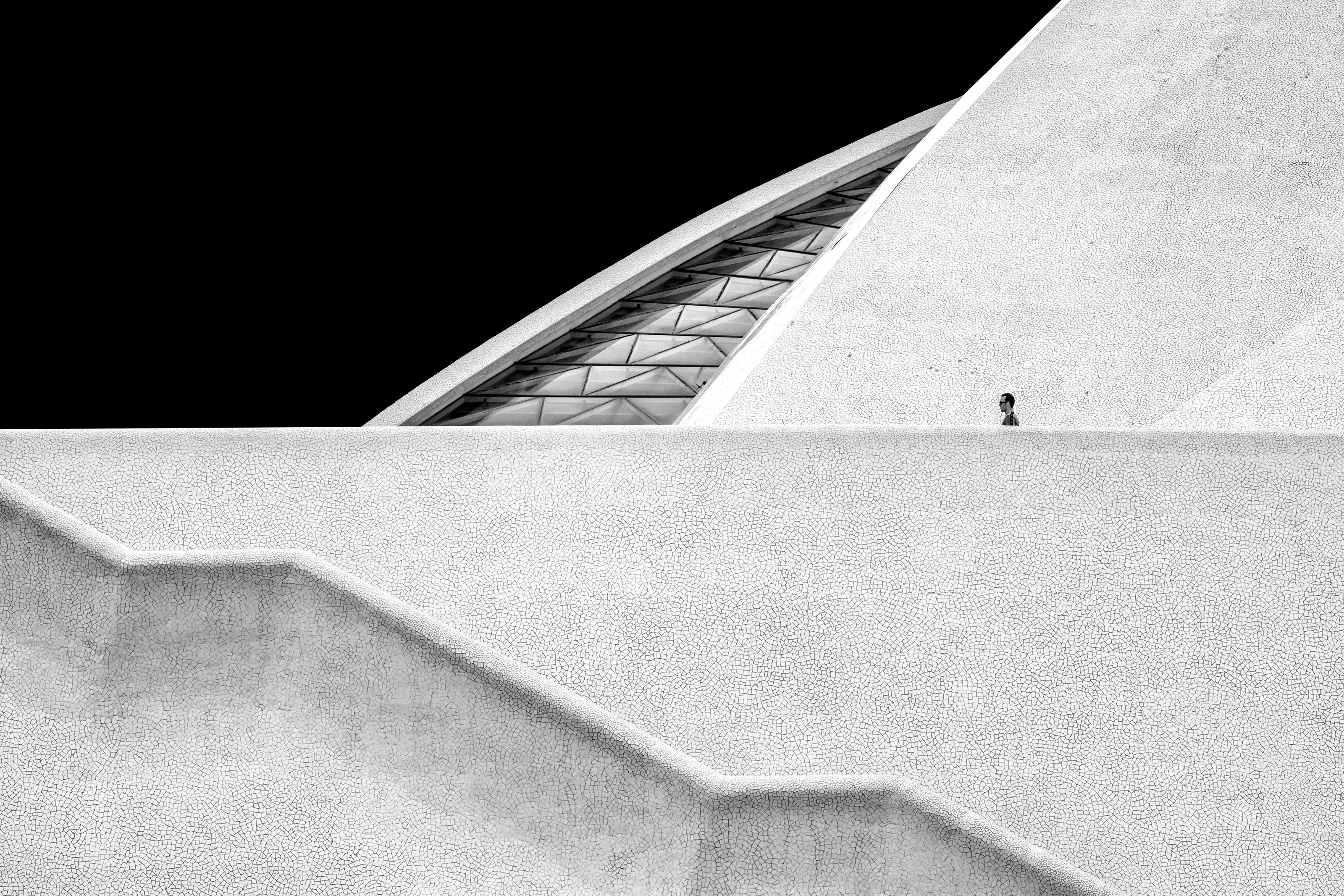
The striking colour scheme of the architecture in this image does not fail to grab the attention. You have done well though to avoid any temptation to over-saturate the colours, instead keeping things how I imagine they would be to the eye. The figure is only small within the composition, but by being sklhouetted against the light they become a key element of the photo. Good control of shadows and highlights has brought some lovely tones on the smooth and reflective surfaces. Congratulations on your third place finish.


A great low light image of the illuminated entrance to what looks to be a back entrance to a shopping centre. The lone figure is well positioned in the entranceway. The predominantly dark tones suit the subject, but there are enough areas of brightness to prevent the mood being too oppressive. Great work, well done on your top ten placing.


678 Photographers
Meet the judge
34,889 Ratings


