Get notified of their new contests


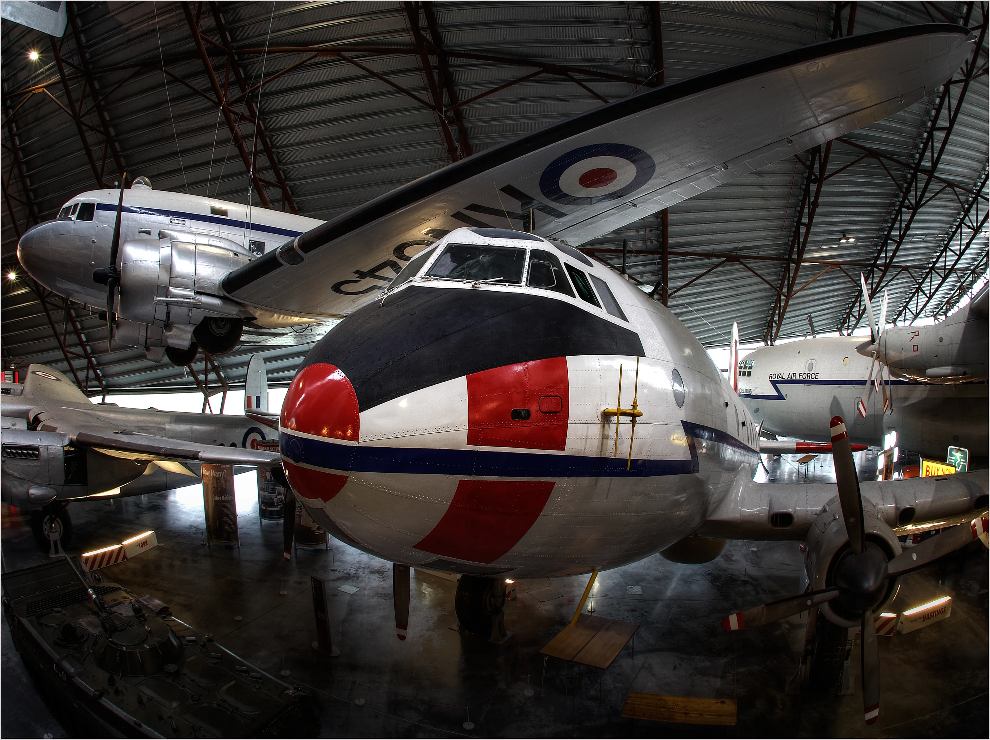
This is another good looking and well processed HDR image. It’s well composed, the whole of the plane is included in the frame and the background is nicely uncluttered. I especially like the patches of colour from the plane insignia adding interest to the otherwise subdued colour scheme and the reflected window light picking out the nose cone, cockpit and engine housing.
A fine image and congratulations on a top ten placing.

I’m a great devotee of HDR processing of interior images and this entry uses the technique to great effect.
The composition here is perfect and provides a complete view of the aeroplane from propellor to tail and wing tip to wing tip. The colours and lighting work well and the plane is well separated from the simple gray background. My one minor criticism is the red tail plane of the jet on the right of the image which does tend to pull the eye slightly. This could perhaps be addressed by desaturating the red to sit it more unobtrusively into the background.
All in all though a lovely shot and well worthy of a top ten placing.


Thanks to everyone who entered the contest and for the variety and quality of your entries. From personal experience I know how hard it is to take a really good photograph inside an aviation museum, such is the cramped nature of the exhibits, the difficult lighting conditions and the crowds of people.
This my winning entry entered the top ten as soon as I saw it and whilst other images jockeyed for places this image was always going to be first.
Put simply I love this image, the composition is clean and uncluttered, the viewpoint is perfect and the conversion to monochrome crisp and clear. It’s an image with great visual impact and is a worthy winner of this competition.
Congratulations on first place !!


What a great image this is. The low viewpoint, head on view and resultant symmetry provide for a great deal of visual impact and the inclusion of a few figures lets the viewer see how big these machines really were.
Monochrome is a sensible approach here as it’s such a detailed image that I feel the inclusion of colour would be distracting. Furthermore, the monochrome conversion has been very well handled and is crisp and contrasty.
Well done on your top ten placing.
Some monochrome conversions are wishy washy and grey but this is crisp and contrasty and very suiting of the subject matter. It’s a busy image with a lot odd detail and I feel colour would be 2y too confusing.
270 Photographers


Now this is so very different from the other entries in the contest and is almost an aeroplane abstract rather than a static representation of the museum exhibits.
Monochrome works well and I love the strong diagonals and sense of movement. A brave image to enter and a worthy gamble.
Very well done on your top ten placing.
462 Images entered

17,456 Ratings


What a wonderful image this is and rather than fight the clutter and pick out an individual plane the photographer here has embraced the chaos and produced an image of great quality.
The colours are vivid, the starbursts pure eye candy and the elevated viewpoint reveals the aeronautic clutter in all its glory. Above all though the composition has been carefully considered with the elegant sweep of the Concorde wing leading the eye into the frame and the detail beyond.
Fabulous image, well done!!


Meet the judge


