Get notified of their new contests


As they say: the devil is in the detail. The scene won’t be the same without the old fuchsia broom, in a vivid contrast both with the orange wall and the terracotta tiles floor. In addition, the vertical lines playing, that gives impetus to the composition very effective. Thank you so much for this shot!


I really enjoyed the vertical cut of this image and the division of the space into different planes. In the the foreground there is the yellow building, whose monotony is broken by the the roll up door of the same color. In the background, stays a gray wall marked by rectangles; still behind three white columns of irregular height ending with spheres, and, finally, the sky. In short, an excellent composition, dominated by the primary colors, which gives the whole metaphysical atmosphere. Thank you so much for this beautiful picture!


What a gorgeous idea to photograph a block note! The image that emerged is very particular: the vertical lines of the notebook at the first glance remember me the keys of a piano. The space is wisely subdivided, with the white part slightly dominating the black spiral that separates the orange sector. Very well done!


First of all, let me say that choosing the top ten of over 1300 photos, all beautiful, was very, very difficult. Thanks to you all for the highest level of proposals! This image, in my opinion, perfectly fits the architect's motto Ludwig Mies Van Der Rohe: Less is More; it means that simplicity and clarity lead to good design. The composition is rigorous and is based on horizontal lines and vertical elements; the picture is divided into two areas. The left one is occupied by the building and is slightly larger than the second one; a division this areas there is the intense red of the projecting frames. In the field occupied by the sky, the white, light clouds dynamized the scene, that otherwise would be too rigid. Really great!
Meet the judge


n this image the picture is transversally cut by a red metal stair, which is placed exactly at the center of the scene. The composition is, in my opinion, very strict, carefully thought out and realized; in its extreme simplicity, in addiction, it has verygreat visual impact. Thank you for participating!

1,361 Images entered

1,023 Photographers
64,487 Ratings

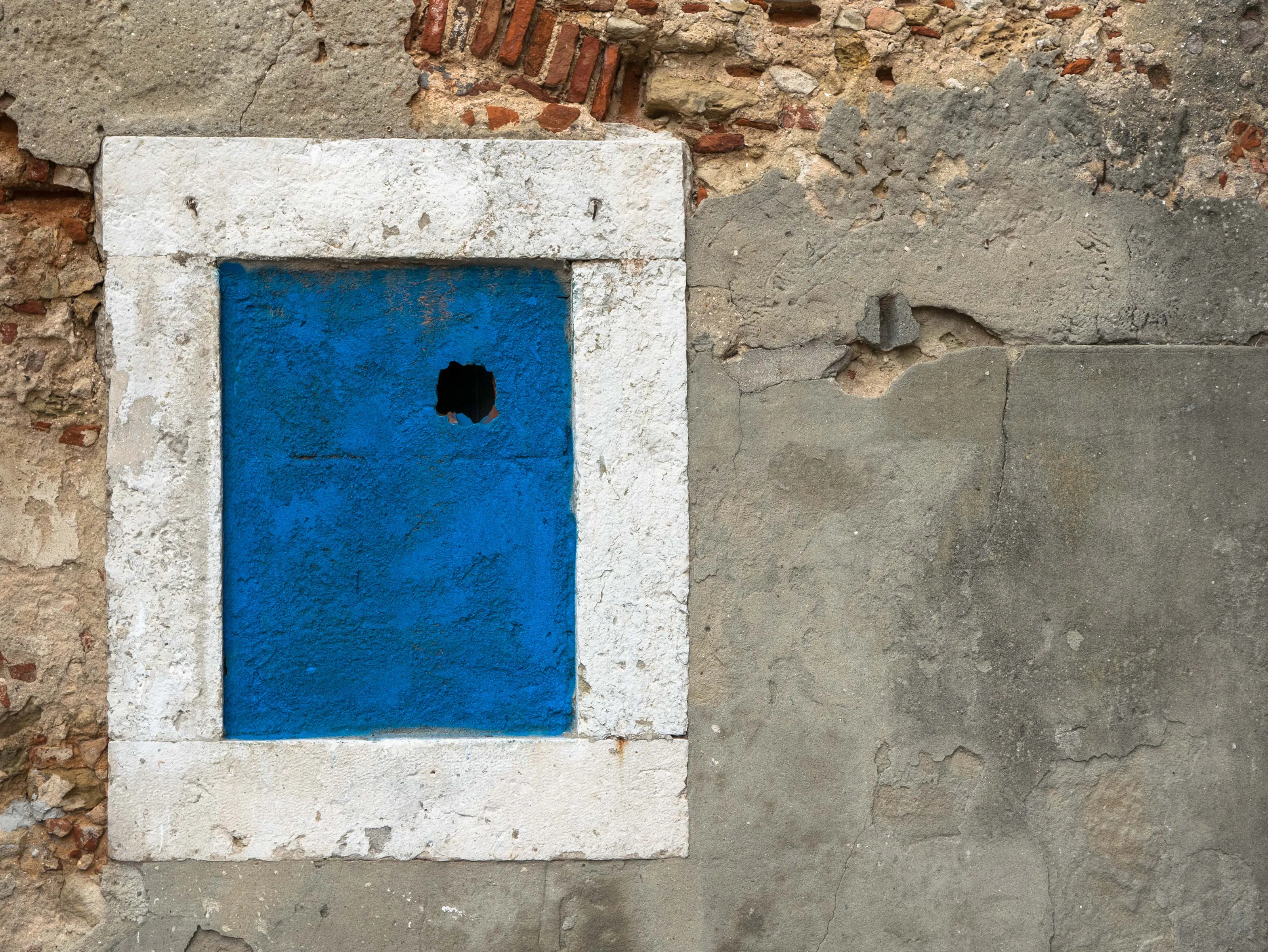
The composition of this image, only in appearance very simple, is indeed very strict. Starting from the bottom, the framework is divided in three parts: the large square tiled floor, the wall, only interrupted by a small rectangular window, and the sky. That’s all. Between the wall and the sky there is a thin red stripe, clearly marking the passage. The sense of solitude and alienation communicated by this picture is very intense, and this is for me a perfect example of minimalist photography.


This is one of the images that most drew my attention, and on which I stopped longest. The third rule is here stricly respected, with the subject posed in the bottom left, much smaller than the whole framework. The dark and neutral background highlights the walking old lady; the only element of the scene but very strong and expressive. Well done!
Brief
See more contest details
Minimalism is not just black and white. Franco Fontana, one of the most famous minimalist photographers, has always used color. Propose images in which cleanliness, geometry, composition and chromatic contrast are protagonists.


